The Divi Theme comes with a gallery module which gives you the option of displaying your image gallery as a series of thumbnails (grid view).
Changing the Gallery Grid with Divi Booster
Divi Booster adds options to the Divi Gallery module settings for controlling the number of images per row, as well as their size, spacing and scaling:
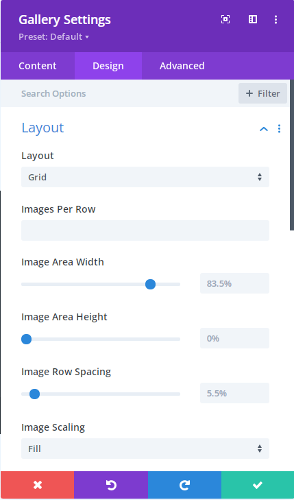
To use these settings, first set a value for the "Images Per Row". Even if you want to keep the default number of images per row, enter it here to activate the other Divi Booster added settings.
Use the "Image Area Width" to control the width of the images (which will also control the gap between them). A width of 100% will mean the images touch with no gaps, while an image width of 80% would leave a gap between the images equal to 20% of the area occupied by a 100% width image. I hope that makes sense!
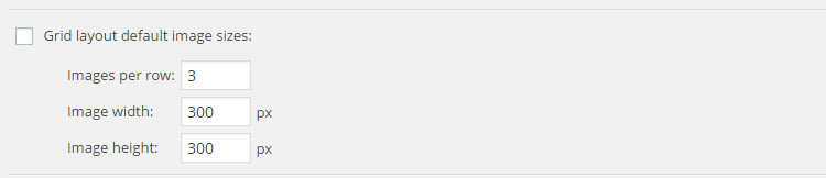
Changing the Gallery Grid with Divi Booster (Site-wide)
There is also an option in Divi Booster (under "Divi > Divi Booster > Modules > Gallery") for controlling the number of images per row and their size on a site-wide basis – i.e. it'll apply to all gallery modules on the site:
Changing Gallery Grid Image Sizes with CSS
To manually adjust the size and spacing of the images in your thumbnail grid, you can use the following CSS.
/* Set the image widths */
.et_pb_gallery_grid .et_pb_gallery_item,
.et_pb_gallery_grid .column_width,
.et_pb_gallery_grid .et_pb_gallery_image,
.et_pb_gallery_grid .et_pb_gallery_image.portrait img
{
    width: 250px !important;
}
.et_pb_gallery_grid .et_pb_gallery_image img
{
    min-width: 250px;
}

/* Set the image heights */
.et_pb_gallery_grid .et_pb_gallery_image,
.et_pb_gallery_grid .et_pb_gallery_image.landscape img
{
    height: 250px !important;
}
.et_pb_gallery_grid .et_pb_gallery_image img
{
    min-height: 250px;
}

/* Set the spacing between images */
.et_pb_gallery_grid .gutter_width { width: 25px; }
.et_pb_gallery_grid .et_pb_gallery_item { margin-bottom:25px !important; }
It looks complex, but it's very simple to change it to suit your needs. There are three parts. First we set the image width to 250px. Then we set the height to 250px (to get square images, in this case). Finally we set the space between side-by-side images to be 25px.
The width normally available to the gallery images is 1080px and if the images are take up too much space the ones on the end will be pushed down to the next row. So if you want 4 images per row, make sure that 4*width + 3*spacing <= 1080px.
Divi 2.4 Update
Some extra CSS is required to make it work with Divi 2.4. You need to add the following, changing the bits in bold to suit your needs. The "4n" and "4n+1" parts should be changed to "Xn" and "Xn+1" where "X" is the number of images you want per row, and the "24px" part should be changed to your desired margin width minus 1.
.et_pb_gallery_grid .et_pb_gallery_item { clear:none !important; }
.et_pb_gallery_grid .et_pb_gallery_item:nth-child(4n) { margin-right:0 !important; }
.et_pb_gallery_grid .et_pb_gallery_item:nth-child(4n+1) { clear:both !important; }
.et_pb_gallery_grid .et_pb_gallery_item { margin-right:24px !important; }
.et_pb_gallery_grid .et_pb_gallery_image img { min-height: 0 !important; }
.et_pb_gallery_grid .et_pb_gallery_image,
.et_pb_gallery_grid .et_pb_gallery_image.landscape img
{
    height: auto !important;
}
Hi Dan —
I have 3 variations on gallery layouts, each with different gallery grids and thumbnail sizes.
How do I apply the above code to a specific set of gallery images only.
Thanks!
Hi Vivian, the easiest way would be to add 3 copies of the code, then in each copy change the occurrences of ".et_pb_gallery_grid" to a class name of your choosing (starting with a period), e.g. ".my-gallery-variation-1", using a different class name for each copy of the code. Then to apply the first variant of the code to a particular gallery module, go to "Gallery Settings > Advanced > CSS ID & Classes > CSS Class" and set it to "my-gallery-variation-1" (no period). To apply a different variant, just enter that variant's class name. I hope that helps / makes sense!
.
I've tried changing the ratio on the gallery thumbnails, but my thumbs are still cropped. Also, when I try to change the max height, it doesn't seem to affect anything.
I've reloaded the images after changing the cropping in . All software up to date.
Hi dave, is there any chance you're able to send me a link to the page you're working on so that I can take a look? Thanks!
Is there any way to display 2 images instead of 1 in the "slipped" (not grid) option of the gallery?
Hey Nico, does this do what you need?
https://divibooster.com/show-2-images-at-a-time-in-the-gallery-module-slide-layout/
I've been unable to create a gallery with DiviBooster customizing the image size and images per row (the reason I purchased DiviBooster). I've tried manually with code provided as well.
Is this feature of DiviBooster not compatible with Divi 3?
Hi Grant, yes the feature should work correctly with the latest version of Divi (it is on my test sites at least). Looking at the source code of the gallery in the page you've linked in your comment, it looks like you've got the following settings:
Gallery Module Settings > Layout > Images per row: 3
Gallery Module Settings > Layout > Image max width: (not set)
Gallery Module Settings > Layout > Image max height: (not set)
I'd expect that changing these will let you control the images per row and image width / height. Note that the image width is a percentage of the space available to the image given the images per row setting. For example, with 4 images per row, setting this to 100% would cause each image to take up the full 25% of the page width available to it, while setting it to 80% would make the image take up 20% of the page width, with the remaining space being margin. The height is given as a percentage in the same way.
If you're still having trouble with it, perhaps you can let me know what settings you've applied / what you're trying to do that isn't working? Thanks!
Posted this in the wrong discussion – the code is working well for me, so far. I'm sure this will be a very basic question, but need to make sure I'm getting it right in the code. I'm making the row wider, with 5 images in each line, but there seems no way to make the module align centred in either the row or module settings. Assume I need to add it to the css? Any thoughts on what I need to add and where?
Hey David, in recent versions of Divi there's an option in the row settings that should help you. Go to "Row Settings > Design > Sizing > Row Alignment" and set it to centered (by clicking the "centered alignment" icon). This centers the row, so if you have an 90% width row, it will put 5% margin on each side, with the 90% row area centered. The gallery, however, will be left-aligned within this row area, and so might appear uncentered. The easiest solution, if it works for you, is to set the row width equal to the width of the gallery. That way, the gallery will appear centered. If that doesn't work for any reason, let me know (and if you're able to share a link showing how things are currently set up, please do). Also, I'll delete the comment posted in the other discussion. Thanks!
Hello,
I get a Expected RBRACE. error with the code below
Hi Nico, that error means that there is a right brace symbol "}" missing. I've checked the code and it is validating / seems to have all the required braces. Two things I can think of that might cause this are:
1) A brace missed when copying the code from this post. Can I suggest deleting what you previously copied and copy the code across again? That might be all it is.
2) An error elsewhere in your CSS file (i.e. an opening brace with no corresponding closing brace).
If you still can't track down the issue, is there any chance you could send me a full copy of your CSS code (via the contact form) so that I can take a look?
Thanks!
If you don't want to break the layout of the image grid when viewed on a smaller viewport use following CSS:
.et_pb_gutters3 .et_pb_column_4_4 .et_pb_grid_item {
width: 24.2%;
margin: 0 1% 1% 0;
}
@media all and (max-width:980px) {
.et_pb_column .et_pb_grid_item:nth-child(n) {
width: 32% !important;
margin: 0 1% 1% 0 !important;
}
}
@media all and (max-width:767px) {
.et_pb_column .et_pb_grid_item:nth-child(n) {
width: 49%!important;
margin: 0 1% 1% 0!important;
}
}
This example is optimized for 4 pictures in a row and will minimise the image spacing.
Thanks for sharing, Vladimir!
Very handy, Thanks Vladimir!
This doesnt seem to be working anymore
Thanks for the update, Etu. Is there any chance you're able to post a link to the page you're working on so that I (and possibly Vladimir if he sees this) can take a look and see if it can be fixed? If the link is private, please feel free to send it to me through my contact form. Thanks!
Hi! thanks for the posts but I d like to know how to center the gallery as it stays on the left margin
You're welcome, pilar. Any chance you're able to send me a link to the page with your gallery, so that I can check it out and make sure I'm giving you the right advice?
Thank you works great! DiviVersion: 3.0.34
This works perfectly on the new Divi 3.06 too. Thank you so very much!
Hi Dan
Is there a way of not showing the photo name in a gallery, I'd like the comment/caption to show but not the name of the pic.
I'm playing with a gallery at the bottom on this page and can't remove the title.
http://www.wsf.wales/junior-squad/
Thanks
Andy
Hi Andy, here's how to hide the image titles while leaving the captions visible:
https://divibooster.com/hide-divi-gallery-titles-but-not-the-captions/
Hopefully that does what you need.