
Divi’s Gallery module displays images in a regular grid, which can feel restrictive when your photos have different heights or aspect ratios. A masonry layout preserves those varied proportions and arranges the images more compactly, reducing unnecessary gaps and awkward cropping.
In this guide, I’ll show you two ways to create a responsive masonry image gallery while continuing to use Divi’s standard Gallery module.

Both methods preserve the normal Divi Gallery module workflow, allowing you to continue using Divi’s existing gallery settings and compatible customisations.
- Divi Booster or Divi Gallery Booster: both add a true masonry layout that places each image into the shortest available column. They also follow the gallery’s selected image order as closely as possible, provide responsive controls for columns and spacing, and handle lazy-loaded images correctly when the layout moves images above the fold.
- PHP and CSS: creates a basic masonry-style layout using CSS columns. It is a useful lightweight alternative, but it fills the columns sequentially rather than dynamically packing images into the shortest column.
For the most efficient layout and the greatest control inside the Divi Builder, use the plugin method with either Divi Booster or Divi Gallery Booster.
Add a True Masonry Layout with Divi Booster or Divi Gallery Booster
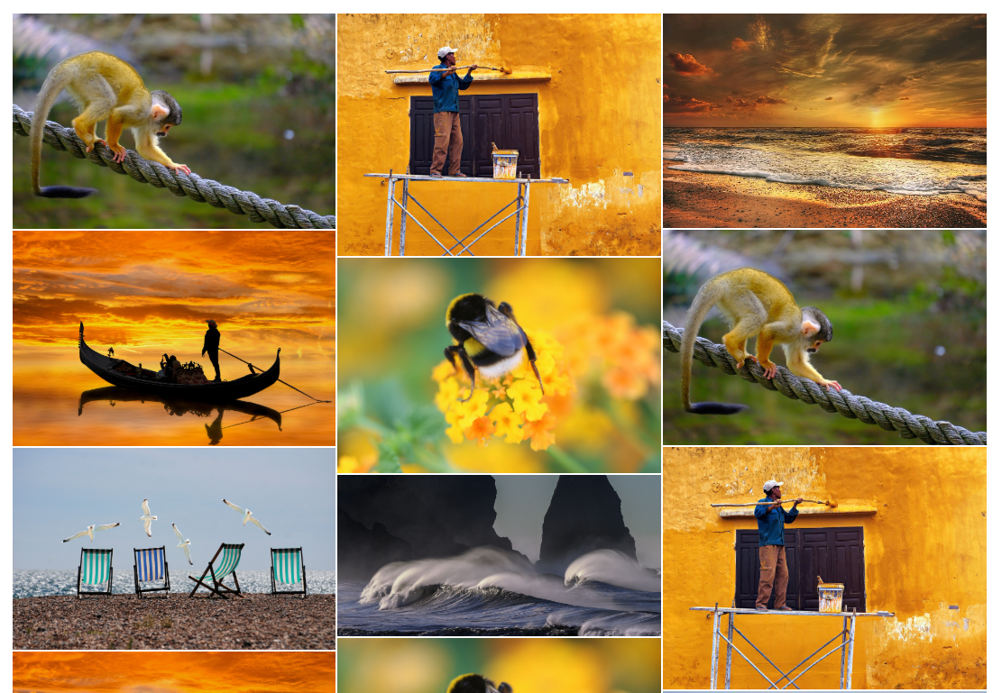
Divi Booster and Divi Gallery Booster both add a true Masonry layout directly to Divi’s existing Gallery module. Rather than filling fixed CSS columns from top to bottom, it places each image into the shortest available column, producing a more compact and efficiently packed gallery.
The layout also uses the image order selected in the Gallery module. It arranges the rows and columns to follow that order as closely as possible while still maintaining the efficient masonry layout.
Because the feature extends Divi’s native Gallery module, you can continue using the module’s existing content, ordering, display and design settings, along with compatible gallery customisations you have already applied. You do not need to recreate the gallery in a different module.
Install and activate Divi Booster or Divi Gallery Booster
Install and activate either Divi Booster or Divi Gallery Booster on your WordPress site.
Get Divi Booster or Get Divi Gallery Booster
Once activated, the plugin adds its masonry settings directly to Divi’s existing Gallery module. The setup is identical whether you use Divi Booster or Divi Gallery Booster.
Add or open a Divi Gallery module
Open the page in the Divi Builder and add a Gallery module, or open an existing Gallery module you want to update. Add your gallery images as usual from the module’s Content settings.
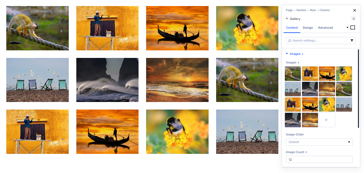
Set the Gallery layout to Masonry
Open the Gallery module settings and locate the layout controls, at Gallery > Design > Layout.
Set the Gallery layout to Masonry.
This changes the gallery from Divi’s standard grid into a true masonry layout. Each image retains its varied proportions and is placed into the shortest available column.
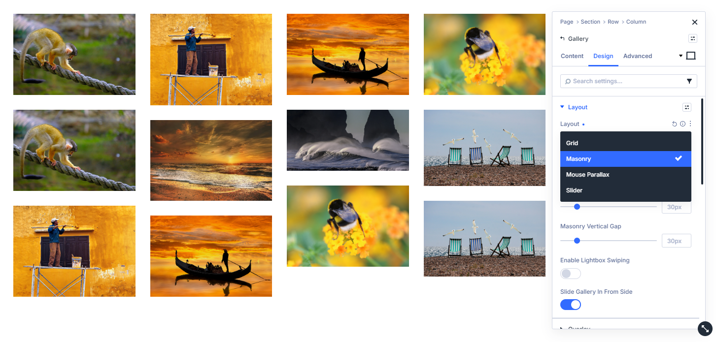
Choose the masonry column count
In the Gallery module’s layout settings, adjust the Masonry Columns option. You can set different values for desktop, tablet, and phone, such as three columns on desktop, two on tablet, and one on phone.
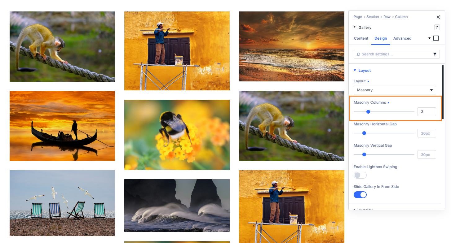
Adjust the horizontal and vertical gaps
In the Gallery module’s layout settings, adjust the Masonry Columns option.
You can set different column counts for desktop, tablet and phone.
Use Divi’s responsive controls to preview each device size and adjust the column count to suit the available width.
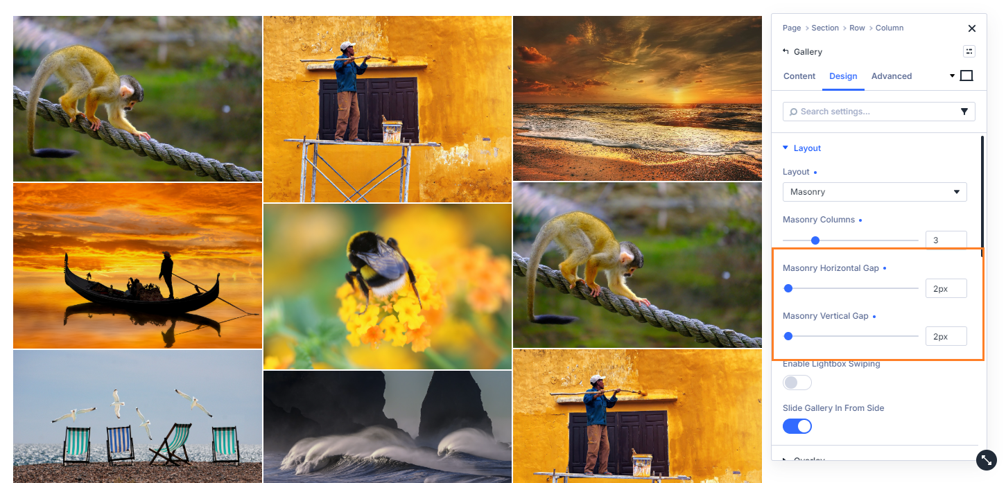
Save and check the gallery on the front end
Save your Gallery module and publish or update the page. View the page on the front end and confirm that the images are flowing into the masonry layout, with the column count and gaps you selected.
Continue improving your Divi gallery
Once your masonry layout is in place, you can continue enhancing your gallery.
If you're using Divi Gallery Booster, explore its additional gallery-specific features.
If you're using Divi Booster, you'll find the same gallery enhancements alongside hundreds of other Divi improvements.
Create a Masonry-Style Divi Gallery with PHP / CSS
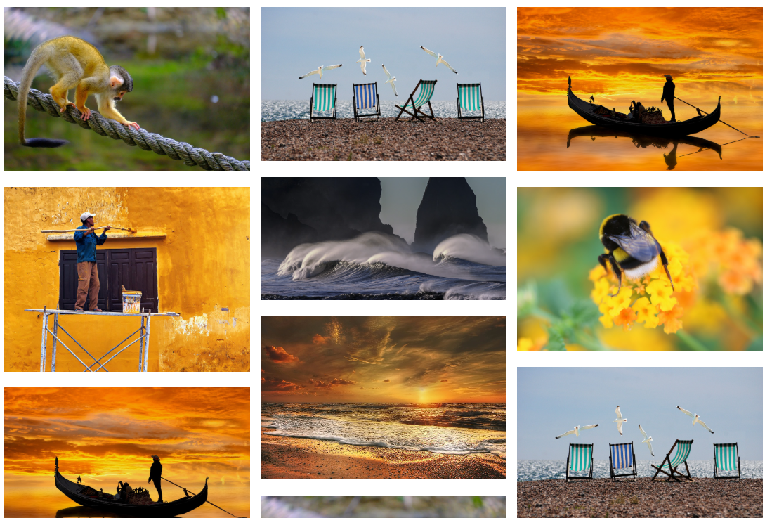
For a basic no-plugin alternative, you can use PHP to restore the gallery images’ original proportions and CSS columns to arrange them in a masonry-style layout.
This method also continues to use Divi’s standard Gallery module, allowing you to retain the module’s normal image selection and compatible design customisations.
However, it is not the same as the true masonry layout provided by Divi Booster and Divi Gallery Booster.
The CSS-columns method:
- fills one column vertically before continuing into the next, making the result less order-aware than the true masonry layout;
- typically produces less efficient image packing;
- requires manual responsive CSS adjustments; and
- does not include additional handling for images moved into view by the new layout.
Use this method when a simple column-based masonry effect is sufficient and you are comfortable maintaining both PHP and CSS.
Prevent Gallery Modules from Using Cropped Images
Divi normally uses cropped gallery image variants with consistent proportions. This works well for the standard grid layout, where the images need to align in uniform rows.
A masonry-style layout instead needs to display images at their varied aspect ratios.
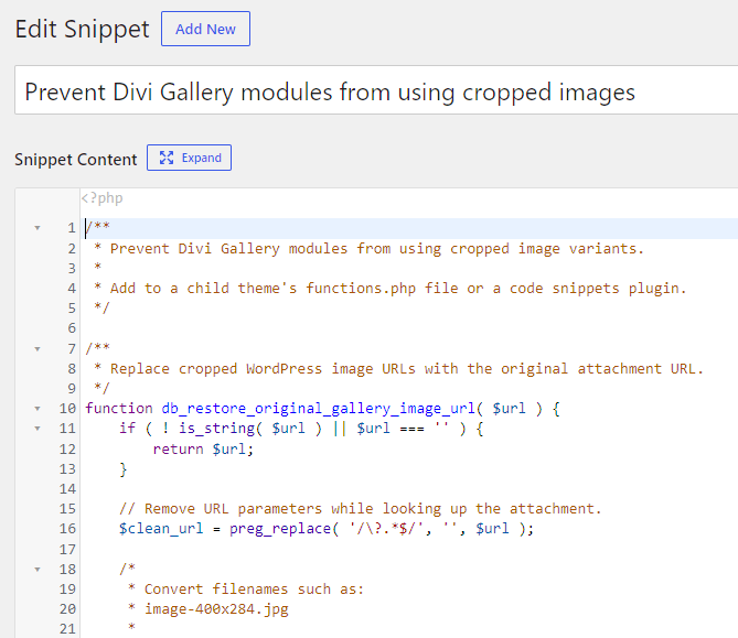
CSS can rearrange the gallery items, but it cannot restore the original image proportions if Divi has already output cropped thumbnail files. The following PHP code replaces those cropped URLs with the original full-size attachment URLs.
/**
 * Prevent Divi Gallery modules from using cropped image variants.
 *
 * Add to a child theme's functions.php file or a code snippets plugin.
 */

/**
 * Replace cropped WordPress image URLs with the original attachment URL.
 */
function db_restore_original_gallery_image_url( $url ) {
	if ( ! is_string( $url ) || $url === '' ) {
		return $url;
	}

	// Remove URL parameters while looking up the attachment.
	$clean_url = preg_replace( '/\?.*$/', '', $url );

	/*
	 * Convert filenames such as:
	 * image-400x284.jpg
	 *
	 * back to:
	 * image.jpg
	 */
	$possible_original = preg_replace(
		'/-\d+x\d+(?=\.[a-zA-Z0-9]{2,5}$)/',
		'',
		$clean_url
	);

	if ( $possible_original === $clean_url ) {
		return $url;
	}

	$attachment_id = attachment_url_to_postid( $possible_original );

	if ( ! $attachment_id ) {
		return $possible_original;
	}

	$original_url = wp_get_attachment_image_url( $attachment_id, 'full' );

	return $original_url ?: $possible_original;
}


/**
 * Replace cropped URLs in gallery image src and srcset attributes.
 */
function db_disable_divi_gallery_image_cropping( $html ) {
	if (
		! is_string( $html ) ||
		$html === '' ||
		strpos( $html, 'et_pb_gallery' ) === false
	) {
		return $html;
	}

	return preg_replace_callback(
		'/<img\b([^>]*)>/i',
		function ( $matches ) {
			$attributes = $matches[1];

			/*
			 * Replace the main src URL.
			 */
			$attributes = preg_replace_callback(
				'/\bsrc=(["\'])(.*?)\1/i',
				function ( $src_match ) {
					$original_url = db_restore_original_gallery_image_url(
						html_entity_decode( $src_match[2] )
					);

					return 'src=' . $src_match[1] .
						esc_url( $original_url ) .
						$src_match[1];
				},
				$attributes
			);

			/*
			 * Replace each URL in srcset.
			 */
			$attributes = preg_replace_callback(
				'/\bsrcset=(["\'])(.*?)\1/i',
				function ( $srcset_match ) {
					$sources = array_map(
						'trim',
						explode( ',', html_entity_decode( $srcset_match[2] ) )
					);

					$updated_sources = array_map(
						function ( $source ) {
							$parts = preg_split(
								'/\s+/',
								trim( $source ),
								2
							);

							$url        = $parts[0] ?? '';
							$descriptor = $parts[1] ?? '';

							$url = db_restore_original_gallery_image_url( $url );

							return trim(
								esc_url( $url ) . ' ' . $descriptor
							);
						},
						$sources
					);

					return 'srcset=' . $srcset_match[1] .
						esc_attr( implode( ', ', $updated_sources ) ) .
						$srcset_match[1];
				},
				$attributes
			);

			/*
			 * Remove width and height attributes so the image can retain
			 * its natural aspect ratio in the masonry layout.
			 */
			$attributes = preg_replace(
				'/\s+(?:width|height)=(["\']).*?\1/i',
				'',
				$attributes
			);

			return '<img' . $attributes . '>';
		},
		$html
	);
}


/**
 * Divi 4 Gallery modules.
 */
add_filter(
	'et_module_shortcode_output',
	function ( $output, $render_slug, $module ) {
		if ( $render_slug !== 'et_pb_gallery' ) {
			return $output;
		}

		return db_disable_divi_gallery_image_cropping( $output );
	},
	10,
	3
);


/**
 * Divi 5 Gallery modules.
 */
add_filter(
	'render_block_divi/gallery',
	function ( $block_content, $parsed_block, $block ) {
		return db_disable_divi_gallery_image_cropping( $block_content );
	},
	10,
	3
);
You can add this code to the functions.php file of a child theme, or using a plugin such as Code Snippets.
Add the masonry CSS
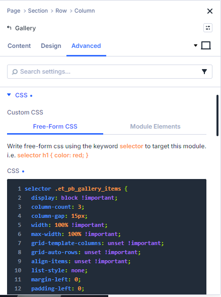
Add this CSS to the gallery module settings at Gallery > Advanced > Custom CSS > Free-Form CSS:
selector .et_pb_gallery_items {
	display: block !important;
	column-count: 3;
	column-gap: 15px;
	width: 100% !important;
	max-width: 100% !important;
	grid-template-columns: unset !important;
	grid-auto-rows: unset !important;
	align-items: unset !important;
	list-style: none;
	margin-left: 0;
	padding-left: 0;
}

@media only screen and (max-width: 1200px) {
	selector .et_pb_gallery_items {
		column-count: 2;
	}
}

@media only screen and (max-width: 767px) {
	selector .et_pb_gallery_items {
		column-count: 1;
	}
}

selector .et_pb_gallery_items .et_pb_gallery_item,
selector .et_pb_gallery_items > li,
selector .et_pb_gallery_items > div {
	break-inside: avoid;
	page-break-inside: avoid;
	-webkit-column-break-inside: avoid;
	-moz-column-break-inside: avoid;
	width: 100% !important;
	max-width: 100% !important;
	margin: 0 0 16px 0 !important;
	float: none !important;
	display: inline-block !important;
	flex: 0 0 auto !important;
}

selector
	.et_pb_gallery_items
	.et_pb_gallery_item
	.et_pb_gallery_image,
selector
	.et_pb_gallery_items
	.et_pb_gallery_item
	.et_pb_gallery_title {
	width: 100% !important;
	max-width: 100% !important;
}

selector
	.et_pb_gallery_items
	.et_pb_gallery_item
	.et_pb_gallery_image
	img {
	display: block;
	width: 100% !important;
	height: auto !important;
}

selector .et_pb_gallery_pagination {
	display: none !important;
}
Save and test the page
Save your changes and view the gallery on the front end. Check the layout at desktop, tablet, and phone widths to make sure the image spacing still feels balanced.
Continue improving your Divi gallery
If you want to keep refining the same gallery, check out our other Divi Gallery module tutorials for a wide range of Divi gallery enhancements:
Conclusion
A masonry layout can make a Divi Gallery feel more natural and intentional, especially when your images are not all the same size. The plugin method provides a true masonry gallery, keeps the setup inside the Gallery module and gives you responsive controls, while the CSS method can work as a lighter fallback for simple cases.
If there are other gallery layout controls you’d like to see added, let me know in the comments so I can consider adding them in a future update.

0 Comments