
Show the Full Divi Menu Module Links on Mobile with Divi Booster
Divi Booster adds a responsive “Show Mobile Menu” option to the Divi Menu module, letting you choose whether the full menu or hamburger menu is shown on desktop, tablet, and phone. This is the same setting used in our guide to showing the Divi Menu module hamburger menu on desktop, just applied in the opposite direction.
Install and Activate Divi Booster
If you haven't already done so, install and activate Divi Booster on your site.
Open the Divi Menu Module Settings
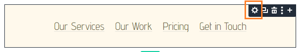
Open the page, header, footer, or Theme Builder template containing your Divi Menu module.
Click the Menu module or its gear icon to open its settings.
Disable the Mobile Menu on Tablet and Phone
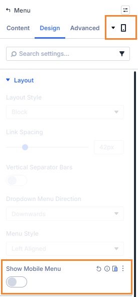
Go to:
Design → Layout → Show Mobile Menu
Disable the tablet and phone values for this setting.
This tells the Menu module to keep showing the full menu links instead of switching to the hamburger menu on smaller screens.
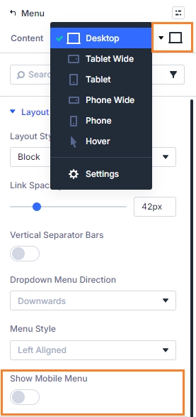
Check the Desktop Value
Desktop normally already shows the full menu links, so you can usually leave the desktop value disabled.
If you want a different setup, you can adjust desktop, tablet, and phone independently from the same responsive setting.
Save and Preview on Mobile
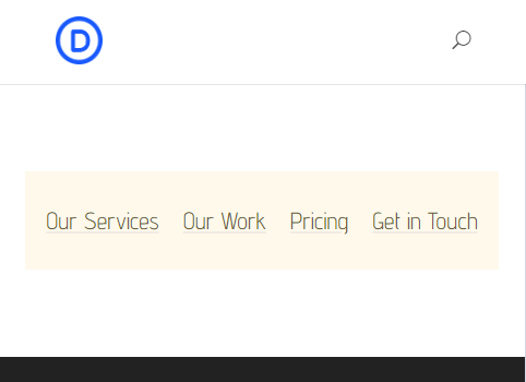
Save the module and preview the page on tablet and phone widths.
The Menu module should now show the full menu links instead of the mobile hamburger button.
Keep Going!
Once you've got the Divi Booster feature configured and the menu displaying fully on mobile, why not make your menu module even better? You can browse the full collection of Divi menu tutorials for other menu module ideas.
Show the Full Divi Menu Module Links on Mobile with CSS
If you only need a simple fixed change for one Menu module, you can use CSS instead. This method is lightweight, but it does not give you the responsive per-device setting inside the module like Divi Booster does.
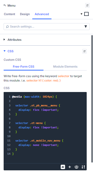
Open the Menu Module Settings
Open the Divi Menu module you want to change.
Add the CSS to the Free-Form CSS Box
In the module settings, go to:
Advanced → Custom CSS → Free-Form CSS
Paste this CSS into the Free-Form CSS box:
@media (max-width: 1024px) {

  selector .et_pb_menu__menu {
    display: flex !important;
  }

  selector .et-menu {
    display: flex !important;
  }

  selector .et_mobile_nav_menu {
    display: none !important;
  }
}
Divi automatically replaces selector with the current module’s selector, so the CSS applies only to this Menu module.
Save and Preview
Save the module and view the page on tablet and phone widths.
The module should now show the full menu links instead of the hamburger menu.
Take it Further!
Once you've got the CSS in place an your menu is displaying fully on mobile, why not make your menu module even better? You can browse the full collection of Divi menu tutorials for other menu module ideas.
Conclusion
Showing the full Divi Menu module links on mobile can work well for short menus, footer navigation, and compact layouts where a hamburger menu adds unnecessary extra taps. Divi Booster is the more flexible option because it adds the control directly to the module settings, while CSS can work well for a quick one-off change. If there are related Menu module options you’d like to see added, please leave a comment with the setup you’re trying to build.

0 Comments