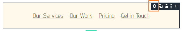
By default, the Divi Menu module shows the full menu on desktop and switches to the hamburger menu on tablet and phone. That can be a problem if your desktop menu is too wide, wraps onto multiple lines, or doesn’t fit the design of a compact header. Showing the hamburger menu on desktop lets you keep the same clean navigation style across all screen sizes. This guide shows how to do it with Divi Booster or with some custom CSS.

Show the Divi Menu Module Hamburger Menu on Desktop with Divi Booster
Divi Booster adds a responsive “Show Mobile Menu” option to the Divi Menu module, letting you choose whether the full menu or hamburger menu is shown on desktop, tablet, and phone.
Install and Activate Divi Booster
Install and activate Divi Booster on your site.
Open the Divi Menu Module Settings
Open the page, header, or Theme Builder template containing your Divi Menu module.
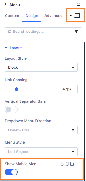
Click the Menu module or its gear icon to open its settings.
Enable the Hamburger Menu on Desktop
Go to:
Design → Layout → Show Mobile Menu
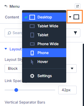
Enable the desktop value for this setting.
Check the Tablet and Phone Values
Tablet and phone will normally already use the mobile menu, but you can adjust them from the same responsive setting if needed.
This lets you show the hamburger menu on desktop while keeping full control over tablet and phone behavior.
Save and Preview the Header
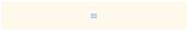
Save the module and preview the page on desktop.
The Menu module should now show the hamburger menu button instead of the full desktop menu.
Keep Going!
If you want to make your site even better, why not improve your branding now by adding the site title and tagline to the Divi Menu module
You can also browse the full collection of Divi menu module tutorials.
Show the Divi Menu Module Hamburger Menu on Desktop with CSS
If you only need a simple fixed change for one Menu module, you can use CSS instead. This method is lightweight, but it does not give you a responsive setting inside the module like Divi Booster does.
Open the Menu Module Settings
Open the Divi Menu module you want to change.
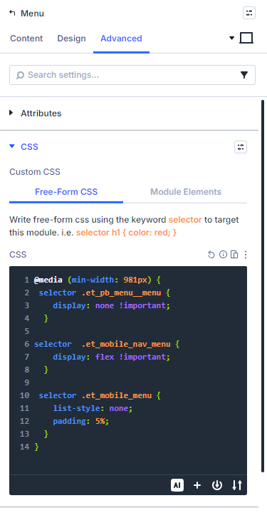
Add the CSS to the Free-Form CSS Box
Go to: Advanced → Custom CSS → Free-Form CSS
Paste this CSS into the Free-Form CSS box:
@media (min-width: 981px) {
 selector .et_pb_menu__menu {
    display: none !important;
  }

selector  .et_mobile_nav_menu {
    display: flex !important;
  }

 selector .et_mobile_menu {
    list-style: none;
    padding: 5%;
  }
}
Divi automatically replaces selector with the current module’s selector, so the CSS applies only to this Menu module.
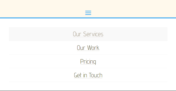
Save and Preview
Save the module and view the page on desktop.
The module should now show the hamburger menu button instead of the full menu.
Take it Further!
Now that you've sorted out the desktop hamburger menu, why not keep up the momentum and boost your branding by adding the site title and tagline to the Divi Menu module
For more options, browse the full Divi menu tutorials.
Conclusion
Showing the Divi Menu module hamburger menu on desktop is a simple way to keep your header compact and consistent across screen sizes. Divi Booster is the more flexible option because it adds the control directly to the module settings, while CSS can work well for a quick one-off change. If there are related Menu module options you’d like to see added, please leave a comment with the setup you’re trying to build.

0 Comments