
Title icons can make a Divi Accordion module easier to scan, especially for FAQs, service lists, and feature sections. In this guide, you'll learn how to add icons to accordion titles, style them differently for open and closed states, and give a specific accordion item its own icon settings when needed.

Add Icons to Accordion Titles using the Accordion Title Icon Feature
This method uses the Accordion Title Icon feature to add a default title icon to an Accordion module, then override that icon on an individual accordion item. You'll also set separate colors and sizes for open and closed accordion states.
The Accordion Title Icon feature is available in both the standalone Accordion Title Icon plugin and Divi Booster. If you already have Divi Booster installed, you don't need to install the standalone plugin.
This method works with Divi 5.
Accessing the Accordion Title Icon feature
The Accordion Title Icon feature is included in Divi Booster. If you already own Divi Booster, you can use the feature without installing any additional plugin.
If you don't have Divi Booster and only want the Accordion Title Icon functionality, you can purchase the standalone Accordion Title Icon plugin below.
Already using Divi Booster?
You can follow the instructions below using the Accordion Title Icon settings provided by Divi Booster (v5.9 onwards). The settings and functionality described in this guide are the same whether you're using the standalone feature plugin or Divi Booster.
Choose the default title icon
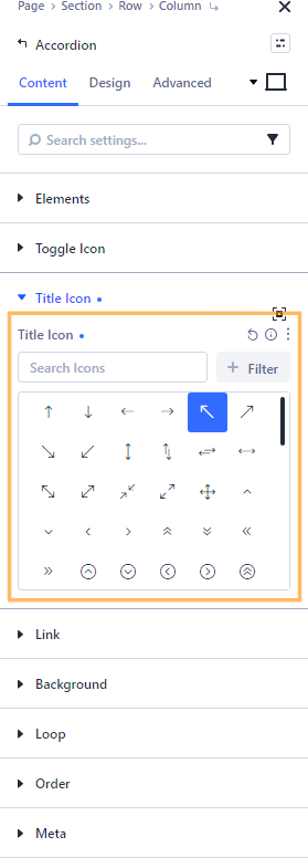
Open the settings for the Accordion module you want to customize. In the "Content" tab, find and expand the "Title Icon" section.
In the "Title Icon" settings, use the icon picker to select the icon you want to display to the left of each accordion title.
This parent-level icon will be used by all accordion items that do not have their own item-level icon selected.
Style the default icon (open and closed state)
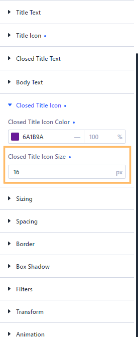
Switch to the "Design" tab and expand the "Title Icon" settings. Set the open-state icon color and size.
Then expand the "Closed Title Icon" settings and set the closed-state color and size.
These styles apply to any accordion item using the default parent icon settings.
Override the icon on an individual Accordion item
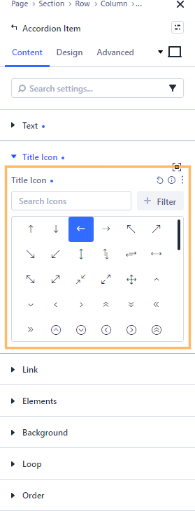
To give an accordion item its own icon, open the Accordion module's child elements list and select the item you want to customize. In that item's settings, go to the "Content" tab, expand "Title Icon", and choose a different icon from the icon picker.
This item-level icon replaces the default parent icon for this accordion item only.
Style the item-level icon (open and closed state)
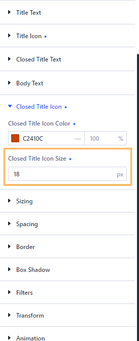
With the individual Accordion Item settings still open, switch to the "Design" tab. Expand "Title Icon" and set the item's open-state icon color and size
Next, expand "Closed Title Icon" and set the item's closed-state color and size.
These item-level styles override the Accordion module's default title icon styles for this item only.
Save and check the published accordion
Save and publish the page, then exit the Visual Builder and view the page on the front end. Check that the accordion titles show icons to the left of the title text.
If you added an item-level override, the customized item should show a different icon from the other accordion items.
Click between accordion items on the front end to confirm the open and closed styles are applied correctly.

Take it further with more Accordion improvements
The Accordion Title Icon feature is included in Divi Booster, along with many other enhancements for the Divi Accordion module.
Once your accordion title icons are in place, you might like to make your accordion even better with these guides:
- Make Divi Accordion Items Closeable – Let visitors close the currently open accordion item.
- How to Make a Divi Accordion All Closed by Default – Start all accordion items closed for a cleaner FAQ layout.
- How to Add FAQ Schema to a Divi Accordion Module – Add FAQ structured data to accordion-based FAQ content.
Conclusion
You have now seen how to add icons to Divi Accordion module titles, style them for open and closed states, and override the default icon on a specific item.
The Accordion Title Icon feature is available both as a standalone plugin and as part of Divi Booster, so you can use whichever option best suits your Divi setup.
If you are trying to create a different accordion effect, let us know in the comments below.

0 Comments