Tooltips are a great way to include additional information in your Divi site, without overloading your users with information. There also perfect for adding fun or interactive elements to engage your users. In this guide we'll show you how to set up and configure a tooltip using the built-in Divi 5 Tooltip Module.

Add a Tooltip in Divi using the built-in Divi Tooltip Module
The Divi Tooltip Module is a new module built into Divi 5. It lets you easily add tooltips to your Divi layouts without requiring third-party tooltip plugins or custom code. Here's how to set it up.
Set up the Parent Element
An important thing to realize about the Divi Tooltip module is that the tooltips are positioned relative to their parent element. If you add a tooltip directly in a row, it will be positioned relative that row. Perhaps more usefully, you can also embed the tooltip module inside another module and the tooltip with then be positioned relative to that module.
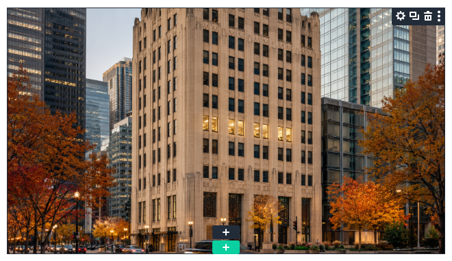
I'll take this latter approach here to demonstrate the embedding. So for this example I'm going to use a standard image module, with an image of a city building to which we'll add an overlaid tooltip.
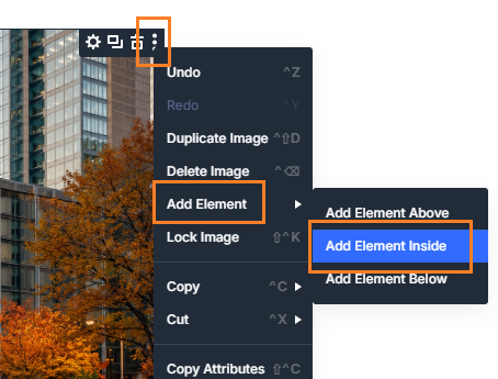
Select to Add Element Inside the Parent
Now, we'll embed our tooltip into the parent image module. To begin, right click on the "three dot" menu in the image action buttons, and navigate to "Add Element" then select the "Add Element Inside" option.
Note: if you're just using a tooltip in a row, not embedding it into another module, you can just use the row's regular add module "+" button instead.
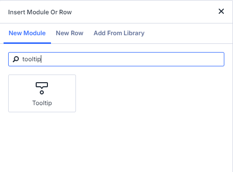
Insert a Tooltip Module
Now the "Insert Module or Row" modal menu should appear. Scroll to, or search for, the module called "Tooltip". Click it to add it to the parent element. (Note that the Divi Tooltip Module is available in Divi 5.8 upwards).
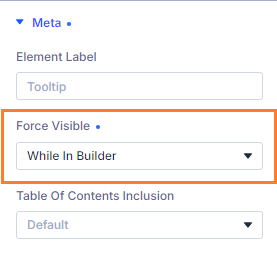
(Optional) Force the Tooltip to be Visible in the Editor
By default, the tooltip is set to show on hover. In the builder preview, this has the effect that when you click away from the parent element the tooltip module becomes hidden. You can you get back to it by clicking on the parent element or using the layers menu. But if you want to keep it visible at all times while you work on it, set:
Tooltip > Content > Meta > Force Visible = While in Builder
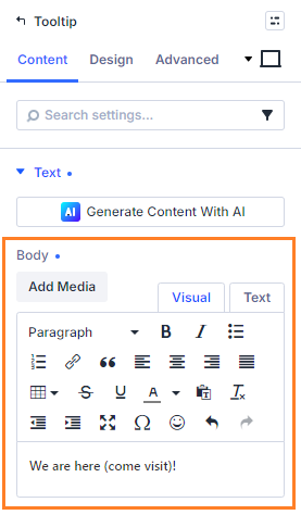
Enter your Tooltip Text
Now, in the Tooltip module's settings, enter the text to be displayed in the tooltip at:
Tooltip > Content > Text > Body
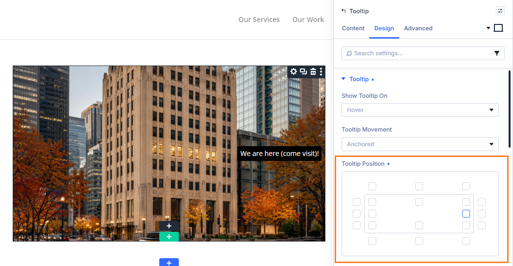
Set the Tooltip Position
To position the tooltip relative to our parent element, we can use the following setting:
Tooltip > Design > Tooltip > Position
Select the little square that best reflects where you'd like to place the tooltip. In the current example, I've placed this next to the office location so that the tooltip will draw attention to it.
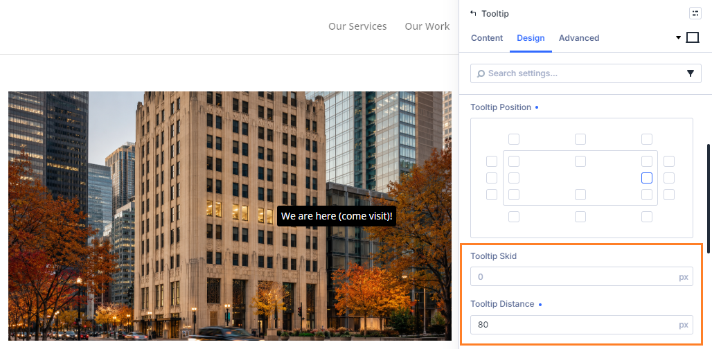
Fine-tune the Tooltip Position
The tooltip module comes with two settings that can be used to tweak the position of the tooltip:
Tooltip > Design > Tooltip > Tooltip Skid
Tooltip > Design > Tooltip > Tooltip Distance
The names and behavior of these settings might be a bit confusing at first, but basically they adjust the position of the tooltip relative to the edge it is on. Note here that the inside corner tooltip positions are considered to be associated with the top or bottom edges, rather than the sides.
Tooltip Skid moves the tooltip along its edge, so essentially moves a tooltip away from the top right corner. So tooltips positioned on the top or bottom edge are moved to the right by the skid amount, while tooltips positioned on the left or right edge are moved down by the skid amount.
Tooltip Distance, on the other hand, moves the tooltip away from its edge. Tooltips on an inside edge will move in the direction of the center of the parent element, while tooltips on the outside will move away from the parent element.
It's worth noting, too, that negative values don't seem to be supported, so you may need to pick a starting position that is closer to the top/right of the parent element than your intended final position.
For this example, I'm using the Tooltip Distance to move the tooltip closer to the center of the image, next to the office location.
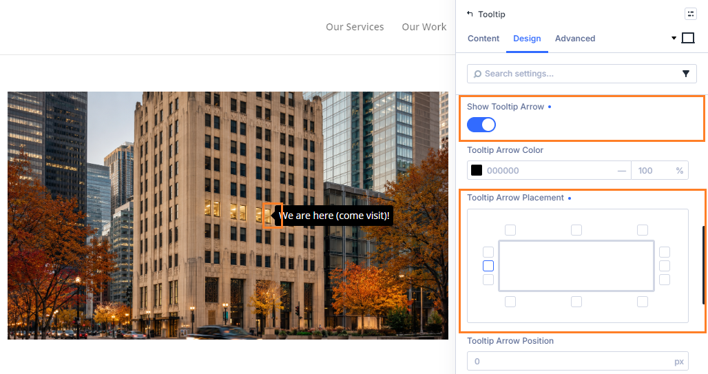
Add a Tooltip Arrow
The Divi 5 Tooltip module supports all the usual Divi design settings such as backgrounds and fonts. But a tooltip-specific style option worth a mention is the option to add an arrow to the edge of the tooltip. It's a small detail, but can help clarify what the tooltip relates to and draw the user's attention appropriately. To add a tooltip arrow, first enable:
Tooltip > Design > Tooltip > Show Tooltip Arrow
The select where on the tooltip you'd like the arrow to appear using the following setting:
Tooltip > Design > Tooltip > Tooltip Arrow Placement.
You can also set the arrow color and size, and fine tune its position.
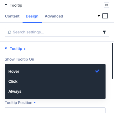
Choose the Tooltip Trigger
One more thing the Divi Tooltip module lets you customize is the conditions under which the tooltip is shown. Specifically the setting:
Tooltip > Design > Tooltip > Show Tooltip On
Lets you choose between showing the tooltip on "Hover" (the default), on "Click", or "Always" shown.
Save and View the Result
Now that the tooltip is setup, save the page and view the result. You should now see your tooltip displayed in the correct position over the parent element, showing up base on the trigger condition you selected.

Add an Icon to the Tooltip
Now that you've got a basic tooltip up and running, why not customize it further by adding an icon to the tooltip?
You can find out how to do it in our guide to adding an icon to the Divi tooltip module.
Conclusion
So there we have it – an informative, interactive tooltip set up using the Divi Tooltip module. At this point you might like to explore the tooltip settings further to style the tooltip the way you want it to appear.
If there's anything in particular that you'd like to be able to do in the Divi Tooltip module, let me know in the comments below!

0 Comments