Fix Tab Gaps when LearnDash used with Divi

Written by Dan Mossop

LearnDash includes a feature which allows tabs to be added to LearnDash pages (e.g. by plugins). However, this feature can introduce some white gaps in Divi. Here's what to do about it.

First, here's an example of LearnDash tabs shown on a course page in Divi:

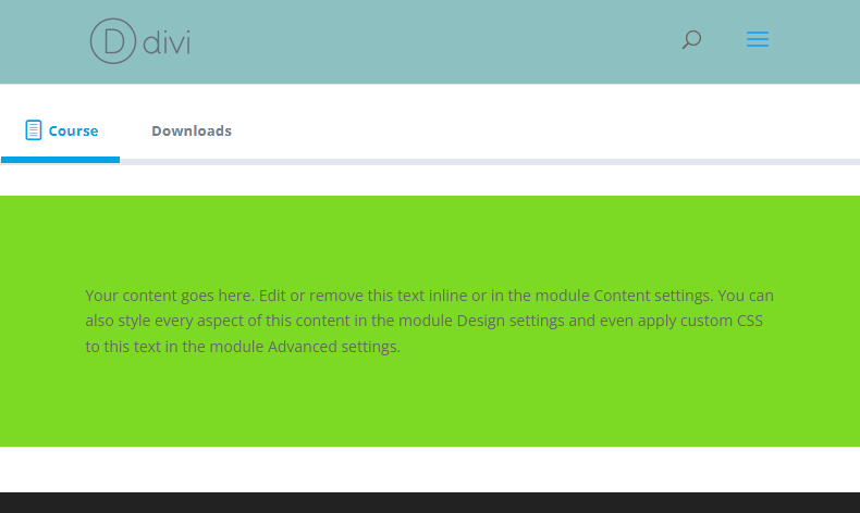
As you can see, there is some blank space above and below the green section. This is added by the LearnDash tab feature and can't be easily controlled within Divi.

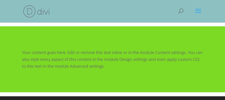
Even when no tabs are show, a gap can remain:

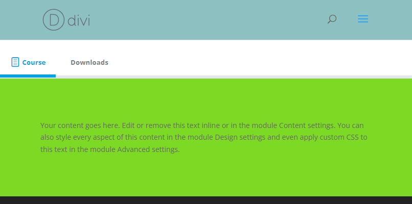
Removing the LearnDash Tab Gaps with Divi LearnDash Kit

Divi LearnDash Kit automatically removes the gaps, allowing the Divi Builder area to fully cover the tab area, and as such the entire look of the area can be controlled from within the Divi Builder. Here's how the tabs look after activating Divi LearnDash Kit: 

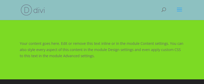
And how it looks when there are no tabs:

This feature is available in Divi LearnDash Kit v1.6.5 upwards.

Removing the LearnDash Tab Gaps with CSS

If you're not using Divi LearnDash Kit, you can achieve a similar result using the following CSS:

/* === Modify LD tabs margins so doesn't introduce gaps in Divi pages  === */
.et-db .learndash-wrapper .ld-tabs {
    margin-top: 0;
	margin-bottom: 0;
}
.et-db .learndash-wrapper .ld-tabs .ld-tabs-navigation {
	margin-top: 1em;
}
.et-db .learndash-wrapper .ld-tabs .ld-tabs-content .ld-tab-content {
	padding-top: 0; 
	padding-bottom: 0;
}

We may earn a commission when you visit links on our website.

Seamlessly Integrate LearnDash with Divi!

Elevate your LearnDash LMS with the Divi LearnDash Kit from Divi Booster. This plugin resolves compatibility issues like the unsightly tab gaps, adds custom LearnDash modules to Divi, and supports Divi design settings, creating a cohesive and visually appealing learning environment.

Latest Posts

Top (or Bottom) Align Divi Icon List Module Icons

When Icon List items wrap onto multiple lines, the default icon alignment can make the icon appear vertically centered next to the text, which may look unbalanced or harder to scan. Setting the icons to align at the top creates a cleaner, more consistent...

Make Divi Button Modules Full Width with Centered Content

This configuration makes a Divi button stretch to the full width of its container while keeping its label neatly centered, creating a bold, edge-to-edge call-to-action. You might want this for hero sections, pricing tables, or any layout where a standard-sized button...

Fix the Flickr Typo in the Divi Social Media Follow Module

Sometimes it's the small things that make the difference... there is a minor typo in the Divi Social Media Follow module that was present in Divi 4, and (currently) remains in Divi 5. Specifically, the tooltip for Flickr is misspelled as "Flikr". Here's how to fix...

Add a Frosted-Glass Background Blur in Divi

Give your Divi layouts a polished, glassmorphism look by blurring the content behind a semi‑transparent Divi section, row or module. This effect enhances readability over busy or textured backgrounds while preserving the visual impact of your imagery and layout. In...

About Dan Mossop

Dan is a Scottish-born web developer, now living in Brisbane with his wife and son. He has been sharing tips and helping users with Divi since 2014. He created Divi Booster, the first Divi plugin, and continues to develop it along with 20+ other Divi plugins. Dan has a PhD in Computer Science, a background in web security and likes a lot of stuff, 

0 Comments

Submit a Comment

Comments are manually moderated and approved at the time they are answered. A preview is shown while pending but may disappear if your are cookies cleared - don't worry though, the comment is still in the queue.

Your email address will not be published. Required fields are marked *.