
By default, the featured images of your blog posts in the Divi theme's blog module show at full width above your blog posts' titles and extracts. This won't suit every design, in particular those where the image is not the most important element of the post. In this tutorial we'll show you how to make the images smaller and aligned to the left of the posts' titles and extracts, giving your Divi Blog module a list layout.
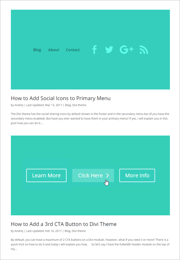
Before
Below you can see an example of the standard Divi blog module layout, provided by our friends at divitheme.net. The images are automatically stretched to the full width of the blog module. As a result, the images are pretty big. Also, small source images will be scaled up, potentially making the images look blurry / low quality.
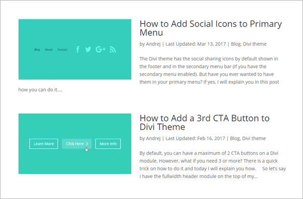
After
Here's what we're aiming for instead: a more compact Divi blog module list layout with left aligned images.
How to Use a List Layout in the Divi Blog Module using CSS
We can easily make the desired changes with some CSS code. Here are the steps to add it to your site.
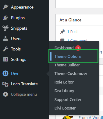
Open the Divi Theme Options
Divi's Theme Options include various settings for configuring Divi's overall behavior. To open the theme options, from your WordPress dashboard, click on "Divi" in the sidebar menu, then the "Theme Options" sub-menu item.
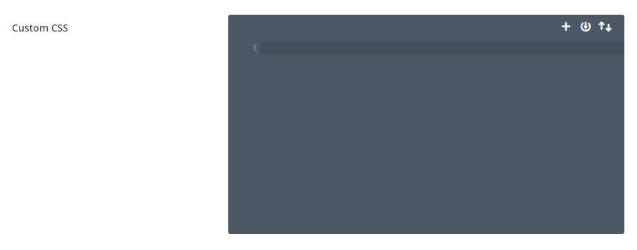
Navigate to the "Custom CSS" Setting
Now click on the "General" tab in the Divi Theme Options, which brings us to Divi's main site-wide settings. Scroll to the bottom and you should see a box called "Custom CSS" which allows you to add your own CSS code alongside that already added by Divi:
Add the Divi Blog Module List Layout Custom CSS
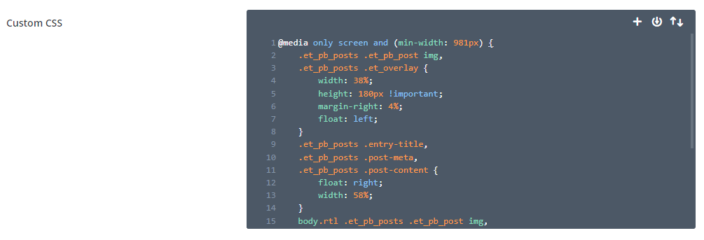
In the custom CSS box, enter the following CSS, which will make all the changes we need to create a blog module list layout with images on the left.
@media only screen and (min-width: 981px) {
	.et_pb_posts .et_pb_post img,
	.et_pb_posts .et_overlay {
		width: 38%;
		height: 180px !important;
		margin-right: 4%;
		float: left;
	}
	.et_pb_posts .entry-title,
	.et_pb_posts .post-meta,
	.et_pb_posts .post-content {
	    float: right;
	    width: 58%;
	}
	body.rtl .et_pb_posts .et_pb_post img,
	body.rtl .et_pb_posts .et_overlay {
		float: right;
		margin-left: 4%;
		margin-right: 0;
	}
	body.rtl .et_pb_posts .entry-title,
	body.rtl .et_pb_posts .post-meta,
	body.rtl .et_pb_posts .post-content {
	    float: left;
	}
}
Related Post: Adding CSS to the Divi Theme
Note: You can adjust the width, height and margin values in the code to tailor the list layout to your needs.
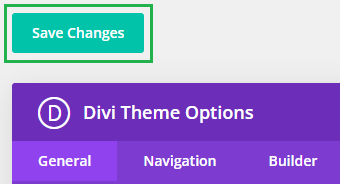
Save the Divi Theme Options
To apply the changes, we need to save the Divi Theme Options. This can be done by clicking the "Save Changes" button at the top or bottom of the Divi Theme Options area:
View the Result
Now view your blog module on the front-end view of your site – it should now be in a list format with images on the left and titles / text on the right.
Conclusion
There we have it, a quick and easy way to improve the design of your blog with a list layout with more compact images and more focus on the post titles. Enjoy the new layout and please feel free to ask in the comments if you need any help or have any questions about it.

Hi There,
featured image is not sowing
https://dev.cayrcc.org/home/
Hi ubaid,
It looks like Divi isn’t adding a featured image for the second post listed in the blog module. This is most likely because a featured image hasn’t been set on the blog post itself. I’d suggest (re)adding the featured image to the post and checking if that helps.
Also, please note that the CSS code provided in the post only restyles the HTML that Divi generates for the blog module; it doesn’t itself add the featured image to the post. Since there is no featured image in the HTML for the second post, no image will display on the left when the CSS is applied. Once the featured image is being set on the post correctly, it should display on the left in the re-styled blog module.
Thanks!
Thanks
You're welcome, ubaid :)
I just added your CSS but nothing happened, I am sure I left some small detail out
Just realized I already had some similar CSS added-@media (min-width: 981px){
#topnav {
display:none;
}
.cu-blog .et_pb_salvattore_content[data-columns]::before {
content: '4 .column.size-1of4' !important;
}
@media only screen and ( min-width: 981px ) {
.cu-blog .column.size-1of4 {
width: 24%!important;
margin-right: 1%;
}
}
@media (max-width:481px) {
.custom-row .et_pb_column {
margin-bottom: 0 !important;
}
}
@media only screen and (max-width: 980px){
.custom-menu-row .et_pb_column.et_pb_column_2_5 {
width: 45% !important;
float: left;
margin-bottom: 0px !important;
}
Okay, great. I'm glad you were able to figure it out, and thanks for letting me know.
Many thanks for this. Really appreciate the effort of putting your own experiences out on the web for everyone to see!
Thanks Carlos!
What would us non-coders do without people like you, thank you so much. Worked like a charm, I just adjusted the percentages here and there
Ha ha, live a simpler, happier life, probably :) Great to hear it worked for you!
Hi Dan,
This is great coding stuff, it definitely worked for my site, the only problem I have now is that when i also add the "read more" button on there, as in when I enable it, that read more area/words/section goes to a new line and goes underneath my image when it should follow my excerpt, right next to the if words of the excerpt. Any idea how to fix this to make the "read more" enabled option to immediately follow the excerpt and not to under the image. Currently my image is to the left and the excerpt is on the right. The click here option goes to the left under the image. THANKS!
Hey Drew, I've updated the code to do this. Note that to make it work neatly I've changed the width from px to %. Ideally the height would be in % too, but currently it needs to be in px to make the overlay work. If you're not using overlays, you could set the height as % too, or as "auto" to maintain the aspect ratio. Hope it helps, but let me know if not. Thanks!
This is great, thank you so much for all your help!
I have a completely separate question which I am wondering if you can help with. On mobile, my header search button overlaps my logo. I would prefer not to make my logo smaller, is there a way to move the search section more to the right? or make it smaller, or a shorter field as to avoid the overlap?
I don't use any plugins for the search button, i just inserted it in the header via wordpress option to add that in.
thanks again!
Drew
Hey Drew, I think the following CSS should help:
@media only screen and (max-width: 980px) {
	#main-header .et-search-field {
		max-width: calc(100% - 30px);
	}
	#main-header .et-search-form {
		max-width: calc(50% - 16px) !important
	}
}
You can add it into the "Divi > Theme Options > General > Custom CSS" box, or child theme style.css file.
Let me know if it doesn't solve it for you.
Thanks!
hi!
the code is working on desktop, unfortunately,
1. on mobile The title is above the image almost with no space in between title and image.
2. excerpt is below image, large space gap between them
Can you please advise how to fix this?
Many thanks
Hi juli, the code doesn't actually make any changes on mobile. Instead, the Divi default blog module styling is left as is. The thinking behind this is that putting the featured image on the left wouldn't look very good on mobile as the small screen width doesn't really leave enough space for a featured image and text side by side.
The issue you're having is actually caused by something else. You have the following javascript / jQuery code running on your site:
jQuery(document).ready(function(){
jQuery(".et_pb_posts article").each(function(){
jQuery(">a:first-child", this).insertBefore(jQuery(".post-meta", this));
});
console.log("done");
});
This is moving the featured image after the title and causing the layout issues you mention. I'm not sure what is adding the code, but hopefully you recognize it. If not, try looking for it in the "Divi > Theme Options > Integrations" tab. Alternatively, try disabling your plugins one at a time to see if the order of the title / featured image is restored. Removing that code should fix the layout issues. You should then be able to use the margin / padding settings in the blog module Design tab to make any tweaks to the space between the title, image and excerpt.
I hope that helps, but let me know if there's anything you get stuck on. Thanks!
Worked beautifully! Thank you.
You’re welcome, Loo Han!
Nice its worked dude, thanks you
You're welcome, Pe Jung Labs :)
Much needed code, thanks for writing a blog on it.
You're welcome, Shahzad :)