
By default, the featured images of your blog posts in the Divi theme's blog module show at full width above your blog posts' titles and extracts. This won't suit every design, in particular those where the image is not the most important element of the post. In this tutorial we'll show you how to make the images smaller and aligned to the left of the posts' titles and extracts, giving your Divi Blog module a list layout.
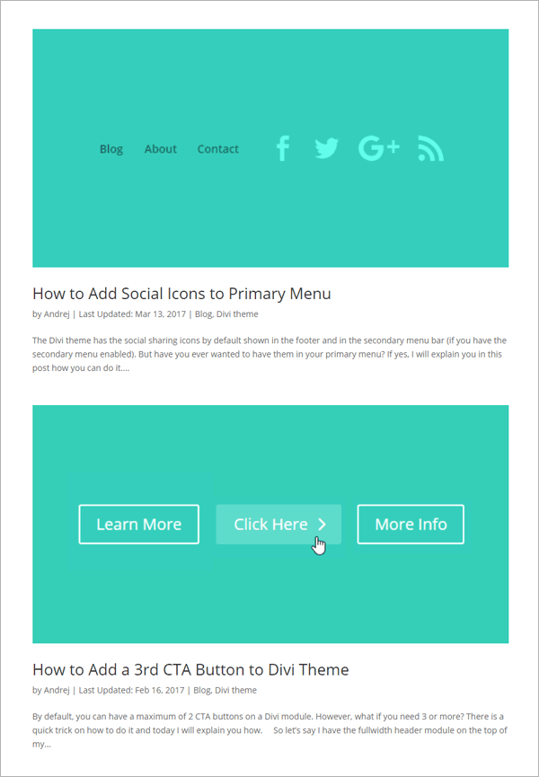
Before
Below you can see an example of the standard Divi blog module layout, provided by our friends at divitheme.net. The images are automatically stretched to the full width of the blog module. As a result, the images are pretty big. Also, small source images will be scaled up, potentially making the images look blurry / low quality.
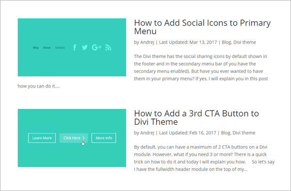
After
Here's what we're aiming for instead: a more compact Divi blog module list layout with left aligned images.
How to Use a List Layout in the Divi Blog Module using CSS
We can easily make the desired changes with some CSS code. Here are the steps to add it to your site.
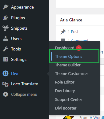
Open the Divi Theme Options
Divi's Theme Options include various settings for configuring Divi's overall behavior. To open the theme options, from your WordPress dashboard, click on "Divi" in the sidebar menu, then the "Theme Options" sub-menu item.
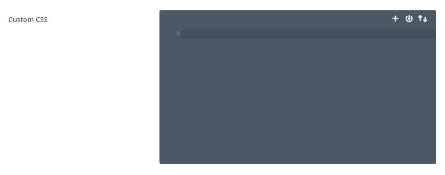
Navigate to the "Custom CSS" Setting
Now click on the "General" tab in the Divi Theme Options, which brings us to Divi's main site-wide settings. Scroll to the bottom and you should see a box called "Custom CSS" which allows you to add your own CSS code alongside that already added by Divi:
Add the Divi Blog Module List Layout Custom CSS
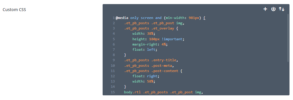
In the custom CSS box, enter the following CSS, which will make all the changes we need to create a blog module list layout with images on the left.
@media only screen and (min-width: 981px) {
	.et_pb_posts .et_pb_post img,
	.et_pb_posts .et_overlay {
		width: 38%;
		height: 180px !important;
		margin-right: 4%;
		float: left;
	}
	.et_pb_posts .entry-title,
	.et_pb_posts .post-meta,
	.et_pb_posts .post-content {
	    float: right;
	    width: 58%;
	}
	body.rtl .et_pb_posts .et_pb_post img,
	body.rtl .et_pb_posts .et_overlay {
		float: right;
		margin-left: 4%;
		margin-right: 0;
	}
	body.rtl .et_pb_posts .entry-title,
	body.rtl .et_pb_posts .post-meta,
	body.rtl .et_pb_posts .post-content {
	    float: left;
	}
}
Related Post: Adding CSS to the Divi Theme
Note: You can adjust the width, height and margin values in the code to tailor the list layout to your needs.
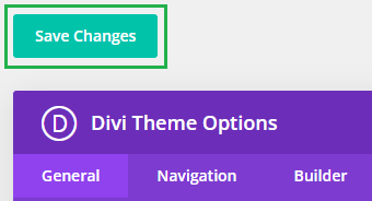
Save the Divi Theme Options
To apply the changes, we need to save the Divi Theme Options. This can be done by clicking the "Save Changes" button at the top or bottom of the Divi Theme Options area:
View the Result
Now view your blog module on the front-end view of your site – it should now be in a list format with images on the left and titles / text on the right.
Conclusion
There we have it, a quick and easy way to improve the design of your blog with a list layout with more compact images and more focus on the post titles. Enjoy the new layout and please feel free to ask in the comments if you need any help or have any questions about it.

THis is awesome THank you!
Hi, Thanks a lot for the code. I have used it for RTL site. Image showing right side. But overlay showing left site. Can you please help me? Thanks in advance. I have used below code. And the website is https://netindex.co.il/
@media only screen and (min-width: 981px) {
.et_pb_posts .et_pb_post img,
.et_pb_posts .et_overlay {
height: 180px !important;
width: 335px;
float: right;
left: 0;
margin-left: 25px;
}
}
Hi Jewelosman, the last thing you need to do in that code is change the "left: 0;" line to "right: 0;". I've updated the code in the post above to work with both LTR and RTL sites, but either using that or modifying your existing code should work. Let me know if you need any further help with it. Thanks!
Hi Dan, thanks for this. Perfect!
However, something happen after update divi and I don't know what to do.
As you can see the title now is below the image. That's very strange.
I forgot to say. On the visual builder the module display ok, but outside when i check see the site, it appears with the title below the image.
Hi Adri, did you manage to fix this? I checked on the site you've linked and I can see the titles (e.g. "Reciclagem na rua") showing up in the correct place, to the right of the image. If you're not seeing that, perhaps firs try clearing your browser cache first in case it's holding onto some old CSS from before the update. If you can still see the issue after that, let me know. Thanks!
Oh awesome! This is exactly what I've been looking for for ages. Thanks so much, Dan! :)
You're very welcome, Denise!
Perfect, thank you! Saved me a lot of time (:
You're very welcome, Ashleigh :)
Hi, I've asked for assistance re: this blog/code for months now. Can someone please contact me.
This code only works on pages 2 and older of my blog (not the blog landing page). Please help asap. This is the code I've used:
/* blog page text beside image */
@media only screen and (min-width: 981px) {
.et_pb_posts .et_pb_post img,
.et_pb_posts .et_overlay {
height: 200px !important;
width: 300px;
float: left;
left: 0;
margin-right: 25px;
}
}
You can view what I mean at: http://melissasteginus.com/blog
Hi Melissa, I'm really sorry I haven't been able to respond to you sooner. I've just sent you an email about it. It sounds to me like the first page of the blog is being cached somewhere (possibly the browser). From my browser I see the code being applied on the first page as well, and the post listing look the same on the first and subsequent pages. Anyway, I've included more detail in the email. Thanks!
Works like a charm, thank you very much !
Hi, I tried this and it hasnt worked – maybe Im doing something wrong with it
Hey Justin, any chance you are able to share a link to the page you're working on so that I can take a look at what is going on? Thanks!
Control image aspect ratios add this
object-fit: contain;
overflow: hidden;
https://divibooster.com/show-archive-page-featured-images-on-left-of-post-extract
Is there any way to get this to apply to a specific module vs. every blog module?
Hi Nik, go into your blog module's settings, and on the "Advanced" tab, enter a value for the "CSS Class", such as "my-blog-module". Then in the code above replace the two occurrences of ".et_pb_posts" with ".my-blog-module". The code should then apply only to that module (and any others you give the same CSS Class value). I hope that helps!
does not work for me? reason?
Hey Asif, are you able to share a link to the page you’re working on so that I can take a look? Thanks!
Thank you!!
Only one problem: Overlay feature no longer works.
Do you have a workaround?
Hey Brad, I've just updated the code to better handle overlays, and have simplified the code slightly. Let me know if you spot any other issues with it. Thanks!