

By default, Divi Accordion modules keep one toggle open. That means visitors can open another item, but they cannot simply close the currently open item and leave the whole accordion collapsed.
In this guide – updated for Divi 5 – I’ll show you how to make Divi Accordion items closeable in Divi 5 and Divi 4, so visitors can open and close each accordion section independently.
This can make FAQ sections, product details, documentation, and long content panels cleaner and easier to browse.
Quick answer:
To make a single Divi Accordion module closeable, enable the Closeable option added by Divi Booster at Accordion Settings → Design → Toggle.
To make all Accordion modules across your site closeable, enable the global Make accordions closable option in Divi Booster under Modules → Accordion.
Either option lets visitors close the currently open accordion item and leave the accordion fully collapsed.
If you prefer not to use a plugin, you can also use the jQuery and CSS snippet later in this guide, though custom code may need updating if Divi changes its accordion markup or behavior.
In this guide, I’ll cover three ways to make Divi Accordion items closeable:
1. Make individual Accordion modules closeable using Divi Booster.
2. Make all Accordion modules closeable site-wide using Divi Booster.
3. Make Accordion modules closeable manually using jQuery and CSS.
Looking for the related setting that controls the accordion’s state on page load? See how to make a Divi Accordion module start all closed.
Want the easiest option? Divi Booster adds the Closeable setting directly to the Accordion module, so you can enable it from the Divi interface without adding or maintaining code.
Make Individual Divi Accordion Modules Closeable Using Divi Booster
Use this method when you want to make one or more specific Accordion modules closeable, while leaving other accordions on your site unchanged.
Divi Booster adds a Closeable setting to individual Accordion modules, allowing that module’s items to be opened and closed independently from the module settings.
If you already have Divi Booster installed, follow the steps below. If not, you can get Divi Booster here and enable closeable accordions without adding custom code.
Enable the 'Closeable' Option in Accordion Settings
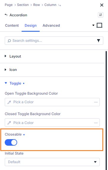
In the page or layout containing your Accordion module, open the Accordion module’s settings. Head to the Design tab, then expand the Toggle section. Here, you'll see the Closeable option. Switch the 'Closeable' toggle to On to allow users to close each accordion item independently – with no other item automatically opening in its place.
Style the Close Icon in the Module Settings
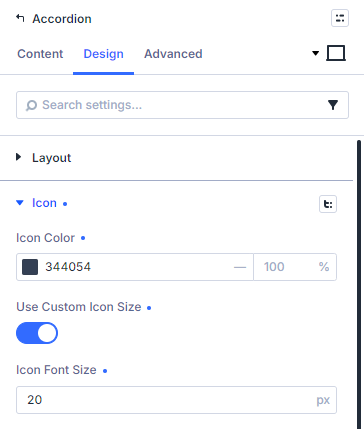
The close icon added by this feature inherits the styles of the built-in "open" icon. That means you can style both the open and close icons using the existing options in the accordion module settings:
Save and Publish Your Changes
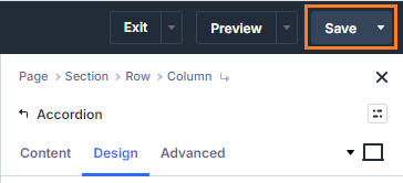
After making your changes in the accordion module, save your changes. When you are ready to do so, publish your page so that your changes will be applied to the live view of the page.
Test the Closeable Accordion Feature
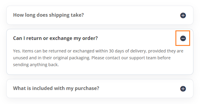
View your accordion on the front end. You should now see that a "close" icon has been added to open toggles. Clicking on the icon or title of an open accordion toggle will now close that toggle, even if all other toggles are already closed.
(Optional) Start the Accordion Fully Closed
Closeable accordions are often used together with an all-closed initial state, especially for FAQ sections. Divi Booster also adds an Initial State option for Accordion modules, letting you choose Default, All Closed, or All Open.
See the full guide: How to Start a Divi Accordion Module All Closed
Make All Divi Accordion Modules Closeable Using Divi Booster
Use this method if you want closeable accordion behavior across your whole site, rather than enabling it one module at a time.
Divi Booster includes a global Make accordions closable option that applies the closeable behavior to Accordion modules site-wide. This affects Accordion modules across your site, while still allowing each module’s normal design settings to control its appearance.
This is useful if you use accordions throughout your site for FAQs, product information, documentation, support pages, or other expandable content.
Enable the 'Make accordions closable' Option in Divi Booster
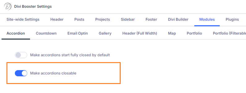
In your WordPress dashboard, go to Divi → Divi Booster → Modules → Accordion. Enable the Make accordions closable option.
Once enabled, open accordion toggles will display a close icon and can be collapsed without forcing another toggle to open.
Save Your Changes
Click Save Changes at the top of the Divi Booster settings page to apply the setting.
Test Your Site-Wide Closeable Accordions
View one of your Accordion modules on the front end. Open a toggle, then click the title or close icon again. The toggle should close, even if no other accordion item is opened.
Style the Close Icon Globally
The close icon inherits the styling of Divi’s built-in open icon. For individual Accordion modules, you can style the icon using the module’s normal icon design settings.
If you want to apply styling globally across your site, you can use CSS such as:
/* Normal state */
.et_pb_accordion .et_pb_toggle_open .et_pb_toggle_title:before {
	color: grey !important;
}

/* Hover state */
.et_pb_accordion .et_pb_toggle_open .et_pb_toggle_title:hover:before {
	color: blue !important;
}
Related Post: Adding CSS to the Divi Theme
The example above will make the icon grey normally, changing to blue when hovered.
(Optional) Start All Accordions Fully Closed
Closeable accordions are often used together with an all-closed initial state, especially for FAQ sections. Divi Booster includes a global 'Make accordions start fully closed by default' option that can be applied to all accordions.
See the full guide: How to Start a Divi Accordion Module All Closed
Make Divi Accordion Modules Closeable Manually Using jQuery and CSS
If you don’t want to use a plugin, you can make Divi Accordion items closeable with custom jQuery and CSS. This is useful for one-off customizations, but because it relies on Divi’s front-end markup and animation classes, you may need to revisit the code after future Divi updates.
Add Custom jQuery and CSS in Divi Theme Options
Navigate to the Divi > Theme Options page in your WordPress dashboard, and go to the Integration tab. In the section labeled Add code to the <head> of your blog, paste the following code. This script and style allow users to close open accordion items with a click.
When added in Divi Theme Options, this code applies to Accordion modules across your site. For a single page only, you can instead place the code in a Code module on that page.
For a no-code version, use one of the Divi Booster methods above: the module-level setting for a single accordion, or the global setting for all accordions.
Otherwise, paste the following code:
<script>
jQuery(function($){
  $('.et_pb_toggle_title').click(function(){
    var $toggle = $(this).closest('.et_pb_toggle');
    if (!$toggle.hasClass('et_pb_accordion_toggling')) {
      var $accordion = $toggle.closest('.et_pb_accordion');
      if ($toggle.hasClass('et_pb_toggle_open')) {
        $accordion.addClass('et_pb_accordion_toggling');
        $toggle.find('.et_pb_toggle_content').slideToggle(700, function() {
          $toggle.removeClass('et_pb_toggle_open').addClass('et_pb_toggle_close');

        });
      }
      setTimeout(function(){
        $accordion.removeClass('et_pb_accordion_toggling');
      }, 750);
    }
  });
});
</script>
<style>
.et_pb_accordion .et_pb_toggle_open .et_pb_toggle_title:before {
    display: block!important;
    content: "\e04f" !important;
}
</style>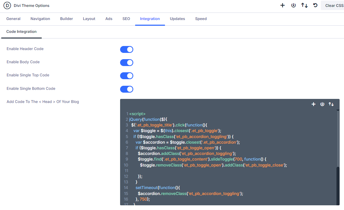
Save Theme Option Changes
Once you have pasted in the code, click the Save Changes button at the top of the Theme Options page to apply your new settings.
Insert an Accordion Module and Publish
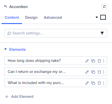
Add an Accordion module to your desired row using Divi Builder. You can style the accordion as usual – no module setting changes are needed to enable closeable functionality with this method. When you're finished, save your changes.
Test Your Closeable Accordion
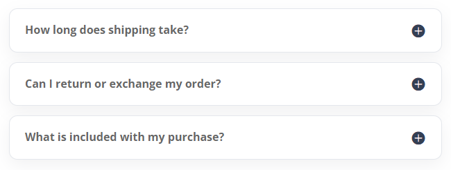
On the front end, test your accordion by clicking any accordion item’s title to open or close it. Thanks to your custom code, your visitors can close any sections they are finished reading.
(Optional) Add a Second Close Icon to Long Accordion Toggles
If you have very long accordion content, visitors may need to scroll back to the top of the toggle to close it. In that case, you can add a second close icon at the bottom of each open toggle using the additional code below.
Use this in addition to the main jQuery and CSS code above:
<script>
jQuery(function($){
	$('.et_pb_toggle_title').each(function(){
		var $title = $(this);
		var $closebar = $title.clone(true).addClass('db_pb_toggle_close2').html(' ');
		$title.closest('.et_pb_toggle').append($closebar);
	});

  	$('.db_pb_toggle_close2').click(function(){ // Listen for clicks on the close bar
    		var $toggle = $(this).closest('.et_pb_toggle');
    		var mainAreaOffset = $('#et-main-area').length ? $('#et-main-area').offset().top : 0;
    		$('html, body').animate({scrollTop: $toggle.offset().top - mainAreaOffset - 16}, 700); // Scroll considering the main area's top offset
  	});
});
</script>
<style>
	.et_pb_toggle_close .db_pb_toggle_close2 {
		display: none;
	}
	.db_pb_toggle_close2 {
		margin-top: 10px;
		visibility: hidden;
	}
	.db_pb_toggle_close2:before {
		visibility: visible;
	}
</style>
Customize the Accordion Further
Once your accordion items can be closed, you may also want to make the accordion start with all items closed, or add a button that opens and closes every toggle at once.
See also:
Conclusion
Making Divi Accordion items closeable gives visitors more control over what stays open on the page, which is especially useful for FAQs, product details and long information sections.
For the simplest setup, use Divi Booster to enable closeable accordions from the module settings or apply the behavior site-wide from the Divi Booster settings page. If you prefer a manual approach, the jQuery and CSS method above can also be used, though it may require maintenance after future Divi updates.


Thanks a million Dan for the JQ code! It does the job I want! Excellent!
Hi Dan,
Loving Divi Booster!
I'm having some issue with the accordions closing after they've been opened on some browsers and mobile. I'm using the Divi Booster option "make accordions closable". Any way you could help?
Here the page:
https://studio.impactbrand.com
Hi Alan, it looks like you're using the toggle module rather than the accordion module. The Divi Booster option should only affect the accordion module, but there was a bug in earlier versions which caused it to affect the toggle module (leading to the type of effect you're describing). If you haven't, try updating to the latest version of Divi Booster – I think that should fix the issue for you. Let me know if not. Cheers!
Hi Dan, can you take a look at this, there is a small plus sign above the toggles on the page. I want to take it out but i don't know how.
http://rmiinstitute.com/staging/
Hi Vic, I'm not quite sure how they got there, but this CSS should get rid of them:
.et_pb_text .et_pb_toggle_title:before { content: ''; }Hi again :-)
Now I changed it. I deleted the code in the footer.php and put your 2 codes in where you described and now the close icon works :-) But now the accordions are not closed when entering on the site – the two first are open.
Hhhmmm ;-) what am I doing wrong?
Looking forward to hearing from you.
Hi Elisabeth,
I'm glad you got the code working :)
I wrote a separate post which describes how to make the accordions start off closed.
You should just be able to add the code in that post alongside the code you have already added.
Hope that helps!
Hi :-)
Before I found you page I found this code to put in the footer.php
jQuery(function($){
$('.et_pb_accordion .et_pb_toggle_open').addClass('et_pb_toggle_close').removeClass('et_pb_toggle_open');
$('.et_pb_accordion .et_pb_toggle').click(function() {
$this = $(this);
setTimeout(function(){
$this.closest('.et_pb_accordion').removeClass('et_pb_accordion_toggling');
},700);
});
});
It worked to have all accordions closed.
Then I put you code:
In the CSS where you described it. I got the icon to close the box – but the box is just not closing.
Is it because I can not mix the two codes?
Have a nice day.
Elisabeth :-)
Hi, I'm using Divi Booster but nothing happens when I select "Make accordions closable"
Hi Pascal, is there any chance you're able to send me a link to the page you're working on so that I can take a look?
Thank you so much. This is exactly what my client asked for and it works perfectly.
Shaun
Hi! I'm having an issue — the open/close toggling is working perfect on IE and FF, but I can't see the (-) close toggle button on chrome!
Hi Trisha, are you able to send me the link to a page it's happening on? I took a quick look on the site linked in your comment but it seemed to be working (in Chrome) on the ones I saw.
Dan —
I actually solved it, I didn't have a media query closed in my custom css. Also, if you could please remove the URL from my name — thanks!
Okay, great! I'm glad you solved it, Trisha. I've removed the URL. Cheers!
It adds the minus sign nicely, but clicking the minus sign doesn't actually close the accordion. I added the What am I doing wrong? I inserted the code into the footer as you explain in this post: https://divibooster.com/make-divi-accordions-closed-by-default/ and then I added the second part of the code above to the custom css in the theme options. What did I miss?
Hi Simone, the code you've added into your footer seems to be different to what I have in the post above, and doesn't seem to work correctly. I'd suggest replacing the jQuery code you currently have in your footer with that given above and see if it helps. Also, I'd place the code before the closing </html> tag.
Hi, Dan – trying again as my first comment never got approved a couple weeks ago.
When I turn on the accordion settings in Divi Booster I get a gray "-" sign when I click on the accordion button. When I deselect the settings the gray minus sign goes away. Also, with or without the settings on or off, the accordion doesn't close the previous when I open a new one. Any insight is greatly appreciated. Loooove Divi Booster!
Please have a look here: http://stainfu.com/f-a-q/
~Scott
Hi Scott, sorry I'm just getting to this. I've released an update (2.4.0) which should sort out the "-" sign. It should now correctly inherit the styles you configure for the "+" icon, rather than showing the default size and gray color. I've also updated the post above.
I think the reason the previous toggle isn't closing when you open a new one is that you are using the "toggle" module rather than the "accordion" module. The former gives you toggles which are essentially independent of one another, while that latter gives toggles that open and close based on the state of the others. Switching over to an accordion module should give you the behavior you are looking for.
Hi,Dan –
I have set the accordion buttons in Divi Booster to:
Make accordions start fully closed by default
-and-
Make accordions closable
It doesn't seem to close the previous toggle and places a gray overlay – icon on top of the black + icon. Please have a look:
http://stainfu.com/f-a-q/
I have tried turning each of the 2 settings on and off to see if it makes a difference and apart from the white – overlay icon going away, it functions the same. Please advise.
Hi Scott, I've released an update (2.4.0) which should sort out the "-" sign. It should now correctly inherit the styles you configure for the "+" icon, rather than showing the default size and gray color. I've also updated the post above.
I think the reason the previous toggle isn't closing when you open a new one is that you are using the "toggle" module rather than the "accordion" module. The former gives you toggles which are essentially independent of one another, while that latter gives toggles that open and close based on the state of the others. Switching over to an accordion module should give you the behavior you are looking for.
Thanks, Dan! You are the man!
Or you can just use the toggle module instead of the accordion module. The toggle module allows all toggles to be closed by default.
Yeah, that's correct, though you do lose the accordion effect where opening one toggle closes the others so it depends on the effect you're after. Cheers!