If you add a full width header to a Divi Theme page, you may find that it looks right on desktops, but that the font sizes are too big on mobiles. This can be fixed by using one of Divi's more hidden features – different font sizes for mobiles and tablets.
If you go into the full width header's settings, you should find a setting link for changing the title font size:
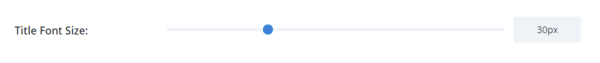
If you change the value from the default, a little mobile icon will appear after it:
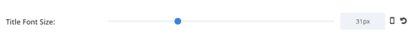
Now click on that mobile icon. It will bring up a modified version of the font size selector, which lets you set different values for mobiles and tablets:
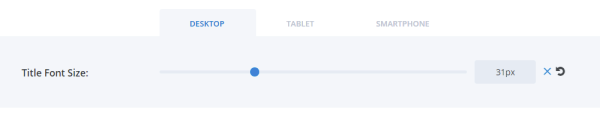
Using this, you should be able to reduce the title font size so that it looks right on mobiles / tablets.
There are similar settings for the subheading and content text font sizes.

Thank you so much for this! Was such a huge help!
You're very welcome!
Thank You SOOOO MUCH I have been searching for this answer for months. Thank You Very Helpful!
Is it possible to do art direction with the background image?
Hey Lochlan, I'm pretty clueless about what exactly that would entail. Are you able to give me an example of the type of thing you'd like to do with the background image? Thanks!