
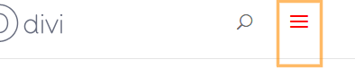
Customizing the color of your mobile menu button (hamburger icon) in Divi allows your site's navigation to better match your brand and design preferences, improving overall site aesthetics and user experience. By updating the menu button color, you can enhance visibility for mobile users and create a more cohesive look throughout your site. In this guide we show several different ways to modify the mobile menu button color in Divi.
Change the Divi Mobile Menu Button Color using Divi Booster
This method demonstrates how to update the Divi mobile menu button (hamburger icon) color using the dedicated setting provided by the Divi Booster plugin. Divi Booster, makes it easy to select your desired color and immediately apply it to enhance your site's mobile navigation appearance.
Access Divi Booster's Mobile Header Settings
Start by heading to the Divi menu in your WordPress admin sidebar and selecting "Divi Booster." Once you're on the Divi Booster settings page, expand the 'Header' section, then the 'Mobile Header' subsection.
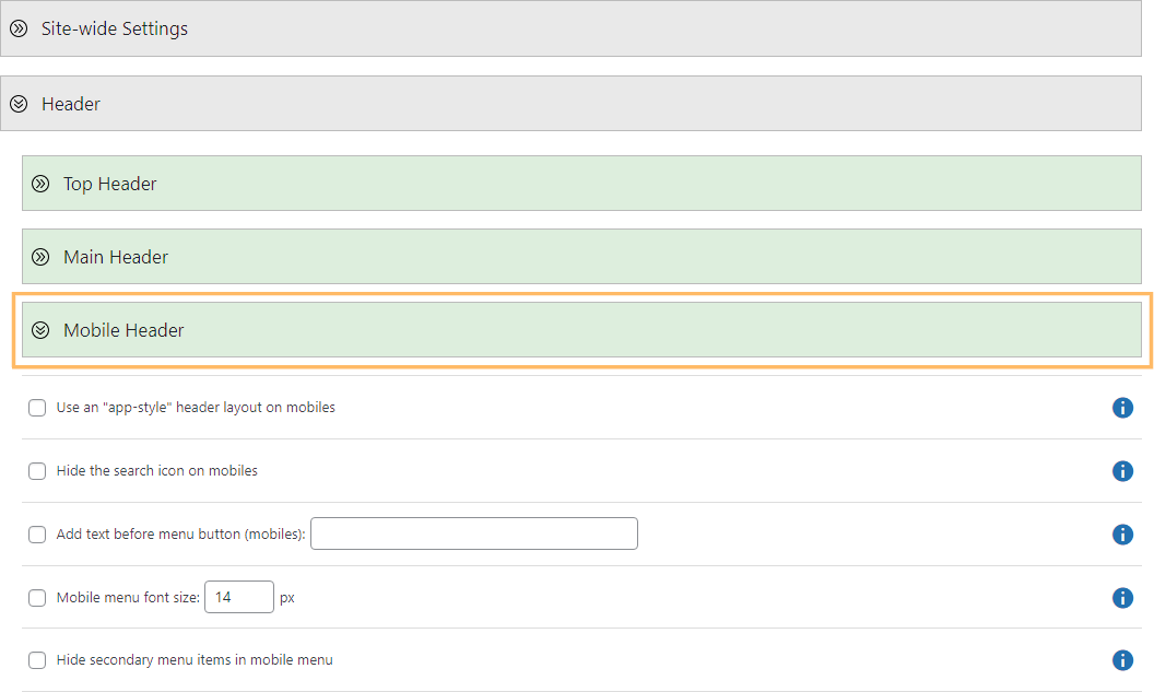
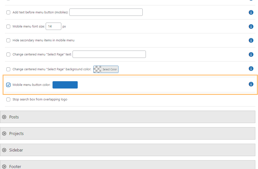
Change the Mobile Menu Button Color
Within the 'Mobile Header' section, enable the 'Mobile menu button color' option by checking the box. A color picker will appear next to this setting—use it to enter your desired color value (such as '#1e73be') or select a shade using the color picker.
Save and View Your Changes
After setting your preferred color, scroll to the top or bottom of the page and click the 'Save Changes' button to apply your update. Then visit your site on a mobile device or resize your browser to a mobile width to see your re-colored hamburger menu in action.
Change Divi Mobile Menu Button Color Using Custom CSS
This method demonstrates how to change the Divi mobile menu button (hamburger icon) color by adding custom CSS through the Theme Options panel in the WordPress dashboard. This approach is effective for users who want a quick and flexible way to update menu button colors without modifying theme files or using extra plugins.
Add Custom CSS for the Mobile Menu Button
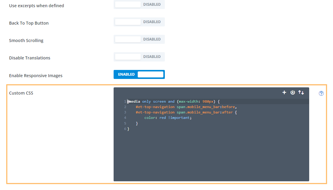
In the WordPress admin, go to the Divi menu and select 'Theme Options.' Scroll down to the 'Custom CSS' field. In this field, paste the following CSS, replacing 'red' with the color you wish to use for your menu button:
@media only screen and (max-width: 980px) {
    #et-top-navigation span.mobile_menu_bar:before,
    #et-top-navigation span.mobile_menu_bar:after {
        color: red !important;
    }
}
Save and Preview Your Custom Color
Once you've added your custom CSS, click the 'Save Changes' button. You can then preview your site by resizing your browser to a mobile width or checking your site on a mobile device. You'll see the hamburger menu button in your specified color.
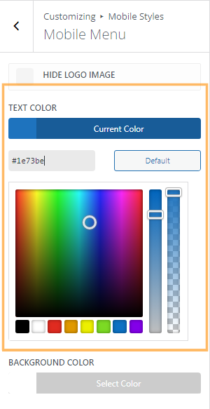
Change Divi Mobile Menu Button and Menu Link Color using Theme Customizer
This method demonstrates how to change the color of the Divi mobile menu button (hamburger icon) using the Theme Customizer, but note that unlike the methods above it also affects the color of the links in the mobile menu itself.
Use the Theme Customizer to Change Mobile Menu Colors
From the Divi menu in your dashboard, open the Theme Customizer. In the Customizer, expand the 'Mobile Styles' section, then the 'Mobile Menu' subsection. Find the 'Text Color' setting, click on the color picker, and enter your chosen color value (for example, '#1e73be'). This color will apply to both your menu button and menu links.
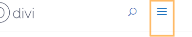
Publish and See Your Updated Menu Button
After choosing your new color, click the 'Publish' button at the top of the Customizer pane to save your changes. Visit your homepage with your browser window at a mobile width, or check your phone, to see the menu icon and links reflect your branding.
Conclusion
Changing the color of the Divi mobile menu button is easy with Divi Booster, a quick CSS tweak, or the Theme Customizer. Choose the method that suits you best and ensure your mobile navigation perfectly aligns with your site's look and feel.


Awesome input, and a complete necessary atribute to edit.
Thanks!
Thanks! Works like a charm, and saved me a lot of time figuring out the !important workaround ;)
Great stuff!
Thank you so much, exactly what I needed, works perfectly!
Great work. Experience more sniper for divi 4.0 too. Kindly share the details, appreciated.
Thank you
Webnoesys IT Solutions LLP
Hi Suffian, I'm afraid I'm not sure what you're asking… I think the message might have got a bit lost in translation. Are you able to explain in a bit more detail what you are trying to do? Also, do you have a link to the site / page you're working on so that I can take a look? Thanks!
That's why I love Divi Booster! Thank you :)
THANKYOU!
This is awesome, have been trying to figure this one out forever, and these 2 pieces of code have just solved it for me in the blink of an eye. Thank you very much!
Thanks! This is what I needed. You are awesome!
Hi, Dan:
Figured it out:
ul#mobile_menu.et_mobile_menu {
background-color: #1a5eac;
}
That did it. The menu is still transparent but the dropdown is now a medium blue. Yay!
Thanks…
John G.
Hey John, I'm glad you were able to figure it out, and thanks for sharing your solution. Cheers!
Been looking for this solution for a week. Many thanks :)
Hi, Dan:
Great product (Divi Booster) and great site. I need to change the background color when the hamburger menu opens without making the entire mobile menu an opaque color. My header nav is transparent, and I can't figure out how to make ONLY the background of the tablet/mobile menu dropdown – when it's open – an opaque color. Can anyone help with this, please? Thanks!