The Divi Slider Module lets you easily add image sliders on your website. In this post, we will walk you through the steps to set the height of a Divi Slider Module.
Setting the slider height in the module settings
Start by editing the page where the Divi Slider Module is located. Locate the Slider Module and click on the module settings to access the customization options.
In the module settings, navigate to the Design tab. Here you will find several styling options for the slider. Look for the "Sizing" heading and click on it to open the slider width and height options.
You should now see settings for the "Min Height", "Height" and "Max Height" where you can enter the desired height value(s). You can specify the height in pixels (px) or any other supported unit (e.g., em). Experiment with different values to achieve the desired height for your slider.
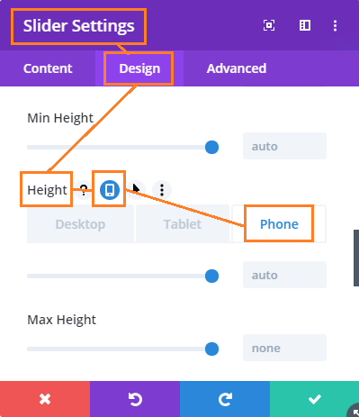
Setting a different height for the slider on mobile / tablets
To make your Divi slider responsive and set the slider height on mobile:
- Go to: Slider Settings > Design > Sizing > Height
- Click on the "Mobile options" icon – this should bring up tabs for "Desktop", "Tablet" and "Phone"
- Click on the "Phone" tab
- Enter the height you want the slider to display on mobile devices.
- Save the Slider settings.
The location of the setting is shown here:


Hi – this is working fab on my tablet, but not on the iphone.
The site is here:
http://www.ramblesintosacredrealms.com/
note – I had to add this code to the above code to get it to render properly on the desktop after adding yours:
.et_pb_slider .et_pb_slide {
background-size: 100% 100% !important;
}
Hey Lois, at the moment the height change is for larger displays only. When I get the chance I'll look into controlling it on mobiles too. You could do it by just copying the code again, and setting the media min and max width as well as the height. But a better solution is probably to try and automatically set a good height for mobiles based on the height of the slider on desktops / tablets. Thanks for sharing the code snippet – I'll try it :)
Hi. Did you find a solution that works for mobile version too?
If yes, I'd be pleased to get it.
Thanks again.
Luca
Hi Luca, I've finally been able to add an improved solution which lets you set different heights for different sliders and includes the ability to set different heights on mobile. Please see the post above for details.
Hi! I'm trying to get the code snippet to work for mobile as well. Tried the one that Lois had posted it's not working for me either. The desktop slider is working great but it's cutting off the top and bottom of my slider images on the one that I've set to be enabled only on mobile.
Hi Kristen, I've just updated the post with a code snippet that lets you set the slider height on mobiles too.
Nice modification but when use your above CSS it does not auto shrink the size when opening on mobile device such as iPhone Safari.
Please ignore my comment. I just saw that you've make some changes to the code and now it works perfectly on mobile device.
Hi Dan! Thank you very much for your code! Did you find a possibility, to show the slider on mobiles with same ratio? It would be great!
Hi Kerstin, I've just updated the code with an option to set a different slider height on mobiles. Please see the post above for details.
Hello,
Thank you for your help and I have used the code you provided in the post and I do change the height of the full width slider but the page I have done the modification is no longer a responsive site.Thanks for your help.
Hi Yulisa, I've updated the code above so that now it only applies to large screens, not mobiles, etc. On smaller screens the standard Divi slider height will be used. This should fix the issue with responsiveness.
At some point I'll try and improve the look on mobiles. Perhaps it will be possible to set the same ratio of height to width on all screen sizes, rather than an absolute height as I was doing…
Hi Dan
I'm using fullwith slider at my frontpage and it looks fine on on large screens, but cropping way too much on mobiles..
Can I somehow fix this?
Thanks
Hi Kirsten, I've updated the post above with details on how to control the slider heights on mobiles. Thanks!
Where is the stylesheet do I put the code?
Hi Stephanie, there are a couple of options. This post explains where to put the CSS.
It looks like the slider stays the size you denote in this css for both mobile and desktop – how would I make this css responsive? Thanks!
Hi Lisa, I've updated the code to only set the height on desktops. On mobiles it falls back to the standard Divi slider sizing, so that the responsiveness is no longer lost.
Dan, you just saved me a lot of grey hair too early in life. Thank you!
Hello,
It worked like a charm. Thanks much for your contribution !!
Cheers!
are the commas not appropriate? Can you provide the exact CSS as it should be because the original example has commas.
Hi Joseph, sorry, that's my mistake. The commas weren't actually the problem with Gab's example – it's that it dropped several of the "et_pb_slider" instances rather than replacing them with disponibilidad. Taking his case as an example, the correct code should be:
/* Set the slider height */
.disponibilidad, .disponibilidad .et_pb_container {
    height: 425px;
}
.disponibilidad, .disponibilidad .et_pb_slide {
    max-height: 425px;
}
.disponibilidad .et_pb_slide_description {
    position: relative;
    top: 25%;
    padding-top: 0 !important;
    padding-bottom:0 !important;
    height:auto !important;
}
Note that there are 5 places where et_pb_slider is substituted by disponibilidad.
hahaha thanks dan! it's ok now! ;)
Hi dan!
Thank you so much for your tips. I've just started working with Wordpress and DIVI and I think that changing the slider height individually in an easier way (from the DIVI builder options for example) would be a great idea.
Anyway, i've tried the code you suggest replacing “et_pb_slider” with the name of my new class ("disponibilidad") but it changes the height of every slider on the site, not only the one i want. This is my code:
/* Set the slider height */
.disponibilidad, .et_pb_container {
height: 425px;
}
.disponibilidad, .et_pb_slide {
max-height: 425px;
}
.disponibilidad, .et_pb_slide_description {
position: relative;
top: 25%;
padding-top: 0 !important;
padding-bottom:0 !important;
height:auto !important;
}
Thanks in advance for your help!!!
Hey Gab, you just need to remove the comma after each .disponibilidad :)
Maybe I did this incorrectly but this seems to run the content off the bottom of the slider.
Any way to fix this?
Hi Michael. Sorry, I didn't notice this effect when coming up with the original solution, but you're right the position of the content wasn't fitting to the new height. I've updated my solution above to better position the slide content within the adjusted slider height.
Nice helpfull topics on your site.
After having put .et_pb_slider { height: 394px; } in a style.css in a child theme, one can see the the change of slider height and the move of the image control arrows as well. In this case for a 2/3 column width.
However the background image for the slide still has the same height as the original slider height with size 700×314 for a 2/3 column. The 'cropped' images are positioned on top. Uploaded image size is 700×394 (aspect ratio 16:9)and should be viewed as such.
I would say 80 px image height is missing but can't find it in the original styling sheet.
Did I miss a thing? Thanks in advance.
Hi Walter. I've updated my solution to adjust the slider background image to have the same height as the slider itself. I think this should fix your issue, but let me know if not.