The Divi Slider Module lets you easily add image sliders on your website. In this post, we will walk you through the steps to set the height of a Divi Slider Module.
Setting the slider height in the module settings
Start by editing the page where the Divi Slider Module is located. Locate the Slider Module and click on the module settings to access the customization options.
In the module settings, navigate to the Design tab. Here you will find several styling options for the slider. Look for the "Sizing" heading and click on it to open the slider width and height options.
You should now see settings for the "Min Height", "Height" and "Max Height" where you can enter the desired height value(s). You can specify the height in pixels (px) or any other supported unit (e.g., em). Experiment with different values to achieve the desired height for your slider.
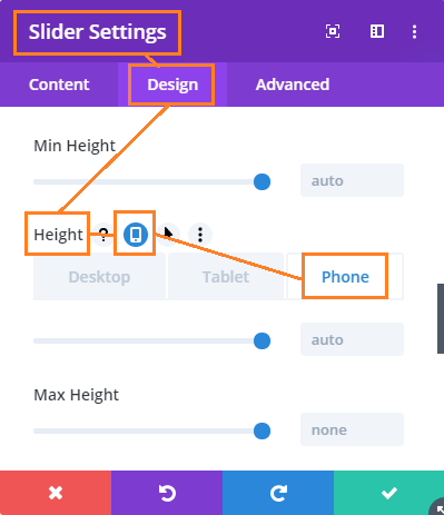
Setting a different height for the slider on mobile / tablets
To make your Divi slider responsive and set the slider height on mobile:
- Go to: Slider Settings > Design > Sizing > Height
- Click on the "Mobile options" icon – this should bring up tabs for "Desktop", "Tablet" and "Phone"
- Click on the "Phone" tab
- Enter the height you want the slider to display on mobile devices.
- Save the Slider settings.
The location of the setting is shown here:


It worked for me..
This is perfect, thanks!!
Thanks! It Works! Can I set the slider height in percentage to the size of the browser window? I would like to show a full screen image without cutting it below, thanks and best regards
I found my mistake! "vh" instead of "%" :)
have a nice day
Great! You too, federico :)
My titles in the slider are too low now and not centralised in the vertical centre.
Hi Nathan, I've just released an update to this post / feature. The new CSS used keeps the slider titles properly centralised.
Thank you, Dan, for the code.
Works perfectly.
Hello Ryan. How to build a specific full width AND full Height for a mobile screen ? i.e. to get a full picture slider on a mobile phone as you can get on a pc using you code set to more than 700 pix in height: 750px !important; to let a tiny part of the rest of the page to let the people scrolling down. I try to find something similar to one of my pages I made using a single full size page header in a full page row : http://dev.digipicture.com/works/lascaux-30000-ans-une-boutique-par-usm/ please use the developer tools to resize the page because it's 2 different full size sliders called according to pc or tablet/mobile.
Thanks Chris
Hi Chris, I've just released an update (details in the post above) which lets you set a different height on mobile. It won't automatically detect the height of the mobile device, but you can do something like you say – make the height as big or a bit bigger than the main mobile devices you are targeting.
Can i use divi booster to change a single slider height?
Hi Nate, you can as of Divi Booster 2.6.4. Please see the post above for details.
Just installed version 2.6.4 and trying to change a single full-width slider height, but on the "Design" tab there is no "Sizing" subheading as the instructions above indicate.
Hi Jim, it looks like some older versions of Divi don't have the "Sizing" subheading so when the slider option is added to that subheading it isn't showing up. I've fixed this in the next version of Divi Booster 2.7.2 which I hope to have out in the next few days – in these older versions the option will show up under the "Layout" subheading instead (on the same tab). If you need to use it sooner, updating to the latest version of Divi should give you the Sizing subheading and thus the height option. Note that if you're on an even older version of Divi with no subheadings at all, the option should appear at the end of the list of options.
Hopefully that helps, but let me know if you still aren't able to find the option. Thanks!
How can I control the position of the button? Since I modified the height from the Divi default to 500px height, the button sits on the top of the frame rather than being centered vertically. Suggestions?
Hi Carlos, I've updated this feature to keep the proper vertical centering. If you need to, you can also use the "Custom Padding" option in the slide settings to adjust the height of the button (make the top padding bigger than the bottom padding and it will move down, and vice versa it'll move up).
Hey Dan, although the slider height change works on desktop, it doesn't seem to transfer to mobile.
Hi Ryan, at the moment the code above (and Divi Booster's implementation) restricts the height change to the desktop only and use the Divi default on mobiles.
This is controlled by this line in the code above:
@media only screen and ( min-width:981px ) {
Changing it to:
@media only screen and ( max-width:980px ) {
Would make the CSS apply on mobiles instead.
There isn't currently an option to apply the height on mobiles in Divi Booster. However, I'm currently working on a rewrite of the slider height feature. It'll allow for setting different widths on mobile and tablets, and be configuration on individual modules. I'm close to completing it and hope to have it released in the near future. Thanks.
Awesome! Thanks Dan! Luckily by just duplicating the sliders, adjusting the visibility ("disable on"), and setting the CSS classes differently this works perfectly. Thanks for the quick fix and I look forward to more improvements in the future!
Nice one :)
Thank you very much for the code. It works perfectly on the desktop. I changed the height to 600px. But when I look preview in Divi builder, it seems that tablet and phone also keep to 600px, though I copied your code completely. and on the phone it looks badly. My site is on the local server yet, so I cant check it on a real phone. Where can be the problem?
Hi Yevgenia, that code only applied on desktops with the Divi defaults being used on mobile / tablet. I've just updated the code to be mobile responsive. Please see the post for details. Thanks!
Thank you for the css, it worked perfectly.
Regards
WPFirm.com
Hello. It works on desktop, but it doesn't work on mobile or tablet. What could I do? TIA
Hi Chris, I've just released an update (see the post above for details) that supports mobile and tablets.
How do you get the divi booster full width slider height adjuster to work on smartphone? It works fine on desktop but leaves a horrible gap between slider and text below. Help!
Hi Tessa, I've just released a new, improved version of the feature which allows you to change the height on smartphones. The feature is available in Divi Booster 2.6.4 onwards. Please see the post above for details.