WooCommerce: Show 4 Products per Row

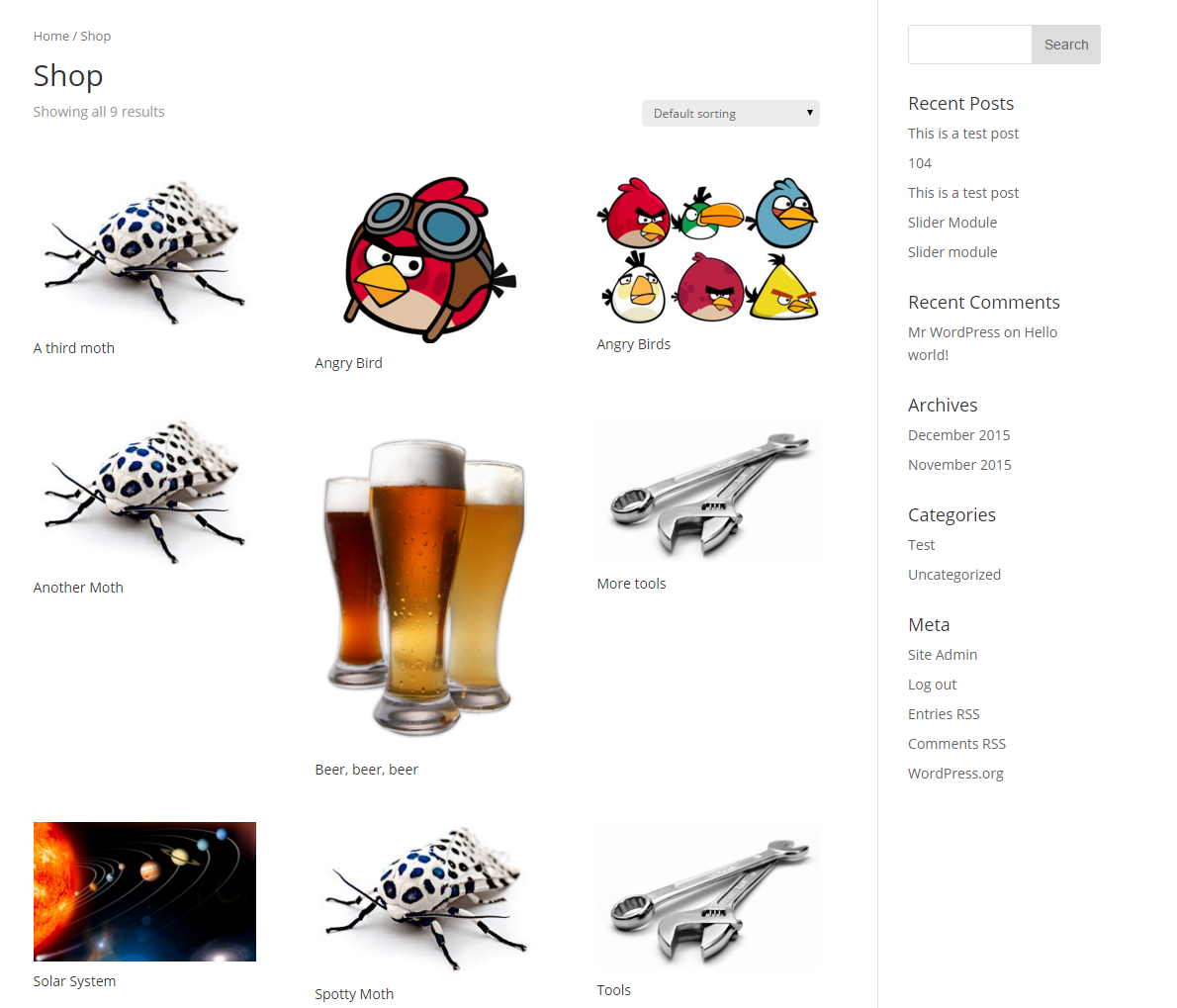
When you set up WooCommerce with the Divi Theme, you'll find it creates you a page for your store. After adding some products, you'll find that your store has a 3 column layout, like so:

If you'd prefer to have four items per row, you can add the following CSS to Divi:

@media screen and (min-width:1024px) {
    .woocommerce ul.products li.product { 
	width: 21% !important;
	margin: 2% !important;
	clear: none !important;
    }
    .woocommerce ul.products li.product:nth-child(4n+1) {
	clear: both !important;
    }
}

@media screen and (min-width: 768px) and (max-width: 980px) {
    .woocommerce ul.products li.product.first, .woocommerce ul.products li.product.last {
        clear: right !important;
    }
    .woocommerce ul.products li.product:nth-child(4n+1) {
         clear: none !important;
    }
}
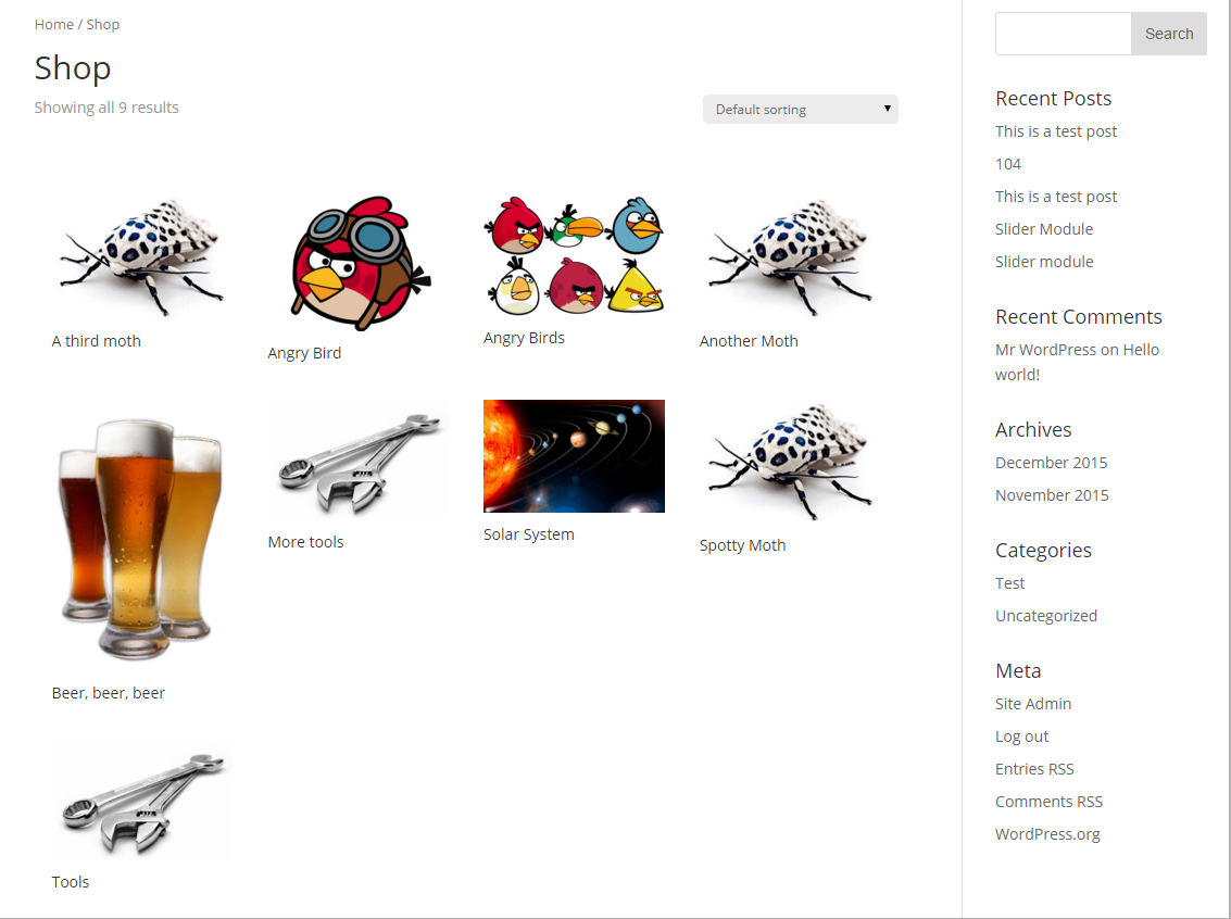
Now your store will look something like so:

Thanks to Innuvo and vks for the suggested improvements.

I've added this as a feature in Divi Booster. Simply enable the "Plugins > WooCommerce > Make WooCommerce store display 4 items per row" option, and it will automatically add the code for you.

Want get more out of Divi?

Hundreds of new features for Divi
in one easy-to-use plugin

17 Comments

  1. I bought divi last year and it's great

    Reply
  2. It works nice! Great solution!

    Reply
  3. This worked for me, thank you!!!

    Reply
  4. use below it will work on all the devices perfectly

    @media screen and (min-width:1024px) {
    .woocommerce ul.products li.product {
    width: 21% !important;
    margin: 2% !important;
    clear: none !important;
    }
    .woocommerce ul.products li.product:nth-child(4n+1) {
    clear: both !important;
    }
    }

    Reply
    • Hey vks, that media query is a nice addition – it nicely softens the transition as the screen size decreases. I've updated the code above, and Divi Booster, to include it. Thanks!

      Reply
    • Hey thanks for this code! I set it up for 5 columns easily. I was wondering if you know how to easily make it show more than 1 row on a page?

      Reply
      • Nevermind, I realized this was part of the Divi settings for number of posts per page. Thanks!

        Reply
      • How can I set it up for 5 columns?

        Reply
        • Hi Adilson, I haven't tested it yet but you should be able to do it by modifying the above code as follows:

          Change:
          width: 21% !important;
          margin: 2% !important;

          To:
          width: 16% !important;
          margin: 2% !important;

          (i.e. width + 2*margin = 20% or 1/5th of the total width)

          And change each occurrence of "nth-child(4n+1)" to "nth-child(5n+1)"

          Hope that helps, but let me know if you can't get it to work. Thanks!

          Reply
          • That worked Dan, thanks!

  5. Thank you soooooo much, you saved me <3

    Reply
  6. Thanks for help, the code helped me out from this problem on my online store construction.

    Reply
  7. Thanks for the help. Works Great on my online store!

    Reply
  8. Just as a heads up to this, it does work. If you want it to work correctly on mobile too, add the below to help with the clearances:

    @media screen and (min-width: 768px) and (max-width: 980px) {
    .woocommerce ul.products li.product.first, .woocommerce ul.products li.product.last {
      clear: right !important;
    }
    
    .woocommerce ul.products li.product:nth-child(4n+1) {
    	clear: none !important;
    }
    }
    
    Reply
    • Hey Innuvo, thanks so much for the tip – it works very nicely. I've updated the post to include it and added into Divi Booster for the next release (1.9.8). Cheers!

      Reply

Submit a Comment

Comments are manually moderated and approved at the time they are answered. A preview is shown while pending but may disappear if your are cookies cleared - don't worry though, the comment is still in the queue.

Your email address will not be published. Required fields are marked *.

This post may contain referral links which may earn a commission for this site

Divi Booster

Hundreds of new features for Divi
in one easy-to-use plugin

17 Comments

  1. I bought divi last year and it's great

    Reply
  2. It works nice! Great solution!

    Reply
  3. This worked for me, thank you!!!

    Reply
  4. use below it will work on all the devices perfectly

    @media screen and (min-width:1024px) {
    .woocommerce ul.products li.product {
    width: 21% !important;
    margin: 2% !important;
    clear: none !important;
    }
    .woocommerce ul.products li.product:nth-child(4n+1) {
    clear: both !important;
    }
    }

    Reply
    • Hey vks, that media query is a nice addition – it nicely softens the transition as the screen size decreases. I've updated the code above, and Divi Booster, to include it. Thanks!

      Reply
    • Hey thanks for this code! I set it up for 5 columns easily. I was wondering if you know how to easily make it show more than 1 row on a page?

      Reply
      • Nevermind, I realized this was part of the Divi settings for number of posts per page. Thanks!

        Reply
      • How can I set it up for 5 columns?

        Reply
        • Hi Adilson, I haven't tested it yet but you should be able to do it by modifying the above code as follows:

          Change:
          width: 21% !important;
          margin: 2% !important;

          To:
          width: 16% !important;
          margin: 2% !important;

          (i.e. width + 2*margin = 20% or 1/5th of the total width)

          And change each occurrence of "nth-child(4n+1)" to "nth-child(5n+1)"

          Hope that helps, but let me know if you can't get it to work. Thanks!

          Reply
          • That worked Dan, thanks!

  5. Thank you soooooo much, you saved me <3

    Reply
  6. Thanks for help, the code helped me out from this problem on my online store construction.

    Reply
  7. Thanks for the help. Works Great on my online store!

    Reply
  8. Just as a heads up to this, it does work. If you want it to work correctly on mobile too, add the below to help with the clearances:

    @media screen and (min-width: 768px) and (max-width: 980px) {
    .woocommerce ul.products li.product.first, .woocommerce ul.products li.product.last {
      clear: right !important;
    }
    
    .woocommerce ul.products li.product:nth-child(4n+1) {
    	clear: none !important;
    }
    }
    
    Reply
    • Hey Innuvo, thanks so much for the tip – it works very nicely. I've updated the post to include it and added into Divi Booster for the next release (1.9.8). Cheers!

      Reply

Submit a Comment

Comments are manually moderated and approved at the time they are answered. A preview is shown while pending but may disappear if your are cookies cleared - don't worry though, the comment is still in the queue.

Your email address will not be published. Required fields are marked *.