

By default, Divi disables mobile pinch zooming by outputting a restrictive viewport meta tag:
<meta name="viewport" content="width=device-width, initial-scale=1.0, maximum-scale=1.0, user-scalable=0" />This prevents visitors from zooming in on your site using the normal pinch-to-zoom gesture on mobile devices. While this may give you more control over the mobile layout, it can reduce accessibility for visitors who rely on zooming to read content. It can also make it harder for users to inspect details in images, product photos, maps, charts, screenshots, or other visual content.
It can also trigger accessibility warnings in tools such as Google Lighthouse, because users should generally be able to scale a page on mobile.
This guide shows three ways to enable mobile pinch zoom in Divi:
- Using Divi Booster
- Adding a PHP snippet
- Using a free plugin
All three methods below have been tested with Divi 5 and Divi 4.
The Divi Booster and PHP methods remove Divi’s original restrictive viewport meta tag and replace it with a zoom-friendly version. The free plugin method also enables zooming, but does so by adding its own viewport meta tag after Divi’s existing one.
Quick answer
The easiest way to enable mobile pinch zoom in Divi is to use Divi Booster:
Divi → Divi Booster → Site-wide Settings → Accessibility → Enable Zooming
This replaces Divi’s default viewport behaviour with a zoom-friendly version, allowing visitors to pinch zoom on mobile.
If you prefer not to use Divi Booster, you can also enable pinch zoom using a PHP snippet or a free plugin. The PHP method is the cleaner manual option because it removes Divi’s original restrictive viewport tag. The free plugin method is the quickest free no-code option, but it leaves Divi’s original viewport tag in place and adds its own tag after it.
Note that Divi itself does not currently include a built-in option to enable browser pinch and zoom.
Enable Mobile Pinch Zoom in Divi using Divi Booster
If you already use Divi Booster, this is the quickest and cleanest way to enable pinch zooming in Divi. It gives you a Divi-specific setting for restoring mobile zoom without needing to edit PHP or manage custom code.
Unlike simply adding another viewport meta tag to the page, the Divi Booster method removes Divi’s restrictive viewport output and replaces it with a zoom-friendly version. This keeps the page source cleaner and avoids leaving conflicting viewport instructions in place.
The main limitation is that this method requires Divi Booster. If you do not already use it, you will need to install it first. However, if you manage Divi sites regularly, this is usually the most convenient option because the setting can be enabled directly from the WordPress dashboard.
Make sure Divi Booster is installed and running
If you already have Divi Booster installed, you can move straight to the settings in the next step.
If you do not have Divi Booster yet, you can get it here: Get Divi Booster
Once Divi Booster is installed and activated on your site, the Divi Booster settings will be available in your WordPress dashboard.
Open the Divi Booster settings
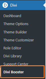
In your WordPress dashboard, go to "Divi → Divi Booster". This opens the main Divi Booster settings page, where you can enable site-wide Divi customizations.
Open the Accessibility section
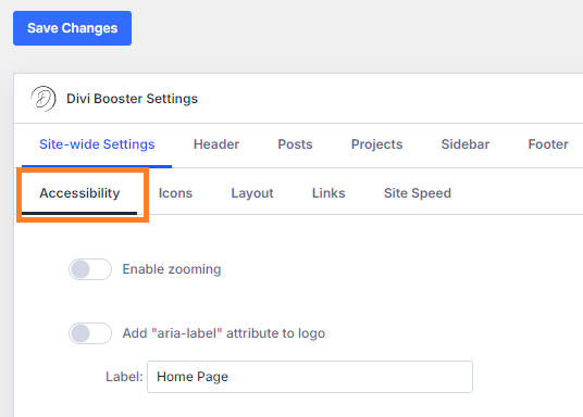
In the Divi Booster settings, open "Site-wide Settings → Accessibility". This section contains options related to improving accessibility and user control across your Divi site.
Enable Zooming
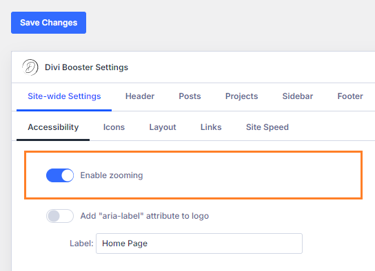
Turn on the following setting "Enable Zooming". This tells Divi Booster to replace Divi’s default mobile viewport behaviour with one that allows users to pinch zoom.
Save and test the change
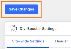
Save your Divi Booster settings, then test your site on a real mobile device.
You should now be able to pinch zoom in and out on the page. If you previously saw a Lighthouse warning related to mobile zooming or user scaling, you may also want to rerun the audit after clearing any site or page cache.
Recommended – Check your mobile content width
Once mobile users can zoom when needed, it is worth checking whether your mobile layout is comfortable at normal size.
A good next step is to review your mobile content width:
Change the Divi website content width on mobiles
This can help improve mobile readability before users need to zoom.
Enable Mobile Pinch Zoom in Divi using PHP
If you are comfortable adding PHP to your site, you can manually remove Divi’s default viewport meta tag and replace it with one that allows pinch zooming.
This method gives you clean output without needing to install another plugin, and it is a good option if you prefer managing small Divi fixes in code. The main downside is that it requires PHP access, and you will need to add the code safely, preferably through a child theme or a code snippets plugin rather than directly editing the Divi parent theme.
The PHP method has been tested with Divi 5 and Divi 4.
Choose where to add the PHP code
Add the PHP snippet to a safe place on your site, such as your child theme’s functions.php file or a code snippets plugin.
Avoid adding the code directly to Divi’s parent theme files, as those changes may be overwritten when Divi is updated.
If you are not sure how to add PHP to Divi, see:
Add the PHP snippet
Add the following code:
add_action('after_setup_theme', 'db_remove_et_viewport_meta');
add_action('wp_head', 'db_enable_pinch_zoom');

function db_remove_et_viewport_meta() {
	remove_action('wp_head', 'et_add_viewport_meta');
}

function db_enable_pinch_zoom() {
	echo '<meta name="viewport" content="width=device-width, user-scalable=yes, initial-scale=1.0, minimum-scale=1.0, maximum-scale=10.0">';
}
This code removes the default Divi viewport meta tag and adds a replacement tag that allows users to zoom.
The replacement tag uses minimum-scale=1.0, which allows users to zoom in while helping prevent the page from being zoomed out smaller than its normal mobile width.
Save your changes
Save the file or snippet, depending on where you added the code.
If you are using a code snippets plugin, make sure the snippet is active. If you added the code to a child theme, make sure the child theme is active.
Clear any caching
Clear any cache used on your site, including page cache, browser cache, and any caching or optimization plugin cache.
This helps ensure that the updated viewport tag is being served when you test the site.
Test pinch zooming on mobile
Open the site on a real mobile device and try pinch zooming.
You should now be able to zoom in on the page. If you are testing with Lighthouse, rerun the audit after clearing caches to confirm that the mobile zoom warning has been resolved.
If you want to confirm the PHP method is being applied correctly, view the page source and check that Divi’s original viewport tag has been replaced by the new zoom-friendly tag.
Recommended – Review related mobile layout issues
After enabling pinch zoom, check your site at normal mobile size. If your layout still feels cramped, or if you want more control over how content appears on smaller screens, you may also find this guide useful:
Enable Mobile Pinch Zoom in Divi using a Free Plugin
If you want a simple free option and do not want to add PHP yourself, you can use a plugin such as Definitely allow mobile zooming.
I’ve tested this plugin with Divi 5 and Divi 4, and it does enable mobile pinch zooming. It works by adding its own viewport meta tag after Divi’s default viewport tag.
This means it is a quick and useful no-code fix, especially if you do not yet have Divi Booster. The trade-off is that Divi’s original viewport tag remains in the page source, so the page contains two viewport meta tags rather than one. The Divi Booster and PHP methods are Divi-aware and produce cleaner output by removing Divi’s original tag and replacing it with a single zoom-friendly version.
Open the WordPress plugin installer
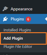
In your WordPress dashboard, go to "Plugins → Add New". This opens the WordPress plugin directory search from inside your site.
Search for the plugin
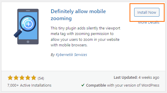
Search for "Definitely allow mobile zooming". This plugin is designed to allow mobile users to zoom in on pages where zooming has been disabled.

Install and activate the plugin
Install the plugin, then activate it. Once activated, the plugin should start allowing mobile zooming without requiring additional setup.
Clear any caching
Clear any site, page, or browser cache before testing.
This is especially important if your site uses a caching or performance optimization plugin, as the old viewport tag may still be cached.
Test pinch zooming on mobile
Open your site on a real mobile device and try pinch zooming.
If zooming works, the plugin is doing its job.
If you view the page source, you may still see Divi’s original viewport meta tag as well as the plugin’s added viewport tag. This is expected with this method. The plugin-added tag should appear after Divi’s tag and, in testing, this later tag allows mobile zooming to work.
If zooming does not work, clear any caching and check whether another plugin, your theme, or a cached page is still affecting the viewport output.
Recommended – improve the mobile user experience further
Enabling zoom helps visitors who need to enlarge the page, but it is still worth improving the layout itself where possible.
You may find these mobile Divi guides useful:
FAQs
Why can’t I pinch zoom on my Divi site?
This prevents users from zooming the page on mobile devices.
How do I enable pinch zoom in Divi?
The easiest Divi-specific option is:
Divi → Divi Booster → Site-wide Settings → Accessibility → Enable Zooming
Does this work with Divi 5?
Does Divi have a built-in pinch zoom setting?
If you want a no-code setting for this, you’ll need a plugin that adds one. In Divi Booster, the setting is:
Divi → Divi Booster → Site-wide Settings → Accessibility → Enable Zooming
Will enabling pinch zoom fix the Lighthouse accessibility warning?
The Divi Booster and PHP methods do this by replacing Divi’s restrictive viewport meta tag with a zoom-friendly one.
Should I use minimum-scale=1.0?
Using minimum-scale=1.0 allows users to zoom in while preventing the page from being zoomed out smaller than its normal mobile width. This helps avoid situations where a site can be zoomed out too far and does not return cleanly to the normal width.
Which method should I use?
Use the PHP method if you are comfortable adding code and want clean manual control.
Use a free plugin if you want the quickest free no-code fix and do not mind that it leaves Divi’s original viewport tag in place while adding its own.
Why do I see two viewport meta tags after using the free plugin?
In testing, the later plugin-added tag allowed mobile pinch zooming to work. However, if you prefer to keep only one viewport meta tag in the page source, use the Divi Booster or PHP method instead.
Conclusion
I hope this helps you enable mobile pinch zooming on your Divi site.
If you have any questions, run into issues applying one of the methods above, or are seeing a related mobile zoom problem that is not covered here, please feel free to leave a comment below. If you include a link to the page you’re working on, I’ll be happy to take a look and help where I can.


Thank you for the recommendation of Definitely allow mobile zooming, it worked great!
You're welcome, Esp :)
in your header just using doesn't work?
Hey Brian, thanks for the comment. However I think any code you included was stripped out. Is there any chance you can resend it, leaving out the less than (“<“) and greater than (“>”) characters? That should hopefully stop the code from getting treated as html and stripped out. I’ll add them back in when I publish. Thanks and apologies!
It looks like this may have been addressed in Divi now.
Hey Parker, I'm not so sure that it has. I can see the following meta being added by Divi on my test sites, on your Aligned Online site and in the latest Divi source (v4.14.9):
<meta name="viewport" content="width=device-width, initial-scale=1.0, maximum-scale=1.0, user-scalable=0" />
This disables user scaling and sets the max scale less than 5, both of which cause the fail in Lighthouse. I've just confirmed the latest version of Divi still triggers the lighthouse fail.
Was there a particular reason you think it has been addressed? If you're seeing a different viewport meta tag on the site you're working on, perhaps the Divi Booster / PHP fix is already in place, or some other plugin is making the fix? If you're able to send through a link to the site you're working on I'd be happy to take a look and see if I can figure out what's going on. Cheers!
Thank you for adding this to Divi Booster, brilliant. I contacted ET support a while back about this and they provided some code to override it which I have to manually add to sites but as always you make things so easy – tick the box, job done!
You’re welcome, md51gnd. Glad it helps :)