Displaying a second WordPress menu into your Divi header can enhance navigation and offer additional functionalities, such as a language switcher or quick links. This post walks you through adding this secondary menu to your Divi header, with tips on showing or hiding it on different devices.
Adding a secondary menu can be useful for:
- Language switching with plugins like Polylang.
- Quick access to key resources or external links.
- Improved organization by allowing a portion of the menu links to be used elsewhere
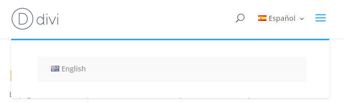
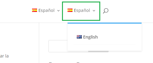
Here's and example of how this second menu appears on mobile and desktop:
Adding a Second Main Menu in Divi using PHP and CSS
To add a second menu in your Divi header, follow these steps.
1. Register the new menu and add it to Divi
Add the following PHP code to your child theme's functions.php file or use a plugin like Code Snippets:
function register_my_custom_menu() {
    register_nav_menus(
        array(
            'new-menu-location' => __('My Custom Menu', 'textdomain'),
        )
    );
}
add_action('after_setup_theme', 'register_my_custom_menu');

function display_my_custom_menu() {
    if (has_nav_menu('new-menu-location')) {
        wp_nav_menu(array(
            'theme_location' => 'new-menu-location',
            'container' => 'nav',
            'container_id' => 'top-menu-nav-2',
            'container_class' => '',
            'menu_id' => 'top-menu-2',
            'menu_class' => 'nav',
        ));
    }
}
add_action('et_header_top', 'display_my_custom_menu');
Related Post: Adding PHP to the Divi Theme
This code registers a new menu location called "My Custom Menu" and displays it in the Divi Header. This new menu will be positioned between the original menu and the search button on desktops and to the left of the mobile menu button on mobile devices.
2. Style Your Menu
Add the following CSS to "WP Admin > Divi > Theme Options > General > Custom CSS" to style the new menu to match Divi's default look:
#top-menu-2 {
    float: left;
    line-height: 0;
}

#top-menu-2 li {
    display: inline-block;
    font-size: 14px;
    padding-right: 22px;
    word-wrap: break-word;
}

#top-menu-2>li:last-child {
    padding-right: 0;
}

#top-menu-2 .menu-item-has-children>a:first-child {
    padding-right: 20px;
}

#top-menu-2 a {
    color: rgba(0, 0, 0, 0.6);
    text-decoration: none;
    display: block;
    position: relative;
    -webkit-transition: opacity 0.4s ease-in-out, background-color 0.4s ease-in-out;
    transition: opacity 0.4s ease-in-out, background-color 0.4s ease-in-out;
}

#top-menu-2 .menu-item-has-children>a:first-child:after {
    font-family: 'ETmodules';
    content: "3";
    font-size: 16px;
    position: absolute;
    right: 0;
    top: 0;
    font-weight: 800;
}

#top-menu-2 li li a {
    padding: 6px 20px;
    width: 200px;
}

nav#top-menu-nav-2 {
    float: left;
    line-height: 0;
    padding-left: 22px;
    display: inline-block;
}


#top-menu-2 .sub-menu li a {
    border-bottom: 1px solid rgba(0, 0, 0, .03);
    color: #666;
    padding: 10px 5%;
    display: block;
}
#top-menu-2 .sub-menu li a, .nav li li a {
    font-size: 14px;
    -webkit-transition: opacity .2s ease-in-out, background-color .2s ease-in-out;
    transition: opacity .2s ease-in-out, background-color .2s ease-in-out;
}

@media only screen and (max-width: 981px) {

    .et_header_style_left #et-top-navigation nav>ul>li>a {
        margin-top: 9px;
    }
    #top-menu-nav-2 {
        margin-left: 22px;
        margin-right: -40px;

    }
    #top-menu-2 .sub-menu {
        position: absolute;
        right: -46px;
        padding: 32px;
        background: #fff;
        width: 78vw;
        z-index: 9999;
        border-top: 3px solid #2ea3f2;
        box-shadow: 0 2px 5px rgba(0, 0, 0, .1);
        -moz-box-shadow: 0 2px 5px rgba(0, 0, 0, .1);
        -webkit-box-shadow: 0 2px 5px rgba(0, 0, 0, .1);
    }
	#top-menu-2 li li a {
		width: 66vw;
	}


    #top-menu-2 .sub-menu .menu-item-has-children>a {
        font-weight: 700;
        background-color: rgba(0, 0, 0, .03);
    }
}
Note that these styles may need to be tweaked to match any customization you've done to the main Divi menu.
3. Adjust Menu Visibility
Hide on Mobile: If you wish to hide the menu on mobile devices, use the following CSS:
@media only screen and (max-width: 980px) {
    #top-menu-nav-2 {
        display: none !important;
    }
}
Hide on Desktop: Similarly, to hide it on desktops, use:
@media only screen and (min-width: 981px) {
    #top-menu-nav-2 {
        display: none !important;
    }
}
4. Assign your Menu
With this in place, you can now assign a menu to the "My Custom Menu" location in the WordPress menu settings, at:
WP Admin > Appearance > Menus
Your menu should now show up in the second menu spot we've added to the default Divi header.

0 Comments