
Change Default Mobile Content Width in Divi using Divi Booster Plugin
This method demonstrates how to modify the default content width for mobile devices in Divi by using the Divi Booster plugin. By following these steps, you can easily increase the mobile content width—such as changing it from the default 80% to 90%—using a straightforward settings panel, making it ideal for users seeking a quick, plugin-based solution without needing to edit code.
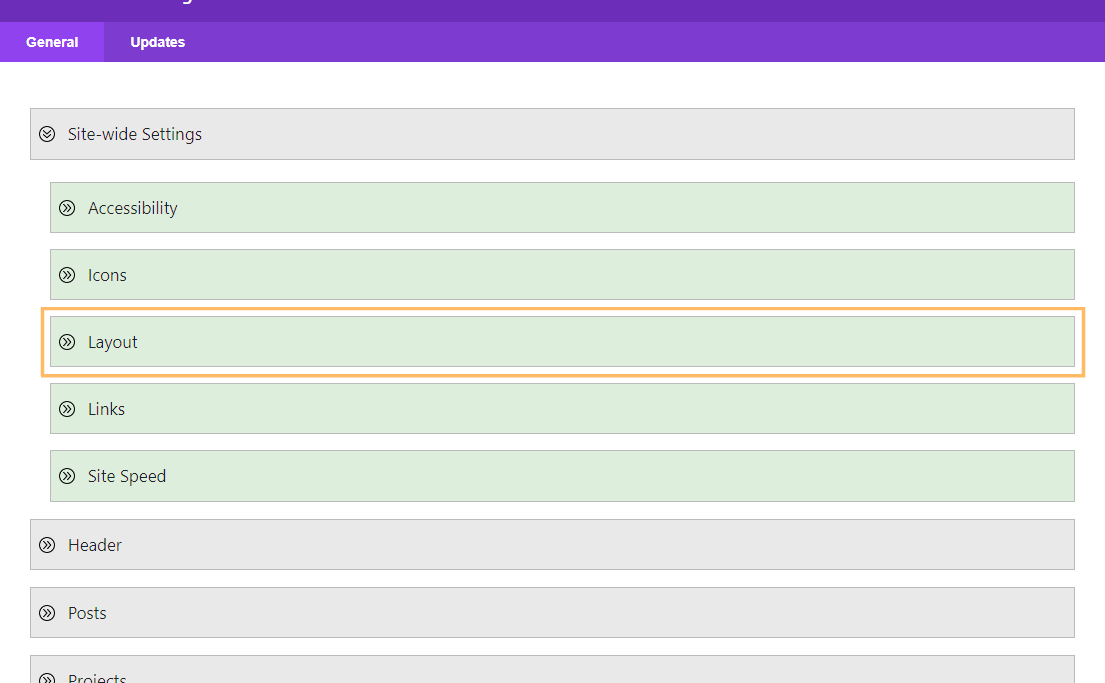
Access Divi Booster’s Site-Wide Layout Settings
To start, open the Divi menu in your WordPress dashboard and click on the "Divi Booster" option. Once inside the plugin settings, expand the "Site-wide Settings" panel and then the "Layout" section.
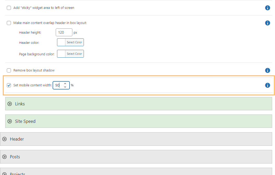
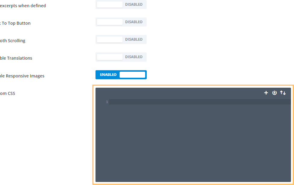
Enable and Adjust the Mobile Content Width
Scroll down to locate the "Set mobile content width" option. Check the box next to "Set mobile content width" to enable it. An input box will appear—enter your preferred content width for mobile devices (for example, "90" for 90%).
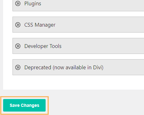
Save Your Changes
Once you've entered your desired width, scroll down and click the "Save Changes" button to apply your new settings.
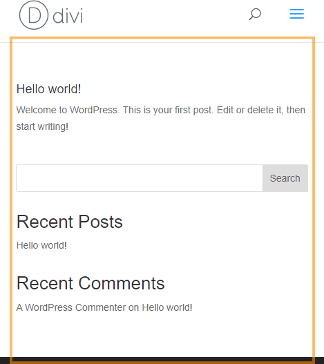
Check Your Site on Mobile
After saving, preview your site on a mobile device or by resizing your browser window to see the updated mobile content width in action. The main content should now span your specified percentage of the screen, such as 90% if that value was entered.
Adjust the Mobile Content Width in Divi Using Custom CSS
This method walks you through adjusting your website's mobile content width by adding custom CSS directly in the Divi Theme Options panel. It's a straightforward solution for those who want to fine-tune the look of their content on smaller screens without relying on third-party plugins or advanced theme settings.
Locate the Divi Custom CSS Box
Go to the Divi menu in your WordPress dashboard and click on "Theme Options." Scroll to the bottom where you'll find the Custom CSS field.
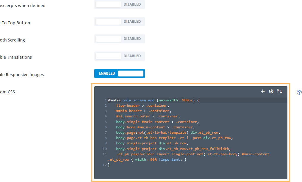
Add Custom CSS for Mobile Content Width
Now paste the following CSS code into the editor to set your mobile content width (e.g., to 90%):
@media only screen and (max-width: 980px) {
    #top-header > .container,
    #main-header > .container,
    #et_search_outer > .container,
    body.single #main-content > .container,
    body.home #main-content > .container,
    body.page:not(.et-tb-has-template) div.et_pb_row,
    body.page.et-tb-has-template .et-l--post div.et_pb_row,
    body.single-project div.et_pb_row,
    body.single-project div.et_pb_row.et_pb_row_fullwidth,
    .et_pb_pagebuilder_layout.single-post:not(.et-tb-has-body) #main-content .et_pb_row {
        width: 90% !important;
    }
}
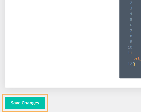
Save Your Custom CSS
After pasting the code, click the "Save Changes" button at the bottom of the Theme Options panel to apply your updated mobile content width.
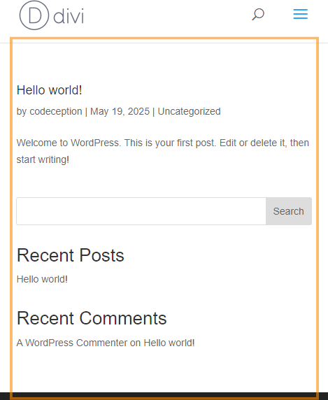
Preview the Mobile Content Width
To confirm your changes, view your website on a mobile device or resize your browser window. Your site's main content should now take up exactly the percentage of the page width you specified with the CSS (such as 90%).
Conclusion
By adjusting your mobile content width in Divi—either with Divi Booster or custom CSS—you can create a more comfortable and visually appealing experience for mobile visitors in just a few simple steps.


Hey Dan, i have a white line at the right side of the page. How do i get rid of that?
Hey Joost, did you manage to fix this? I took a look at the page linked in your comment, but I don't see a white line at the right side of the page. Or am I missing something? Thanks!
Hi Dan – This is amazing! One problem. I am finding that the fullwidth headers we have get cut down to 90% too if I change the width with the CSS code. Is there any way to deal with that? I'm talking about the navy blue header, i.e. on this page: https://www.helpingchildrentoread.com/info/about-us/
I'm crossing my fingers because this has been a headache for ages!
Hi Sarah, you should be able to do it with this CSS:
@media only screen and (max-width: 980px) {
#top-header > .container,
#main-header > .container,
#et_search_outer > .container,
#main-content > .container,
div.et_pb_row {
width: 90% !important;
}
}
It's the same as above, but removes the rule affecting fullwidth rows. I'm not entirely sure why I have that rule in there, but I think there was some cases where it was useful. When I have a chance, I'll have a think… but hopefully this version helps you now!
Hi Dan –
Thanks so much! I am not sure why, but I am getting multiple RBRACE errors when I input that code – on line 6, 8 and 9. It looks fine to me but Divi is objecting! Any ideas?
Ah, there was a comma in there that Divi did not like. So it is now going through but still adding in the 10% space on left and right of full-width sections. If you have any ideas, do pass along!
Ah, sorry about that. I'm glad you caught the extra comma – I've just updated my comment to remove it. Are you able to point me to one of the full-width sections where you're seeing the 10% space? Looking at the full-width section at the top of the homepage (i.e. the one with the "Teach your children to read without guessing…" header), I can see it being set to the full-width of the page (no 10% space). My guess is that on full-width sections where you're seeing the 10% spacing, it is being added by the row within that section (i.e. the row width is set to 80%). If so, you should be able to get rid of it within the row settings, by setting the row width to 100%. But I'll be able to tell you more if I see an example. Thanks!
Hi Dan,
I set it to 90% and it works great on all parts of my site except for the product detail pages. On the detail pages, it cuts off the background on the sections portion of the description. So the back ground only extends 90% of the width and there is white space on the left/right.
Thanks,
Dan
Hi Dan, is there any chance you're able to send me a link to one of the product detail pages so that I can take a look at how you have things set up? Thanks!
Thanks that was a great help. A bit of a let down it's not built into any of the Divi mobile settings. My two cents is in reality, everything should be geared toward the mobile compatibility these days as the default. It's a little counter-intuitive, but I think it's come to this mentality before long: "build your site for mobile… and when you get time, make it look good on desktop too."
Best,
–jody
You're welcome, Jody, and you make a good point. I'm sure this will end up as a setting in Divi eventually, and hopefully there's be more mobile-centric options to accompany it. In the meantime, let me know if there is any thing specific you'd like to be able to do for your sites on mobile and I'll try my best to help :)
worked great
thanks!!!!
Thank you SO MUCH! I only used it for the main nav, but it is SO much better.
Hi Dan, I tried
@media only screen and (max-width: 980px) {
#top-header > .container,
#main-header > .container,
#et_search_outer > .container,
#main-content > .container,
#main-footer > .container,
#et-footer-nav > .container,
#footer-bottom > .container,
div.et_pb_row,
div.et_pb_row.et_pb_row_fullwidth {
width: 90% !important;
}
}
But unfortunately this doesn't work. I have also tried searching for these selectors and cannot find them in the console.
Ah it does work! I had a typo! Thanks a lot, my site is much better now! Cheers!
You're welcome, Horace :)
Hi, Dan,
The Booster plugin has really helped out a lot … nice job.
I'm on Version 2.5.7 and tried the mobile width setting under Layout but it doesn't change the width. Your CSS did however.
Site is https://judithhannahweiss.com/. Please let me know if I'm missing something or if the plugin needs a bit of work.
Thanks!
Chuck
Hey Chuck. The default width in Divi is 80%. I can see that Divi Booster's code is being applied and is working. However, it looks to me like the width you have set in Divi Booster is also 80%. As this matches the Divi default you won't see any change in width. Does it work if you set it to something else, e.g. 90% (as you have set in the CSS version)? If not, try clearing the caches of any performance plugins you have installed as they may be blocking the latest Divi Booster changes from showing up. Let me know if it still isn't working after that. Cheers!
Dan,
I can't recall exactly how this worked out, but it did … thanks!
Chuck
Ha ha! Great, I'm glad it's working now, Chuck. Thanks for letting me know :)
With regards to full width, you say best to adjust each row (time consuming) because it may create issues with wanting full control?
Wouldn't you just be better off messing with the individual sections with padding and margin etc and go with the global ccs control?
for the sections you don't want to be controlled by the global css i mean
Hey nick, I've just looked into this further and it seems like I was mistaken. I had originally thought Divi was using the same CSS when setting the default width as it was when setting row custom widths. This would have meant that any global CSS would have overwritten both the default and the custom widths, causing the problem I was discussing. There wouldn't have been a CSS-only way to override just the default. It turns out this is not actually the case – the custom row widths are being set using max-width whereas the default uses just width.
However, it looks like the custom row widths don't actually apply to mobiles / tablets at all, only on desktops. This means that all rows end up as 80% on mobile whether they have a custom row width set or not. So we can just override this 80% default with our own value and we're not going to be screwing up the (desktop-only) effects of the custom row widths.
I've updated the post / code above to apply to builder pages as well. I'll include the update in the next version of Divi Booster (2.4.9). Cheers!
Hi Dan,
When I activate the mobile width option of the plugin and set the width to 90% it seems to have no effect on my mobile viewport.
I have cleaned the cache of the database.
Would love to see it work.
Hi, the option originally didn't apply to divi builder pages as I thought that would mess with the ability to set custom row widths within builder. However, that turns out not to be the case, so I've updated the plugin to modify the mobile width on divi builder pages as well. Can I get you to try updating to the latest version (2.4.9) and see if that has the desired effect. Please let me know if not. Thanks!
Oh my GAAAAWD! Absolute lifesaver! Ok, maybe a little OTT, but This has been bugging me for AGES! I think the 80% width as standard is just wrong for mobile. I'm pretty sure elegant themes actually agree though, as their new theme on their own website is more like 90%. Anyway, implemented and works great! You can see your handy work here: http://bricksblog.com
Thanks again! :)
Ha ha! You're welcome, Em! Yeah, I like 90% more than 80% too :)
Hey Dan,
Thanks for the quick response. I will try it out.
Best regards
Hi there,
in my Divi Booster there is no “Site-wide Settings > Layout > Set mobile content width”.
The code above does not work, too.
I am using Divi 3.0
Best regards,
chris
Hi Chris,
I've just released v2.4.6 of Divi Booster, which contains the new feature – if you update you should see it.
But looking at your test site, I can see that your site is mainly built using fullwidth pages. My code doesn't adjust the width of content in the fullwidth pages as this can be controlled within Divi Builder itself (e.g. using row widths) and overriding it would prevent any further customization of the row widths (on mobiles, at least). I've added a section to the post above explaining how this can be handled.
I hope that helps,
Dan