The Divi Show / Hide Button module lets you reveal Divi Builder elements with the click of a button. Once clicked, the button becomes "activate", which can be used for example, to style it differently. If you'd like to set up a group of buttons where only one button is active at a time, you can use the "Grouping" option.
Adding a Button to a Group
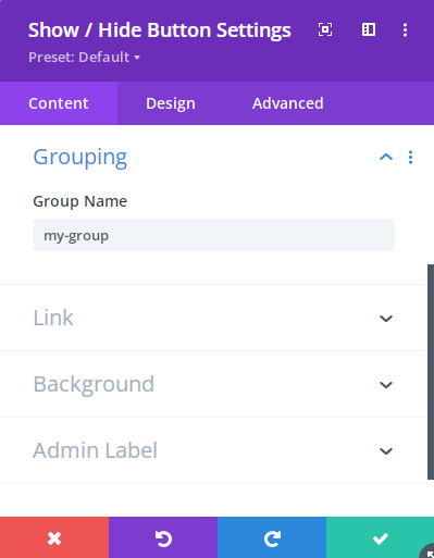
To place a button into a group, enter a name for the group in the "Show / Hide Button Settings > Grouping > Group Name(s)" option. The name should consist of lower-case characters and hyphens only, e.g:

Use the same group name in the "Grouping" option of each other button you want to add to the group. Once each button is added to the group, activating one button will automatically deactivate the others in the group.
The previously active button is deactivated by triggering an automatic click on in, ensuring the deactivation behavior is the same as if the user had manually clicked to deactivate the button. Note that prior to v1.5.7, deactivation simply removed the active class from the previously active button, without triggering a full click event.
Note that the module's group name will also be added as a CSS class on the module.
Placing a Button in More than One Group
You can also place a button in multiple groups at the same time by entering a comma-separated list of group names into the "Group Name(s)" field, e.g. "my-group, my-second-group". Support for multiple group names was added in v1.4.2.
Styling the Active Button in a Group
When the button is clicked, another class "dshb-active-button" is also assigned to the module.
You can use the built in style options to style the active state of the button.
Alternatively, you can style the active button in your group with CSS such as this:
.my-group.dshb-active-button .et_pb_button {
    color: red !important;
    background-color: yellow;
}


0 Comments