Enabling closeable accordion items in your Divi layouts provides visitors with greater control over the content they view, allowing them to close open sections without automatically opening another. This can improve user experience by reducing clutter and helping users focus only on the information they wish to see. In this guide we show you how to set up your Divi Accordion module so that individual items can be closed independently.
Make Divi Accordion Items Closeable Using the Divi Booster Plugin
This method shows how to make the Divi Accordion module's items closeable by enabling the 'Closeable' toggle provided by the Divi Booster plugin. It is a straightforward solution that requires no coding and allows users to easily configure the closeable behavior directly from the module's design settings.
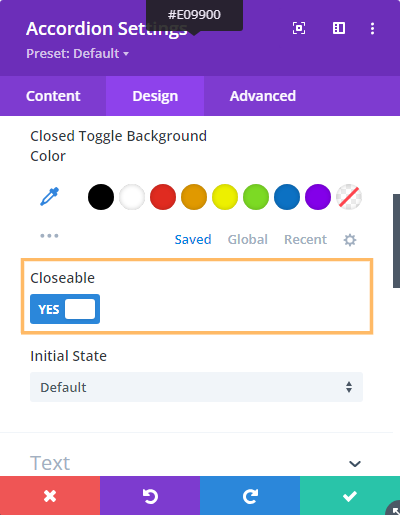
Enable the 'Closeable' Option in Accordion Settings
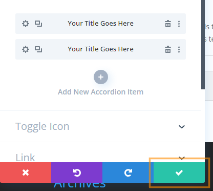
In your existing page or layout where you've added an Accordion module, open the Accordion module's settings. Head to the Design tab, then expand the Toggle section. Here, you'll see the Closeable option. Switch the 'Closeable' toggle to YES to allow users to close each accordion item independently—with no other item automatically opening in its place.
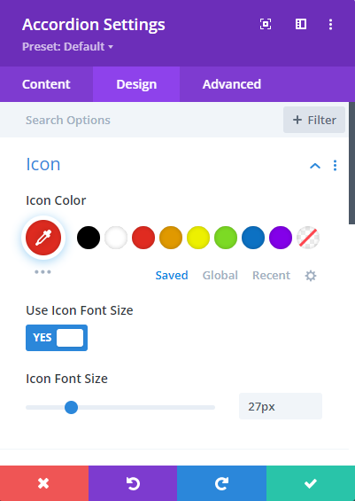
Styling the Close Icon
The close icon added by this feature inherits the styles of the built in "open" icon. That means you can style both the open and close icons using the existing options in the accordion module settings:
If you wish to apply certain styles to the close icon only (i.e. not to the open icon), then you can do so using CSS such as this:
/* Normal state */
.et_pb_accordion .et_pb_toggle_open .et_pb_toggle_title:before {
	color: grey !important;
}

/* Hover state */
.et_pb_accordion .et_pb_toggle_open .et_pb_toggle_title:hover:before {
	color: blue !important;
}
Related Post: Adding CSS to the Divi Theme
The example above will make the icon grey normally, changing to blue when hovered.
Save and Publish Your Changes
After enabling the 'Closeable' setting, simply click the green checkmark to save the Accordion module settings. Then, use the Divi Builder's toolbar at the bottom of the page to publish your changes and exit the visual builder. Your changes are now live!

Test the Closeable Accordion Feature
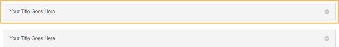
View your page on the front-end. Click the title of any accordion item to close it. Notice that you can now close all accordion items, leaving the accordion fully collapsed if you wish.

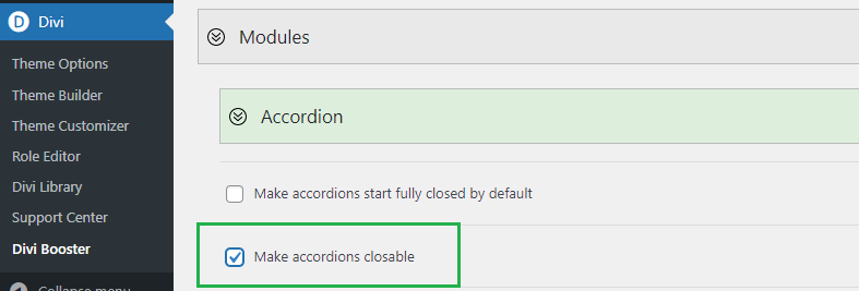
(Optional) Making All Accordion Modules Closeable using Divi Booster
It is also possible to make all accordions on the site closeable using the option found under "Modules > Accordion" on the Divi Booster settings page. This option has been available since Divi Booster v1.9.9.
Make Divi Accordion Module Items Closeable using jQuery and CSS in Theme Options
This method explains how to make items in the Divi Accordion module independently closeable by adding custom jQuery and CSS code in the Theme Options integration area. By following these steps, you gain more control over accordion behavior without needing third-party plugins, making it a flexible solution for customizing your site's interactivity directly from the Divi settings.
Add Custom jQuery and CSS in Divi Theme Options
Navigate to the Divi > Theme Options page in your WordPress dashboard, and go to the Integration tab. In the section labeled 'Add code to the of your blog,' paste in the following code. This script and style allow users to close open accordion items with a click.
<script>
jQuery(function($){
  $('.et_pb_toggle_title').click(function(){
    var $toggle = $(this).closest('.et_pb_toggle');
    if (!$toggle.hasClass('et_pb_accordion_toggling')) {
      var $accordion = $toggle.closest('.et_pb_accordion');
      if ($toggle.hasClass('et_pb_toggle_open')) {
        $accordion.addClass('et_pb_accordion_toggling');
        $toggle.find('.et_pb_toggle_content').slideToggle(700, function() {
          $toggle.removeClass('et_pb_toggle_open').addClass('et_pb_toggle_close');

        });
      }
      setTimeout(function(){
        $accordion.removeClass('et_pb_accordion_toggling');
      }, 750);
    }
  });
});
</script>
<style>
.et_pb_accordion .et_pb_toggle_open .et_pb_toggle_title:before {
    display: block!important;
    content: "\e04f" !important;
}
</style>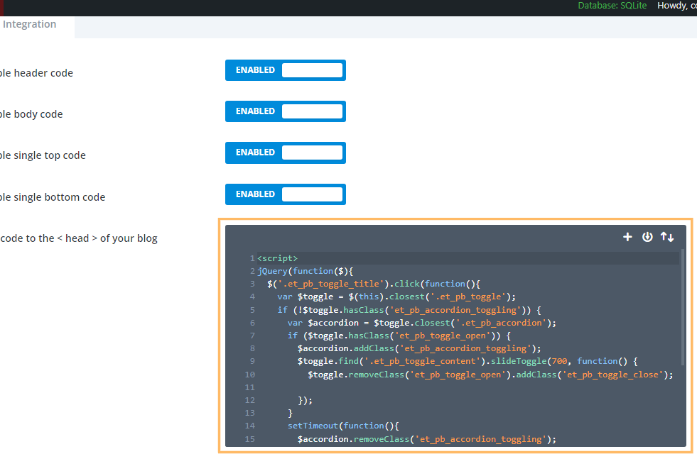
Save Theme Option Changes
Once you have pasted in the code, click the Save Changes button at the top of the Theme Options page to apply your new settings.

Insert an Accordion Module and Publish
Add an Accordion module to your desired row using Divi Builder. You can style your accordion as usual—no changes are needed in the module settings to enable closeable functionality with this method. When you're finished, save your module and publish the page.
Test Your Closeable Accordion
On the front-end, test your accordion by clicking any accordion item’s title to open or close it. Thanks to your custom code, you (and your visitors) can now collapse all sections without having to keep any of them open.
Adding a Second Close Icon at the Bottom of Toggles
If your accordion toggles contain a lot of text, you may want to add a second close icon at the bottom to save your users having to scroll all the way back to the top of the text to close the toggle. Here's the code to do this. It should be used in addition to either the Divi Booster / manual methods given above. The code can be placed either in a code module on the page in question, or in the "Divi > Theme Options > Integrations > Add Code to the Head of your Blog" box.
<script>
jQuery(function($){
	$('.et_pb_toggle_title').each(function(){
		var $title = $(this);
		var $closebar = $title.clone(true).addClass('db_pb_toggle_close2').html(' ');
		$title.closest('.et_pb_toggle').append($closebar);
	});

  	$('.db_pb_toggle_close2').click(function(){ // Listen for clicks on the close bar
    		var $toggle = $(this).closest('.et_pb_toggle');
    		var mainAreaOffset = $('#et-main-area').length ? $('#et-main-area').offset().top : 0;
    		$('html, body').animate({scrollTop: $toggle.offset().top - mainAreaOffset - 16}, 700); // Scroll considering the main area's top offset
  	});
});
</script>
<style>
	.et_pb_toggle_close .db_pb_toggle_close2 {
		display: none;
	}
	.db_pb_toggle_close2 {
		margin-top: 10px;
		visibility: hidden;
	}
	.db_pb_toggle_close2:before {
		visibility: visible;
	}
</style>
Conclusion
Allowing visitors to close accordion items adds flexibility and improves navigation in your Divi layouts. You can achieve this easily with the Divi Booster plugin or by inserting a simple code snippet into your Theme Options. Enjoy a cleaner, more interactive accordion experience!


Hi Dan – Lifetime user here. I placed the code in a Code Module under my lengthly accordion module and when I click the icon, it scrolls way down the page and not back up to the top. Any ideas? Development site: https://node615.namehero.net/~wodehous/vanderbilt-collection/
Hey Lisa!
The issue is actually that the page doesn't scroll at all. When you click the close icon at the bottom of the toggle, the toggle closes and now takes up less space on the page. As a result, all the content below the toggle slides up into the space left behind. This makes it look like the browser window area is scrolling down, when really it is the content moving up past the point on the page the browser is currently displaying.
Anyway, to solve this we can add some code to actually scroll to the top of the toggle when the second close icon is clicked. I've updated the final piece of code in the post with the necessary changes – if you update this piece of code on your site then I think it should work more as you'd expect. Let me know if you have any questions about it, etc.
Thanks!
Brilliant! Many thanks, Dan and also for your quick reply! Much appreciated of all your work.
Thanks, Lisa! I'm really glad you found it helpful. I greatly appreciate your continued support – it means a lot. Reach out any time if you need anything else. Cheers!