The Divi Theme's header dynamically modifies itself to look good on small devices, such as smart phones. Here's how to make it look a little bit better.
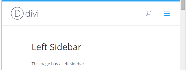
If you leave (or set) the Divi header as the "Default" header style, it will look like this:

Depending on the size of the mobile device's screen, the logo and menu box will vary in distance from the edge of the screen. If you'd like a more consistent appearance across devices, we can set the components to appear at a fixed distance from the edges, using the following CSS:
@media only screen and ( max-width: 980px ) {
    #main-header .container {
        width:100%;
        box-sizing:border-box;
        padding-right:30px;
        padding-left:30px;
    }
    #main-header .logo_container {
        width: auto;
    }
    #main-header #logo {
        max-width: 100%;
    }
}
Note that this will only work for the "Default" header style, not others such as the "Centered" style.
Here's how it looks with the fix applied.
Note that the distance of the logo and menu bar will be the same in all devices, rather than changing as it does in the default configuration.


Thanks for this. Please I'm having issues with my logo, it's very small and almost non-visible. I have tried adjusting the primary header settings and also the logo size, but nothing seems to work!!
Hi Mandy, are you able to confirm / share a link to the site you're working on? I took a look at the site linked in your comment, but notice it's not a Divi site, so I'm not sure if that's the site you're referring to. Just in case it is, I was able to come up with a bit of rough CSS to increase the header / logo size:
.navigation_container { height: 100px !important; }
.themeLogoImg { height: 50px !important; }
#myNavbar { margin-top: 16px; }
The CSS 1) increases the height of the header, 2) increases the height of the logo, and 3) moves the menu links down a bit to center them on the newly expanded header. If that is indeed the site you're working on, let me know and I'll try to refine this a bit. Cheers!
Hello,
When I enable this option it makes the primary menu bar expand longer than the browser window so it creates a horizontal scrolling bar and white space down the side of the page:
http://i.imgur.com/x8TW45f.jpg
Thanks
I just added the following to the div.logo_container and it has fixed it not sure if this is the best method?
padding-left: 30px;
padding-right: 30px;
margin-left: -30px;
margin-right: -30px;
Hi Andrew, thanks for getting in touch and for sharing your solution. The issue seems to be occurring because Divi is now setting the logo_container to 100% width (which it didn't when I originally came up with the customization). I can't see any issues with your method, but a slightly simpler method is to set the width of the logo_container to "auto". That solves it without the need for padding / margin adjustments. I've updated the code in the post above to do this, and have fixed it in the next version of Divi Booster (2.5.7). Thanks again!