
Change Default Mobile Content Width in Divi using Divi Booster Plugin
This method demonstrates how to modify the default content width for mobile devices in Divi by using the Divi Booster plugin. By following these steps, you can easily increase the mobile content width—such as changing it from the default 80% to 90%—using a straightforward settings panel, making it ideal for users seeking a quick, plugin-based solution without needing to edit code.
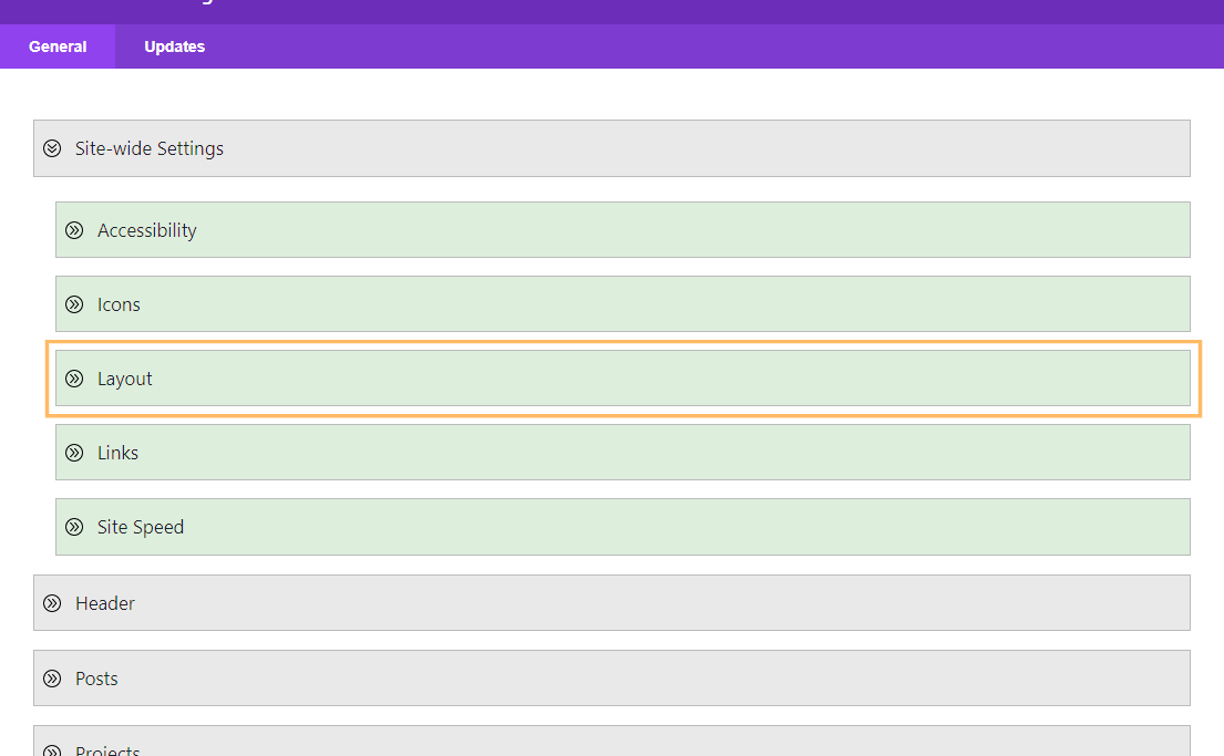
Access Divi Booster’s Site-Wide Layout Settings
To start, open the Divi menu in your WordPress dashboard and click on the "Divi Booster" option. Once inside the plugin settings, expand the "Site-wide Settings" panel and then the "Layout" section.
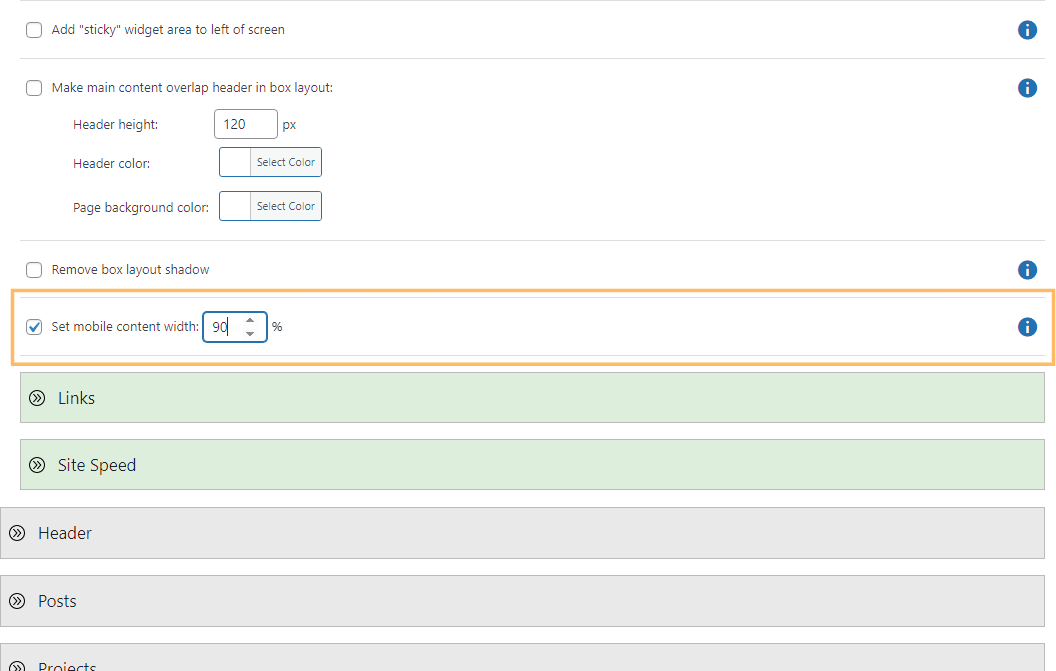
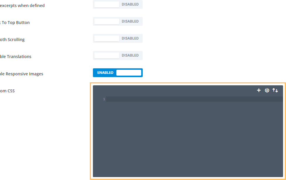
Enable and Adjust the Mobile Content Width
Scroll down to locate the "Set mobile content width" option. Check the box next to "Set mobile content width" to enable it. An input box will appear—enter your preferred content width for mobile devices (for example, "90" for 90%).
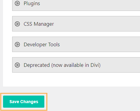
Save Your Changes
Once you've entered your desired width, scroll down and click the "Save Changes" button to apply your new settings.
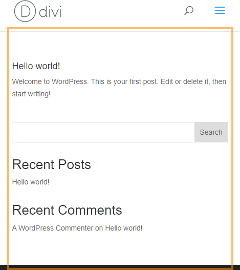
Check Your Site on Mobile
After saving, preview your site on a mobile device or by resizing your browser window to see the updated mobile content width in action. The main content should now span your specified percentage of the screen, such as 90% if that value was entered.
Adjust the Mobile Content Width in Divi Using Custom CSS
This method walks you through adjusting your website's mobile content width by adding custom CSS directly in the Divi Theme Options panel. It's a straightforward solution for those who want to fine-tune the look of their content on smaller screens without relying on third-party plugins or advanced theme settings.
Locate the Divi Custom CSS Box
Go to the Divi menu in your WordPress dashboard and click on "Theme Options." Scroll to the bottom where you'll find the Custom CSS field.
Add Custom CSS for Mobile Content Width
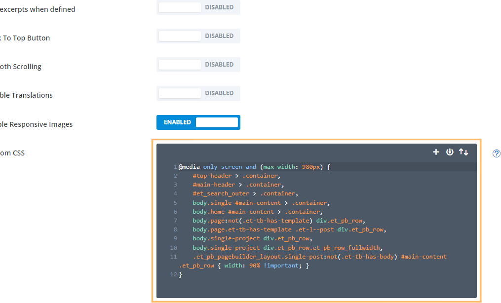
Now paste the following CSS code into the editor to set your mobile content width (e.g., to 90%):
@media only screen and (max-width: 980px) {
    #top-header > .container,
    #main-header > .container,
    #et_search_outer > .container,
    body.single #main-content > .container,
    body.home #main-content > .container,
    body.page:not(.et-tb-has-template) div.et_pb_row,
    body.page.et-tb-has-template .et-l--post div.et_pb_row,
    body.single-project div.et_pb_row,
    body.single-project div.et_pb_row.et_pb_row_fullwidth,
    .et_pb_pagebuilder_layout.single-post:not(.et-tb-has-body) #main-content .et_pb_row {
        width: 90% !important;
    }
}
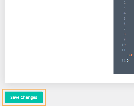
Save Your Custom CSS
After pasting the code, click the "Save Changes" button at the bottom of the Theme Options panel to apply your updated mobile content width.
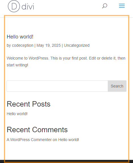
Preview the Mobile Content Width
To confirm your changes, view your website on a mobile device or resize your browser window. Your site's main content should now take up exactly the percentage of the page width you specified with the CSS (such as 90%).
Conclusion
By adjusting your mobile content width in Divi—either with Divi Booster or custom CSS—you can create a more comfortable and visually appealing experience for mobile visitors in just a few simple steps.


Hi Dan! Thank you for a very good guide. I added "#main-content .et_pb_row" to include pages created using the theme builder. I also noticed that increasing the width to 90% created sidescrolling, so I added "overflow-x: hidden!important;" to solve this issue.
You're welcome, Johan, and thanks for the details of your fix.
If I recall correctly, the reason I didn't include a rule for theme builder rows like this is that it would override any custom row width set in the row settings, preventing the row settings option from working. In some situations that won't matter, but it would stop the code from being usable on some sites. Plus, since it is possible to set the width from within the row settings it didn't seem quite as necessary to include it as it did to make sure that the mobile width could be set on other parts of the site for which Divi doesn't have any width setting.
I've actually dealt with this issue already in Divi Booster. It uses some PHP code to add a class to the rows indicating whether or not they have a custom width set and so the mobile width can be ignored on rows which have their own width set. It's a bit involved, but when I get a chance I'll try and add the relevant PHP / CSS to the post here. When I do, I'll try to make sure both your case and the sidescrolling issue are covered.
Thanks again!
Hello Dan, thank you very much! I noticed the code works everywhere except on pages created using the Divi theme builder. Do you know what class(es) I need to add?
Thank you. Your CSS code works great. I don't know why 80% was picked as the default because every millimeter of space on a phone is valuable real estate (I prefer 94%). Besides, it's easier for people to change the margin or padding if the content is too close to the edge.
Hey Jared, I'm glad that helped! I'm not sure why 80% was chosen either. I think it might be that when the Divi Builder and its defaults were introduced, designs with large amounts of whitespace were popular. Ever since, I've been helping people remove excess whitespace ;)
Thanks very much for this!
Hi!
This code snippet works great on my normal pages. However, it does not seem to work for Wordpress Projects, which I am using the theme builder for. Am I doing something wrong?
Hi Linda, I've updated the code to work with projects too. I hope it helps!
This doesn't seem to work anymore.
90% should be the default for mobile anyways.
I was so excited to see this was an option in Divi Booster which I include on every project.
However,
I went into Divi Booster and made the change, saved it.
And now when I go to every page and switch to the mobile view, it still says 80%. (though in a greyed out font)
Is it actually 90%?
I'm thinking it is since the mobile width does not affect anything anymore.
Hi Rick, I took a look at the URL linked in your comment. I can see Divi Booster is running and it's CSS file is being loaded correctly. However, while I can see the file contains the CSS for other features, it is missing the CSS for the mobile width setting. Can I ask you first to go back into the Divi Booster settings, check that the width setting is specified AND that the checkbox next to the setting is ticked (to enable the setting)? Then save the settings and clear your website / browser caches. Hopefully that will get the CSS applying correctly. When I manually add the CSS it adjusts the width as I'd expect. Let me know if you're still having trouble with it after that. Thanks!
Hi Dan,
This seems to only work for pages, but doesn't work for posts? My posts are stuck at 80% no matter what I do! :( Please advise?
Thanks!
Hey Tom, it looks like the code was incorrectly applying twice on posts – giving a 90% x 90% = 81% width… I've updated the code to address this. The updated code will also be in the next version of Divi Booster (2.9.9). Hopefully that helps, but let me know if not. Thanks!
Hey Dan,
Fantastic! I'm happy to hear that and eagerly awaiting the next update!
Thanks a lot Dan!
You're very welcome, Tom!