Reveal Divi Contact Form with a Button Click

Written by Dan Mossop

Divi includes a contact form module that lets you add an email contact form to a page. Here's how to hide the contact form until a "Contact Us" button is clicked.

Add a Contact Us Button with Divi Show / Hide Button Module

Divi Show / Hide Button module makes it easy to reveal and hide Divi Builder elements (sections, rows, modules, etc.) on the click of a button. This can be used to quickly set up a "Contact Us" button which, when clicked by the user, reveals a contact form.

To create a contact button and initially hidden contact form:

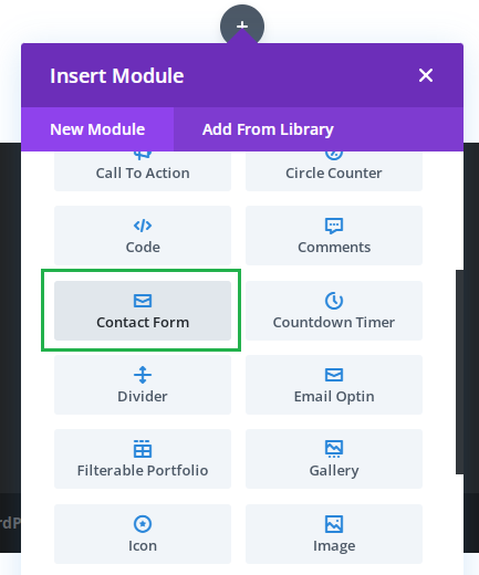
1. Add a contact form module to the page, if you haven't already:

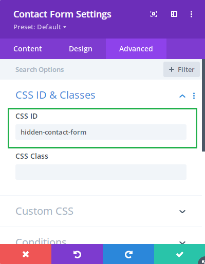
2. Go to "Contact Form Settings > Advanced > CSS ID & Classes > CSS Class" and enter an ID for the contact form, for instance "hidden-contact-form": 

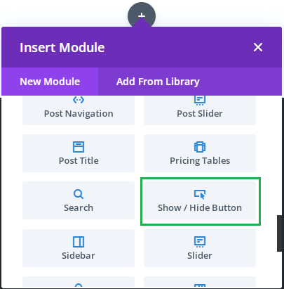
3. Add a Show / Hide Button module to the page:

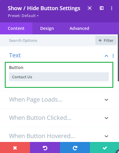
4. Set the Show / Hide Button text at "Show / Hide Button Settings > Content > Text > Button". For example, you may want to use "Contact Us", "Get in Touch", "Show Contact Form", etc.

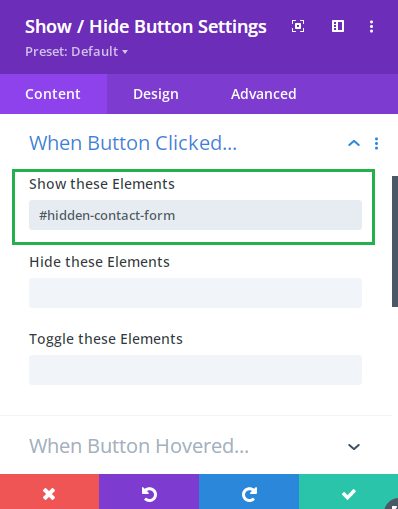
5. Configure the Show / Hide Button to show the contact form when clicked, by entering the ID of the contact form prefixed with a "#" character (e.g. "#hidden-contact-form") at "Show / Hide Button Settings > Content > When Button Clicked… > Show these Elements":

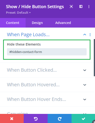
6. Configure the Show / Hide Button to hide the contact form initially, by entering the ID of the contact form prefixed with a "#" character (e.g. "#hidden-contact-form") at "Show / Hide Button Settings > Content > When Page Loads… > Hide these Elements":

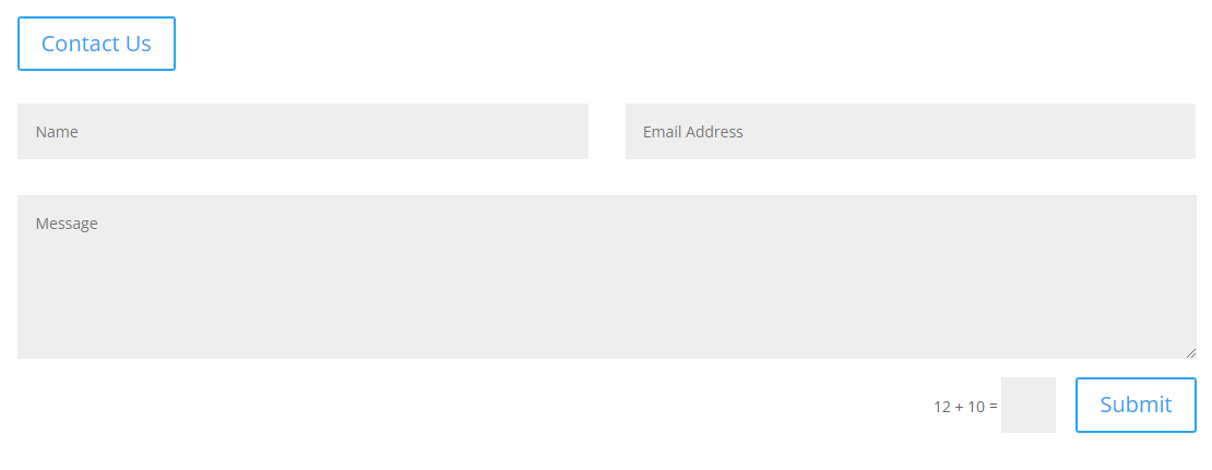
7. Now if you save the page and view it on the front end, you should initially see only the "Contact Us" button. Click on this and the contact form should be revealed, e.g:

We may earn a commission when you visit links on our website.

Transform Your Divi User Experience with Ease!

Enhance user interaction on your Divi site by easily showing or hiding elements like contact forms with the Divi Show / Hide Button Module. Perfect for keeping pages clean and engaging, this module allows you to effortlessly toggle visibility of sections, rows, or modules with a single click.

Latest Posts

Adjust Lightbox Arrow Size in Divi Gallery

Customize the size of the navigation arrows that appear in your gallery lightbox so they’re easier to see and aligned with your site’s design. Whether you want larger, more accessible controls or a subtler look, setting a precise arrow size creates a more polished...

Change Lightbox Arrow Color in the Divi Gallery Module

Make the lightbox navigation arrows in your Divi Gallery match your brand and stand out against your images by assigning a custom color. This improves visual consistency, enhances accessibility with better contrast, and elevates the overall browsing experience for...

Change the Divi Gallery Module Grid Image Scaling

Divi’s Gallery module offers a great way to showcase images, but it can sometimes stretch or crop them in unwanted ways. This article explains how to manage the module’s image scaling behavior to ensure your images are displayed at the correct size and aspect...

Set Custom CSS IDs for Individual Divi Accordion Items

Assigning unique CSS IDs to specific Divi Accordion items allows for precise control over styling, targeting, and linking within your page content. This ability is particularly useful when you want to apply custom designs or create anchor links to particular accordion...

Enable Swipe Navigation in the Divi Gallery Lightbox

Enabling swipe navigation in the Divi Gallery module's lightbox allows users to seamlessly browse through gallery images by swiping left or right, creating a more interactive and mobile-friendly experience. This functionality can significantly improve user engagement...

About Dan Mossop

Dan is a Scottish-born web developer, now living in Brisbane with his wife and son. He has been sharing tips and helping users with Divi since 2014. He created Divi Booster, the first Divi plugin, and continues to develop it along with 20+ other Divi plugins. Dan has a PhD in Computer Science, a background in web security and likes a lot of stuff, 

2 Comments

  1. The show/hide button has a circular border when it appears or loads but has a square border after it's clicked on. Can you please help with instructions on how to correct the border so that the border is the same after it's clicked-on? I've searched the settings but am having trouble finding the correct setting to adjust. Thanks.

    Reply
    • Hey David, you can do this by first enabling:

      Show / Hide Button Settings > Design > Active Button > Use Custom Styles For Active Button

      Then setting the border radius for the clicked / "active" state at:

      Show / Hide Button Settings > Design > Active Button > Active Button Border Radius

      If you reset this option to the default then it should use the circular border set on the normal button state. Alternatively, you can enter the border radius you want on the button when clicked (setting it to 50% will give you fully rounded corners).

      There's a bit more info on the active button styles here:

      Styling the Divi Show / Hide Button when "Active"

      I hope that helps!
      Dan

      Reply

Submit a Comment

Comments are manually moderated and approved at the time they are answered. A preview is shown while pending but may disappear if your are cookies cleared - don't worry though, the comment is still in the queue.

Your email address will not be published. Required fields are marked *.