One feature missing from the Divi Theme which can be found in some other themes is the ability to have a full-width image displayed right at the top of the page, above the main header bar. We can add such a "banner" image to Divi in the several ways:
Adding an Image above the Header with Divi Booster
To add the image above the header in Divi Booster, do the following:
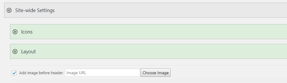
Step 1: Locate the Divi Booster Option
First open the Divi Booster settings page ("Divi » Divi Booster" from your WordPress dashboard).
Then look under "Site-wide Settings » Layout". You should see an option to "Add Image before Header", like so:
Step 2: Select your Image
Click "Choose Image" and the WordPress media library will appear. Upload or select you header image.
Important: Be sure to set the image size to "Full Size" prior to clicking "Use Image", as shown:
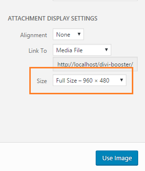
This prevents the image from being added at a smaller size and becoming in blurry / pixelated when scaled up to fit the screen.
Step 3: Save the Divi Booster Settings
You should now be back at the Divi Booster settings page, and will see a thumbnail of your chosen image along with its URL, like so:
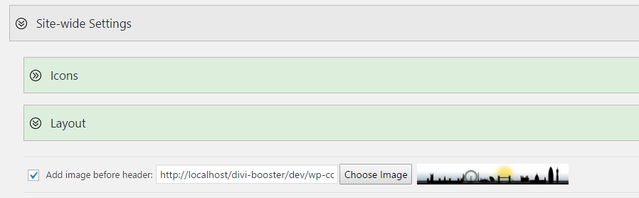
Scroll to the bottom of the Divi Booster settings page and click "Save Changes".
Now when you view your site, your chosen header image should display above the Divi header. Be sure to clear your site / browser cache if you do not see the image right away.
Tips and Tricks
Here are some CSS snippets that may be useful in customizing the image to your liking, whether you are using Divi Booster, or the manual method (below).
Show the Image only on the home page
You should be able to hide the header image on all pages except the homepage with one of these CSS snippets:
body:not(.blog) #wtfdivi004-page-start-img,
body:not(.blog) #myprefix-page-start-img {
	display: none! important;
}OR
body:not(.home) #wtfdivi004-page-start-img,
body:not(.home) #myprefix-page-start-img {
	display: none! important;
}
Which one works will depend on whether you are using the standard Divi home page, or using a separate page.
Just add one (not both) into the Custom CSS box at Divi > Theme Options > General > Custom CSS.
Show the Image only on Posts
To show the image only on posts, add the code below into the Custom CSS box at Divi > Theme Options > General > Custom CSS.
body:not(.single) #wtfdivi004-page-start-img,
body:not(.single) #myprefix-page-start-img {
	display: none! important;
}
Show the Fullwidth Image on Mobiles
To show the image on mobiles and tablets (as well as desktops), you can use this CSS:
@media only screen and (max-width: 980px) {
    #wtfdivi004-page-start-img, #myprefix-page-start-img {
        display: block !important;
        width: 100%;
    }
    #top-header,
    #main-header {
        position: relative !important;
        top: 0 !important;
    }
    #page-container {
        padding-top: 0 !important;
    }
}
You can add this code in the "WP Admin > Divi > Theme Options > General > Custom CSS" box.
If you'd like to "zoom" the image in a bit on mobile, so that it is taller but some of the left and right of the image is hidden off to the sides, you can use this CSS instead:
@media only screen and (max-width: 980px) {
    #wtfdivi004-page-start-img, #myprefix-page-start-img {
        display: block !important;
        width: 140%; /* increase width to enlarge */
        max-width: none; /* remove max-width limiting */
        object-fit: cover; /* cover to maintain aspect ratio */
        position: relative;
        left: 50%; /* move it to the center horizontally */
        transform: translateX(-50%); /* shift it left by half of its width to center it */
    }
    #top-header,
    #main-header {
        position: relative !important;
        top: 0 !important;
    }
    #page-container {
        padding-top: 0 !important;
    }
    body {
        overflow-x: hidden;
    }
}
Manually Adding an Image Above the Header
Step 1: Include the image into the page
We first begin by adding the image to the HTML page and moving it into the correct location. To do so, add the following HTML code into the Divi theme footer.php (or your child theme footer.php) file just before the final </body> tag:
<div style="display:none">
    <img id="myprefix-page-start-img" src="http://www.mysite.com/my-image-url.jpg"/>
</div>
<script>jQuery("#myprefix-page-start-img").prependTo(jQuery("body"));</script>
Change the src="…" part to the URL of your image. If you don't yet have a URL for your image you can get one by uploading the image to your WordPress media library, and then viewing the information for the uploaded image.
Style tip: The image will be stretched to fit the width of the screen, so wide images will generally look better than tall ones.
Step 2: Adjust the page layout to accommodate the image
The above code puts the image into the right place in the page. But it doesn't do anything to make sure it looks good. We can fix this by adding the CSS below. The CSS achieves several things:
- It makes the image full width on full-size screens.
- It hides the image on mobiles, defaulting to the standard Divi mobile layout.
- It fits the image to the width of the "box" when box mode is used.
- As the header is now lower down the page, it delays making the header "float" until the user has scrolled down far enough.
- It fixes up the padding and margins so there are no unsightly gaps.
While it looks complicated, you don't need to understand it to use it, just copy it into the end of the Divi theme style.css (or your child theme style.css) file and it should work.
/* Change header to float correctly wherever it is in the page */
@media only screen and ( min-width:981px ) {
	#main-header { position:relative !important; top:0px !important; } /* inline */
	#main-header.et-fixed-header { position:fixed !important; margin-bottom:0px; top:0px !important; } /* floating */
	body.admin-bar #main-header.et-fixed-header { top:32px !important; } /* adjust for WP admin bar */
	#page-container { overflow:hidden; } /* prevent sub-menus from breaking scrolling */

	/* Handle top header */
	#top-header { position:relative !important; top:0px !important; } /* inline header */
}

/* Style the image for full screen layouts */
@media only screen and ( min-width:981px ) {

	#myprefix-page-start-img { margin-bottom:0px; width:100%; }

	/* Override Divi JS padding adjustment */
	div#page-container[style] { padding-top:0 !important; }

	/* Remove gap between heading and menu caused by line height */
	body { line-height:0 !important; }
	body * { line-height:1.7em }
}

/* Style the image for box layout */
@media only screen and (min-width: 1200px) {
	.et_boxed_layout #myprefix-page-start-img {
		width:1200px;
		-moz-box-shadow: 0 0 10px 0 rgba(0,0,0,0.2);
		-webkit-box-shadow: 0 0 10px 0 rgba(0, 0, 0, 0.2);
		box-shadow: 0 0 10px 0 rgba(0, 0, 0, 0.2);
		display:block !important;
		margin-left:auto;
		margin-right:auto;
	}
}

/* Hide the image on smaller screens */
@media only screen and ( max-width:980px ) {
	#myprefix-page-start-img { display:none !important; }
}

Is it also possible (and how:) to place the image below the navigation? I use your code for my blog pages and there the image comes first and then my Main Navigation bar. I'd like to switch them?!
Hi Timm, I haven't worked out the code to place the image below the navigation yet – though I'll try to figure it out in the future.
In the meantime, you could it with either the Page Builder Everywhere or Divi Layout Injector plugins.
They both let you use the Divi Builder to add modules (such as an image module) at various locations in the page, e.g. under the navigation bar.
Hi Dan,
thank you very much for that plugin. Thats what I was searching for. Because I wanted to add an image bevore menu. But now I see that it won't be shown on mobile. I would like that it's shown on mobile too. Is there a way to do that?
Thanks
Birgit
Hi Birgit, at the moment there's now way to show it on mobile within the plugin, though I hope to add this option soon. In the meantime, you should be able to show it on mobiles too, by adding this CSS to Divi:
Seems to work:

@media only screen and (max-width: 980px) {
	#wtfdivi004-page-start-img { display: block !important; width: 100%; }
	#top-header, #main-header { position: relative !important; top: 0 !important; }
	#page-container { padding-top: 0 !important; }
}
This can be added at "Divi > Theme Options > General > Custom CSS".
I hope that helps. Thanks!
Great! It worked. Thank you very much Dan!
The only difference is: on mobile version I have much more white space between image and navigation menu. Do you know why that is?
Thanks
Birgit
Hmm… I'm not sure, Birgit – I'm not getting any white space between the image and navigation menu when I try it on my test site. Is there any chance you're able to send me a link to your site so that I can take a look?
I wish I could put a section before the header. I've been trying it for hoursss.
Above*
Hi Igor, are you talking about putting a Divi Builder section above the header? If so, either of the Page Builder Everywhere or Divi Layout Injector plugins should do what you need.
I'll give it a try and tell you later! Thank you.
Hi Dan, I tried to modify your code to add a link to the image header that would trigger a LeadPages pop-up box. This didn't work:
jQuery(function($){
setTimeout(function(){
$('#wtfdivi004-page-start-img').wrap('')
},100);
});
Let's try again…
≶script src="//static.leadpages.net/leadboxes/current/embed.js" async defer>≶/script>
≶script>jQuery(function($){
setTimeout(function(){
$('#wtfdivi004-page-start-img').wrap('≶a href="/free-download" data-leadbox-popup="145d449f3f72a2:1038166f7b46dc">≶/a>')
},100);
});≶/script>
Hey Parker, I'm not sure about this one. I've had a play around with it and (comment formatting notwithstanding) your code seems to be working correctly. It loads the embed.js file and correctly wraps the header image with the link. However, I wasn't able to get it to trigger the popup. I thought it might have been an issue with adding the link after a delay – e.g. if the embed.js script adds the link click handlers before link was added – but embedding the link directly in the page didn't change things for me. This may just be down to my lack of understanding of the way leadboxes is doing its thing, though… I'd suggest getting in touch with the leadpages support team if you haven't already, as they are probably better placed to answer this for you. Sorry I can't be of more help!
Just wanted to say thank you! I'd been looking for something like this high and low. Your solution worked excellently for my client's site.
Hi Dan – I'm pulling my hair out as I can't get it to work! Trying the manual bit – have copied Divi footer.php to child theme and added as you instruct – whole file is now:
'footer-menu',
'depth' => '1',
'menu_class' => 'bottom-nav',
'container' => ",
'fallback_cb' => ",
) );
?>
jQuery("#myprefix-page-start-img").prependTo(jQuery("body"));
The image is not showing and I can't understand why. Any ideas – does it not like png images?
Edit – the php code has obviously been stripped out of my previous comment but trust me, it's OK
OK, solved part of this – I had some additional CSS which I think was over-riding yours – I've moved it to the bottom of the custom style and the image is now showing:
/* add border to menu bar bottom */
header#main-header {
border-bottom: 10px solid #fff200 !important;
box-shadow: 0 10px 0 #272361;}
}
This was to add a 2 color border to the bottom of the menu bar.
Only other problem I now see is that the image disappears when you scroll down but I'd like it to remain…doh!
Hi Mark, I'm glad you were able to figure out the conflict. I think the reason that your additional CSS was blocking mine may be that it has two closing braces "}", when it only needs one (unless it is part of a larger code block). Removing one of these additional closing braces should allow you to use both bits of CSS together.
I don't currently have a good way of making the image remain when you scroll down, I'm afraid. If I'm able to come up with something in the future, I'll let you know.
Hey Dan! Love the tuts. Thanks. How would I make it so the hero above the menu only shows on the homepage of my site and nowhere else?
NM. I skimmed your tutorial and didn't see the explanation right at the top :). Can I add a gif?
Hey Tyson, yeah, you should be able to add a gif :)
It worked. Thanks!
Hi Dan, Is there any way to add this Full-Width Image Above the Divi Header just to posts and not to pages? Or looking at it another way, is it possible to turn this feature off for certain pages?
Hey Mark, the following CSS will hide it on everything except posts:
body:not(.single-post) #wtfdivi004-page-start-img,
body:not(.single-post) #myprefix-page-start-img {
display: none! important;
}
You can paste it into the Custom CSS box at: Divi > Theme Options > General > Custom CSS.
Let me know if that doesn't do what you need.
I'm having trouble getting a clear image using Divi Booster. No matter how big or small I make it, the image is still pixelated.
http://moneyevolution.com
for reference.
Brain fart, please ignore above comment.
Is there a way to use this area for placement of the logo without being full width ie: width 350px X height 150px and centered above the header so I can assign the header a different background color allowing me to keep the background of the logo white?
Hi Sara, you should be able resize and center the logo with this custom CSS:
#wtfdivi004-page-start-img, #myprefix-page-start-img {
    width: 350px;
    display: block;
    margin: 0 auto;
}
It should work for both the image if added using the code above, or through Divi Booster.
Hi Dan.
I'm willing to make the header image as a home link, is that possible?
Thanks for your plug-in, is saving my life!
Hi Daniel, I'm looking at adding this in a future version of the plugin. For now, though, you should be able to do it by adding the following into "Divi > Theme Options > Integration > Add code to the < head > of your blog":
<script>jQuery(function($){ setTimeout(function(){ $('#wtfdivi004-page-start-img').wrap('<a href="/"></a>') },100); });</script> This will link to the root domain (which is usually where the homepage is), but if you need to link anywhere else change the href="/" part (e.g. to href="//www.mysite.com/homepage").
I'm unclear about what I need to do here. Do you need to following both the upload instructions and then the manual instructions or is it either/or. I have followed the first part and that puts the logo in place but its massively distorted. You say in a post on this "You should be able to disable this behavior (and center the image), by adding the following after the above code" so I guess that means I do have to add the manual part as well???
Hi Paul. It's either/or. The code in the main body of this post is basically the same as used by Divi Booster (Divi Booster just hides the details and gives you a nice image upload button). This code sets the image to 100% screen width – hence the increase in image size that you noticed.
The code I shared in my comment to Alison is not part of Divi Booster and needs to be manually added. However to get it to work with Divi Booster (which has some slight differences), use this code instead:
@media only screen and (min-width: 981px) {
    body { text-align: center; }
    #wtfdivi004-page-start-img { width: auto !important;  }
}
I hope this all makes sense.