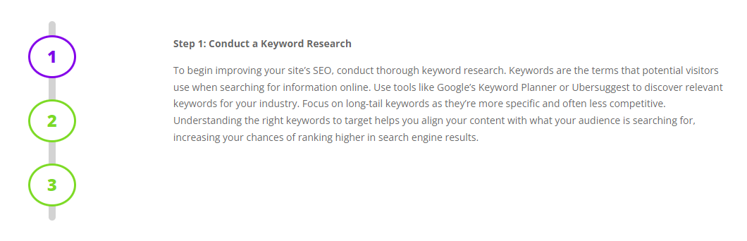
A step progress bar is a handy user-interface element which lets you display a sequence of steps where each step is a button that reveals the content associated with that step. Here's how you can set one up in Divi.
Set up a Step Progress Bar using the Divi Show / Hide Button Module
Divi Show / Hide Button module lets you reveal content at the click of a button making it ideal for implementing a progress bar. Here's how to use it to set up a (vertical) progress bar.
Step 1: Add a two-column row
Start by adding a two-column row which has a narrow column (for the progress bar) and a wide one (for the content). For example:
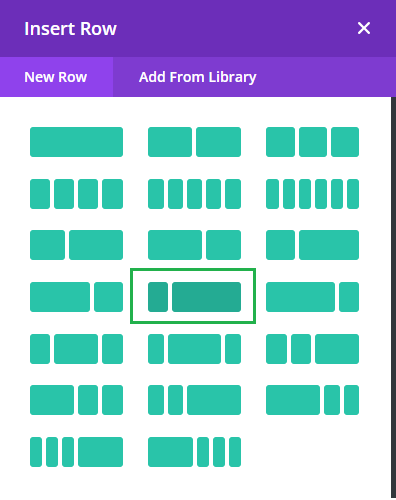
Step 2: Add the modules
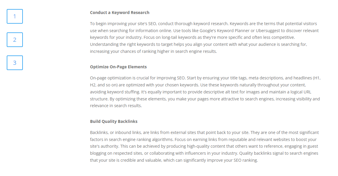
Now, add some Divi Show / Hide Buttons in the narrow column and some content elements in the right column. Don't worry about the settings for these modules just now – we'll fill those out as we go. In my example, I've added three show / hide buttons and three text modules, like so:
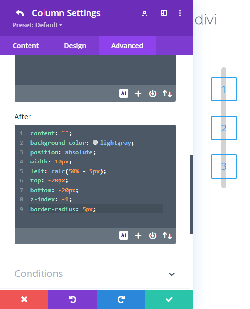
Step 3: Add a bar behind the buttons
First center align the show / hide buttons at "Show / Hide Button Settings > Design > Alignment", and then go into the row settings and open the settings of the column containing the buttons. Under "Column Settings > Advanced > Custom CSS > Module Elements > After" add the following CSS:
content: "";
background-color: lightgray;
position: absolute;
width: 10px;
left: calc(50% - 5px);
top: -20px;
bottom: -20px;
z-index: -1;
border-radius: 5px;
This will give you a grey bar through the buttons like so:
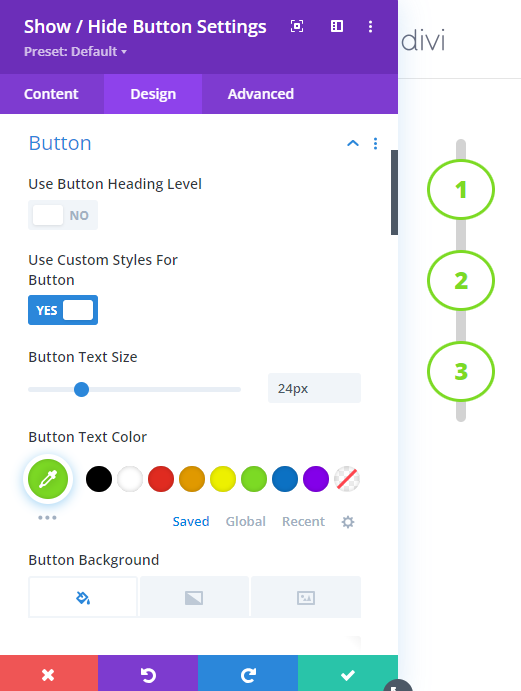
Step 4: Set the default button styles
Now we'll set the default styles for the buttons. To do so, go to "Show / Hide Button Settings > Design > Button", enable "Use Custom Styles for Button" and then set any styles you'd like to apply to your buttons:
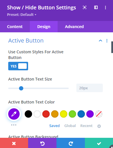
Step 5: Set the active button styles
When the user clicks on a button to reveal the content for a step, it would be nice to adjust the style of the button so that they can easily keep track of what step they are on. To do this, we can set the styles for the "active" state of the show / hide buttons at "Show / Hide Button Settings > Design > Active Button":
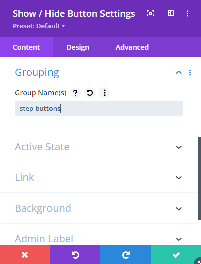
Step 6: Put the buttons in a group
Since you probably only want one button at a time, we need to make the buttons act as a group. To do this in Divi Show / Hide Button Module we can do so by giving each button the same group name at "Show / Hide Button Settings > Content > Grouping" like so:
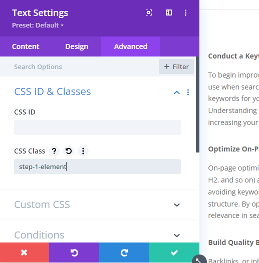
Step 7: Set Classes on the Content Elements
In order for our show / hide buttons to be able to manipulate the visibility of the content elements (text modules in this example), we need to give those elements class names in their "Advanced > CSS ID & Classes > CSS Field" like so:
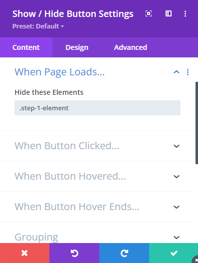
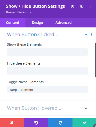
Step 8: Configure the Show / Hide Button
The last thing to do is to tell our buttons to hide their elements initially, and then toggle their visibility when clicked. We can do so by adding the class (with a "." at the start) to the "Show / Hide Button Settings > Content > When Page Loads… > Hide these Elements" field and the "Show / Hide Button Settings > Content > When Button Clicked… > Toggle these Elements" field, like so:
Test it out
Now save your page and check it out on the front-end. If all is well, you should have a fully-functional step progress bar which reveals the content next to each step when clicked.

0 Comments