
Divi lets you place modules side-by-side by adding them to a two-column row. On mobile, however, Divi normally stacks those columns so they appear one above the other.
That works well for many layouts, but it can take up more vertical space than necessary when the columns contain compact content such as icons, logos, buttons, short blurbs or small feature blocks.
This updated tutorial shows you how to keep two Divi columns side-by-side on mobile. First, we’ll cover the Divi 5 method using the Layout Wrapping option. Then we’ll cover the Divi 4 method using a small CSS snippet.
This tutorial is specifically for two-column Divi rows. If you want to display three or four columns side-by-side on mobile, you’ll need a slightly different approach.
Quick answer:
- Divi 5: Open the Row settings, switch to Phone view, then go to Design → Layout → Layout Wrapping and choose No Wrap.
- Divi 4: Open the Row settings and add display: flex; to Advanced → Custom CSS → Main Element.
Before and After: Divi Columns Side-by-Side on Mobile
Divi normally stacks columns on mobile, which can make compact layouts take up more space than necessary. Here’s the difference this tutorial will help you achieve.
Before: Divi Stacks the Columns
On mobile, Divi’s default behaviour is to place columns one below the other.
After: The Columns Stay Side-by-Side
We will instead make the same columns remain next to each other on mobile.

Show Divi Columns Side-by-Side on Mobile (Divi 5)
Divi 5 includes Flexbox layout settings that make it much easier to place row columns side-by-side than it was in Divi 4.
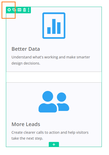
Open the Row's Settings
Locate the row with the columns you want to lay out next to each other. Hover over the row to reveal the green row buttons. If your Divi Builder is set to use "Click" mode, you may need to click on the row instead of hovering. Click the "Gear" icon to open the row's settings.
Switch to the "Phone" Edit Mode
If you haven't already done so, switch to the "Phone" edit mode by clicking on the edit mode icon in the top right of the row settings and selecting "Phone". This will ensure that your edits apply only to the mobile view of your site, without affecting the desktop. If you want the two-column layout on tablet, select the Tablet view instead.
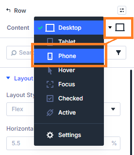
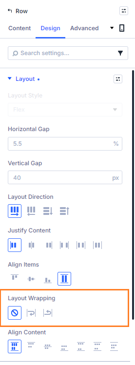
Set the Row Layout to "No Wrap"
Now, in the row settings, we'll disable the flexbox wrapping that is laying the columns out one above the other. To do this, click on the "Design" tab in the row settings, then under "Layout", locate the "Layout Wrapping" and change it to "No Wrap", like so:
Save your Changes
Now save (or publish) your changes using the button at the top right of the Divi 5 builder.
View the Result
If you now take a look at your page on the front-end you should find that you now have 2 columns on mobile, each occupying 50% of the width, instead of stacked columns taking up a full 100% width.

You may need to make adjustments to make the columns look right in the smaller column width they are now allocated. But don't worry, all the usual module settings – font sizes, margin and padding will work as normal and can be used to tweak the design.
Divi 5 Troubleshooting
If your columns are still stacking after following the steps above, check the following:
- Make sure you edited the row, not the column or module – The wrapping/flex setting needs to be applied to the row that contains the columns.
- Make sure you are using the "Layout Wrapping" method – The old Divi 4 method of setting the row to 'display: flex;' no longer works in Divi 5.
- Check that you are editing the correct responsive view – In Divi 5, switch to Phone view before changing the layout wrapping option so that the change is applied on mobile.
- Try reducing spacing and module width requirements – Large padding, wide images, long headings, or large text can affect the layout. Reduce these using Divi’s responsive settings.
- Test the front-end, not just the builder preview – The Visual Builder preview is useful, but always check the published page on an actual mobile device or browser mobile preview.
Improve Your Mobile Layout Further
Now that your two columns are sitting side-by-side on mobile, you may want to make a few extra adjustments so the layout looks good on smaller screens.
If the columns feel cramped, you may find it helpful to adjust your mobile content width:
Show Divi Columns Side-by-Side on Mobile (Divi 4)
There isn't a built-in option to display the modules side-by-side in Divi 4, but we can easily achieve it by setting their row to use the CSS "flex" property. Here's how to do it.
Open the Row's Settings
Locate the row with the columns you want to lay out next to each other. Hover over the row to reveal the green row buttons. If your Divi Builder is set to use "Click" mode, you may need to click on the row instead of hovering. Click the "Gear" icon to open the row's settings.

Set the Row to Flex Mode in its Custom CSS
Now, to display the Divi columns side-by-side on mobile, we will set them to use the CSS "flex" property, which will lay out the columns next to each other.
To do this, click on the "Advanced" tab in the row settings, then under "Custom CSS", click on "Module Elements". Finally, in the "Main Element" box, enter:
display: flex;
Save your Changes
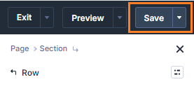
To save the changes to the row, click the green check mark button at the bottom of the row settings. Then save the whole page by opening the Page Settings toolbar, by clicking on the round purple "three-dots" button at the bottom of the visual builder area, and clicking on the "Save" button.

View the Result
If you now take a look at your page on the front-end you should find that you now have 2 columns on mobile, each occupying 50% of the width, instead of stacked columns taking up a full 100% width.

You may need to make adjustments to make the columns look right in the smaller column width they are now allocated. But don't worry, all the usual module settings – font sizes, margin and padding will work as normal and can be used to tweak the design.
Improve Your Mobile Layout Further
Now that your two columns are sitting side-by-side on mobile, you may want to fine-tune the layout so it works well on smaller screens.
If the columns look too close together, you may find this guide useful:
Change the Spacing Between Columns in Divi Rows
If you need to adjust font sizes, spacing, images or other module settings only on mobile, this guide explains how to use Divi’s responsive settings:
Setting Responsive Values for Divi Module Settings
If you are working with a Specialty Section instead of a standard row, see:
Display Divi Specialty Section Columns Side-by-Side on Mobile
FAQs
Does this work for three or four Divi columns on mobile?
This tutorial is intended for two-column rows. Three- or four-column mobile layouts usually need a different CSS approach so the columns have the correct widths.
Conclusion
There we have it. You can keep two Divi columns side-by-side on mobile using Divi 5’s Layout Wrapping option, or by adding a small custom CSS snippet in Divi 4.
Once the columns are side-by-side, take a moment to review the rest of the mobile layout. Check whether the content is still easy to read, the spacing feels balanced, and the modules are arranged in the order you want.
I hope this helps. If your columns are still stacking, if the mobile layout needs more adjustment, or if you’re working with a different Divi layout, please ask in the comments and I’ll try to help.


Hello,
Thanks and do you know for only side by side row on the second column on special section ?
Hey Greg, sorry I'm just responding now. Are you able to share a link to an example? There are quite a few possible combinations with the specialty sections and the answer will depend on how yours is set up. Thanks!
I followed the instructions and the sizes changed, but the modules are still stacked.
Hey George, are you able to share a link to the page you're working on so that I can take a look? You can sent it privately via the contact form if you wish. Thanks! Dan