Setting Responsive Values for Divi Module Settings

Written by Dan Mossop

In today's mobile-first world, ensuring a responsive design is crucial. The Divi Theme offers a powerful feature that lets you set different values for module settings on desktop, tablet, and mobile devices. This flexibility ensures your website looks perfect on any screen size, enhancing user experience across devices.

Here's a step-by-step guide using an example setting to help you understand the process.

Adjusting the Module Settings for Different Devices

Most of the settings in Divi modules can be set differently for different device widths. We'll look at one example here – the process is the same on other settings. Let's say you want to adjust the text size of a heading module to be different on desktops, tablets, and mobile devices. Here's how to do it.

1. Open the Module Settings

Navigate to the page where your heading module is located. Then click on the module settings gear icon to open the settings.

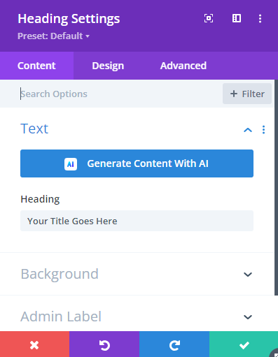
2. Locate the Text Setting

Go to the "Design" tab within the module settings. Find the "Heading Text" section, and locate the "Heading Text Size" option.

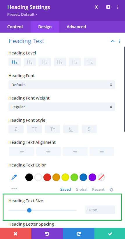
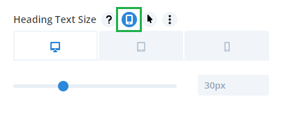
3. Enable Responsive Options

Hover over the "Heading Text Size" label. Click on the mobile device icon that appears to enable responsive options. You will now see tabs for Desktop, Tablet, and Phone settings.

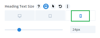
4. Set Different Values for Each Device

Click on the "Desktop" tab and set your desired heading size for desktop view. Switch to the "Tablet" tab and input a different value suitable for tablet screens. Finally, select the "Phone" tab and adjust the text size to fit mobile screens.

5. Save Your Changes

Once you've set the desired values for all devices, click the green check mark to save your changes. Ensure you publish or update your page to apply the changes.

Now when you view the page, the text size should adapt responsively to different device / browser widths.

Enhance Your Divi Customization

Unlock endless customization options for your Divi site with Divi Booster. This powerful plugin adds hundreds of new features, helping you fine-tune your site to perfection with ease. Perfect for responsive design enthusiasts looking to enhance their module settings across devices.

About Dan Mossop

Dan is a Scottish-born web developer, now living in Brisbane with his wife and son. He has been sharing tips and helping users with Divi since 2014. He created Divi Booster, the first Divi plugin, and continues to develop it along with 20+ other Divi plugins. Dan has a PhD in Computer Science, a background in web security and likes a lot of stuff, 

0 Comments

Submit a Comment

Comments are manually moderated and approved at the time they are answered. A preview is shown while pending but may disappear if your are cookies cleared - don't worry though, the comment is still in the queue.

Your email address will not be published. Required fields are marked *.

We may earn a commission when you visit links on our website.

Latest Posts

Hide the Page Title in the Hello Elementor Theme

Hiding the page title in the Hello Elementor theme allows you to create a cleaner and more customized page layout, free from default headings that may not fit your design. This is particularly useful for landing pages or custom content layouts where the default page...

How to Hide a Divi Module When Scrolling Up or Down

In this quick tutorial, I’ll show you how to hide a Divi module when scrolling in a specific direction (up or down), so that the module only shows when you want it to. This is especially useful when using Divi’s Scroll Effects feature and you have a effect you want to...

Fade a Divi Image Module Edge into the Background

Want to create a stylish fade effect on your Divi image module—where one side fades smoothly into the background? With a bit of CSS, you can make any edge (or corner) of the image fade out: top, bottom, left, right, or even diagonally.Fade a Divi Image Module Edge...

Hide the Header and Footer in the Hello Elementor Theme

Removing the default header and footer from your Hello Elementor theme allows for a streamlined and distraction-free website design. This is especially useful when creating unique landing pages, full-width layouts, or custom headers and footers with a page builder. In...

Setting up the Divi Password Box Module

Setting up password protection on a page can help you control access to sensitive or private content in WordPress, allowing only authorized visitors to view certain sections. With the Divi Password Box module, you can replace the plain Divi password form with a fully...

Random Posts