If you're looking to give your Divi website's search module a custom, polished look, you're in luck. With a few lines of CSS, you can transform the appearance of your search box to better match the aesthetic of your site. In this post, we'll look at how to customize the Divi search module using CSS. You'll learn how to swap the search box and button positions, separate them for a cleaner look, adjust padding for comfort, round them for a softer appearance, and even replace the button text with an icon for a sleek finish.
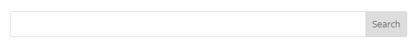
Before we proceed, let's have a look at the unmodified Divi search box:
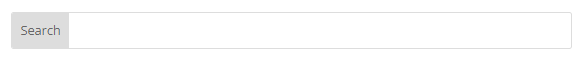
Swap the Search Box and Button Positions
By leveraging the CSS Flexbox order property, you can change the visual order of the search box and button. This is particularly useful if you're aiming for a right-to-left (RTL) layout or just prefer to flip the arrangement.
/* Swap the search box and button positions */
.et_pb_search.search-box-rtl .et_pb_s {
    order: 2;
}
.et_pb_search.search-box-rtl .et_pb_searchsubmit {
    order: 1;
}
Related Post: Adding CSS to the Divi Theme
Here's what this tweak looks like:
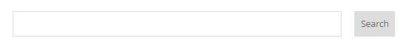
Separate the Search Box and Button
Clarity and spacing can significantly improve user experience. By moving the border onto just the search box (instead of the combined search box and button) and adding margins, you can separate your search elements, ensuring they look distinct.
/* Separate the search box and button */
.et_pb_search.search-box-separated .et_pb_s {
    border: 1px solid #ddd;
}
.et_pb_search.search-box-separated {
    border: none;
}
.et_pb_search.search-box-separated .et_pb_searchsubmit,
.et_pb_search.search-box-separated .et_pb_s {
    margin-right: 10px;
    margin-left: 10px;
}
Related Post: Adding CSS to the Divi Theme
Check out the separation effect:
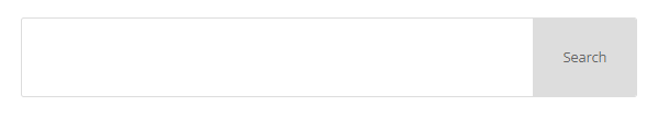
Adjust the Padding
Comfort and readability are key to a good design. With adjusted padding and text-indentation, you ensure there's space inside the search box for a clear, uncluttered look.
/* Adjust the padding */
.et_pb_search.search-box-padding .et_pb_searchsubmit,
.et_pb_search.search-box-padding .et_pb_s {
    padding: 30px;
}
.et_pb_search.search-box-padding .et_pb_s {
    text-indent: 15px; /* Add space to left of search input box text */
}
Related Post: Adding CSS to the Divi Theme
See the difference padding makes:
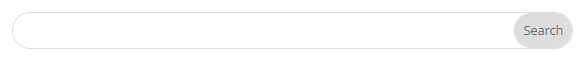
Round the Button and Search Box
A pill shape creates a modern and friendly interface. By rounding the edges of your search elements, you smooth out your design.
/* Round the button and search box */
.et_pb_search.search-box-rounded,
.et_pb_search.search-box-rounded .et_pb_s,
.et_pb_search.search-box-rounded .et_pb_searchsubmit {
    border-radius: 30px; /* Adjust the px value to be half of the height of the search box for perfect pill shape */
}
Related Post: Adding CSS to the Divi Theme
Here's the rounded look:
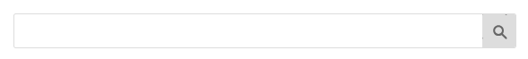
Hide the Text from the Search Button
Sometimes, icons speak louder than words. Hiding the text and using an SVG icon can give your button a minimalist and updated feel.
/* Hide the text from the search button */
.et_pb_search.search-box-icon-button .et_pb_searchsubmit {
    text-indent: -9999px; /* This hides the button text off-screen */
    overflow: hidden; /* Ensure no scrolling within the button */
    background-image: url('data:image/svg+xml;charset=UTF-8,%3Csvg xmlns%3D"http%3A//www.w3.org/2000/svg" viewBox%3D"0 0 64 64"%3E%3Cpath fill%3D"%232f8fff" d%3D"M55%2C51.6l-9.9-9.8c1.5-2.4%2C2.3-5.2%2C2.3-8.1c0-7.7-6.3-14-14-14s-14%2C6.3-14%2C14c0%2C7.7%2C6.3%2C14%2C14%2C14c2.9%2C0%2C5.7-0.8%2C8.1-2.3l9.9%2C9.9c0.6%2C0.6%2C1.4%2C0.9%2C2.2%2C0.9s1.6-0.3%2C2.2-0.9C55.6%2C54.1%2C55.6%2C52.8%2C55%2C51.6zM33.4%2C42.7c-5.1%2C0-9.3-4.1-9.3-9.3s4.1-9.3%2C9.3-9.3c5.1%2C0%2C9.3%2C4.1%2C9.3%2C9.3S38.5%2C42.7%2C33.4%2C42.7z"/%3E%3C/svg%3E');
    background-repeat: no-repeat;
    background-position-x: 5px; /* Adjust icon horizontal position */
    background-position-y: 5px; /* Adjust icon vertical position */
    width: 41px; /* Adjust width as needed */
    height: 41px; /* Adjust height as needed */
}
Related Post: Adding CSS to the Divi Theme
To change the color of the icon, look for the part of the background-image property which reads "fill%3D%22%232f8fff%22". The bit in bold is the hex color code for the icon.
Behold the button's transformation:
Adding CSS Classes to the Divi Search Module
To apply these styles to your Divi search module, first, add the corresponding CSS class to the search module that you want to customize. To do this, open the settings for your search module by clicking the gear icon. Navigate to the Advanced tab, find the CSS ID & Classes toggle, and input your desired class (e.g., "search-box-rounded") into the CSS Class field. Save your changes and exit. With these classes applied, your custom styles will be applied to your search module. You can enter multiple classes separated by spaces to combine the various effects.
Conclusion
With minimal effort and a little creativity, you can make significant improvements to the look and feel of your Divi search module. Play around with the provided CSS, customize as needed, and watch as your search feature becomes not just a functional element, but a standout part of your Divi design.

Great! it will useful for all my sites… :)
I'm pleased to hear that, A Z. If there's anything else you'd like to see included, feel free to let me know. Thanks :)