The Divi Theme allows you to set a primary menu in the main header and a secondary menu in the top header. If you view your site on mobile you may notice that the menu items from both menus are displayed within the same mobile menu. If you don't want this behavior, here's how to exclude the secondary menu items from the mobile menu.
The aim
Say you have a primary and secondary menu on your site, like so:

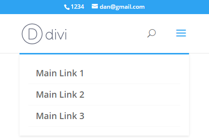
Then your mobile menu will look something like the image on the left (below). We want remove the links from the secondary header (all the "Secondary Link" ones), to get the cleaned up menu shown on the right:
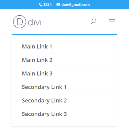
Before: Secondary menu items shown in submenu
Hide Secondary Menu Items in Mobile Menu using Divi Booster
Divi Booster includes an option to exclude the secondary menu items from the mobile menu. You will find it at:
Divi > Divi Booster > Header > Mobile Header > Hide secondary menu items in mobile menu
Hide Secondary Menu Items in Mobile Menu using CSS
To exclude the secondary nav items from the mobile menu, you can use the following bit of CSS:
#mobile_menu li:not([id]) {
	display:none !important;
}
Related Post: Adding CSS to the Divi Theme
This works by detecting whether the items have an id (since the secondary menu items aren't assigned an id by Divi, while the primary menu items are).
Note that there are some situations in which this code won't work, for example, if you are displaying the same menu in both the primary and secondary headers. In that case, try the PHP solution below.
Hide Secondary Menu Items in Mobile Menu using PHP
The CSS code above uses a quirk of Divi – that secondary menu items aren't given IDs – to perform the hiding. A more reliable way is to use PHP to first add a class to the items to explicitly mark them with the menu they are from, like so:
add_filter('wp_nav_menu_objects', 'db105_add_location_class_to_menu', 10, 2);

if (!function_exists('db105_add_location_class_to_menu')) {
	function db105_add_location_class_to_menu($menu_items, $args) {
		if (is_array($menu_items)) {
			foreach($menu_items as $item) {
				if (isset($args->theme_location) && isset($item->classes) && is_array($item->classes)) {
					$item->classes[] = 'dbdb_'.$args->theme_location;
				}
			}
		}
		return $menu_items;
	}
}
Related Post: Adding PHP to the Divi Theme
#mobile_menu li.dbdb_secondary-menu {
	display:none !important;
}
Related Post: Adding CSS to the Divi Theme


Hello,
How can I achieve the opposite? I have a custom link in the secondary menu that I want to remain displayed even on mobile.
Currently it moves automatically into the dropdown box on mobile. How can I keep it on the secondary menu bar on mobile?
Thanks in advance
Don’t worry – I’ve managed to do it with CSS!
Cheers!
Great! I'm glad you were able to figure it out, Jen. Thanks for letting me know :)
Hey, I just used this but the dropdown in the menu no longer works? Any ideas?
Hey Ayaz, are you still having problems with this? I checked the site linked in your comment and everything looks to be working to me – the secondary menu items are hidden and the dropdown within the mobile menu for the "Teams" and "Salons" items are working for me to. But perhaps I'm missing something. If you're still having problems, can you explain in a bit more detail where the issue is / how to trigger it? Thanks!
Hey Dan, does this code still work with the most recent Divi version?
It isn't working on my site. No change when added to child-theme CSS.
(And your codes ALWAYS work! Mad respect.)
Hey Joe, the code is still working as I'd expect on my test site with the latest Divi (3.19.15). I took a look at the site linked in your comment, but it doesn't seem to have the secondary header enabled and I can't see the code anywhere in the CSS loaded by the page. Is there any chance you're able to point to me to an example of the issue? I see on that site, at least, you've got caching / minification going on (which is good, of course!). If you haven't already, I'd try temporarily disabling CSS minification and clearing all caches to see if that gets it working. If not, let me know. Cheers!
Hey, if anyone looks for a code to generally hide submenu items for the mobile menu without having to figure out any single item id, here it is:
/*hide submenu items for mobile menu*/
#main-header .et_mobile_menu li ul, .et_pb_fullwidth_menu .et_mobile_menu li ul {
display:none!important;
}
Thanks for sharing, Yannik :)
Hey, has there been an update to how Divi does this because if I to implement this fix in either the Divi Booster plugin or in the Custom CSS section I just get a blank menu.
Hey Tyler, I just took a look on the latest Divi and there doesn't seem to have been any changes – the code / Divi Booster feature both still work correctly for me. Is there any chance you're able to send me a link to the site you're working on so that I can take a look? Thanks!
Thank you! This was exactly what I was looking for.
Hi, when i'm entering the CSS code, there is no menu (no primary, no secondary) at all. What can be the reason of this issue?
Hi James, I'm not sure what would be causing that for you. Is there any chance you're able to share a link to the site you're working on so that I can take a look at how you have it set up? Thanks!
Sure, just take a look at https://davota.nl
Thanks for that James. I checked the CSS against the site and it is correctly removing the just the secondary menu items in the mobile menu. This makes me think that there might be a problem where you're copying in the CSS. For example, if there was some broken CSS before the added CSS it might be making the "display: none" apply to other elements such as the header. If you're adding the CSS after other CSS (e.g. in the Custom CSS box or a style.css file), try adding it at the beginning before the other CSS. If there's a mistake in that other CSS, then you should see the CSS start working correctly. If that doesn't work, perhaps you'd consider sending me login details to the site (via my contact form) so that I can try it out myself and see if I can spot the problem. Thanks!
Problem solved, thank you for your support!
Sweet. Thanks.
Hi, sorry for my ignorance, but where specifically I should paste the CSS code above?
Best Regards,
Hi Rodrigo, there are a few options. Probably the easiest one is to paste it in Divi's Custom CSS box (Divi > Theme Options > General > Custom CSS), after anything else in there.
This post covers some of the other options: https://divibooster.com/adding-css-to-the-divi-theme/.
Thanks. This is exactly what I needed.
This worked perfectly, but I am in need of a way to stop the PRIMARY menu from displaying mobile.
Hey Jeff, you should be able to remove the primary menu items from the mobile menu with this CSS:
#mobile_menu li[id] { display:none !important; }Thank you!
THX! :-)