By default, the Divi Theme shows the same menu items in both the desktop and mobile versions of the header menu (albeit with different formatting). If you'd like to exclude certain items from showing up in the mobile menu, i.e. making them appear on the desktop menu only, here's how to do it.
Add a CSS class to the menu item
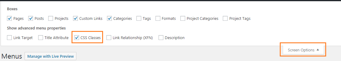
From your WordPress dashboard, go to "Appearance > Menus" and in the "Select a menu to edit:" dropdown, select the menu marked "(Primary Menu)". You should now see the menu items making up the menu in your header.
Now, at the top right of the screen you should see a "Screen Options" tab. Click this, and check the "CSS Classes" box, as shown here:
Hide the Menu Item(s)
Now, add the following CSS to your site:
@media only screen and (max-width: 981px) {
    .desktop-menu-item { display: none; }
}
Related Post: Adding CSS to the Divi Theme
Now when you view your site, the menu item(s) which have been assigned the CSS class should show on the desktop menu, but not in the mobile menu.
Show Menu Items with a CSS Class
If you'd prefer to show only certain menu items, you can give those items a CSS class as above (you may want to choose a different class name, such as "mobile-menu-item" as I do here), and hide the rest with this CSS:
@media only screen and (max-width: 981px) {
    #mobile_menu li:not(.mobile-menu-item) {
        display: none;
    }
}
Hide a menu item, but not its submenu items
To hide a menu item, but show the menu items nested underneath the hidden link, give the "parent" menu items you want to hide a CSS class as above (I'm using "hidden-menu-item" here), and hide them with this CSS:
@media only screen and (max-width: 981px) {
    #mobile_menu li.hidden-menu-item > a {
        display: none;
    }
}

This code worked perfectly, but how do I hide a menu item, but show the menu items nested underneath the hidden link?
Hi Carrie, I've just added a section to the post describing how to do this. Hope it helps!
Thank you!!!
Nice clean solution :)
I was wondering, would it be possible to turn this around? So that you put some CSS in the menu items that you would like to show, and hide the others which do not have that CSS line?
Hey Maarten, I've just added a section at the end of the post describing how to do this. Hope it helps!