Enabling closeable accordion items in your Divi layouts provides visitors with greater control over the content they view, allowing them to close open sections without automatically opening another. This can improve user experience by reducing clutter and helping users focus only on the information they wish to see. In this guide we show you how to set up your Divi Accordion module so that individual items can be closed independently.
Make Divi Accordion Items Closeable Using the Divi Booster Plugin
This method shows how to make the Divi Accordion module's items closeable by enabling the 'Closeable' toggle provided by the Divi Booster plugin. It is a straightforward solution that requires no coding and allows users to easily configure the closeable behavior directly from the module's design settings.
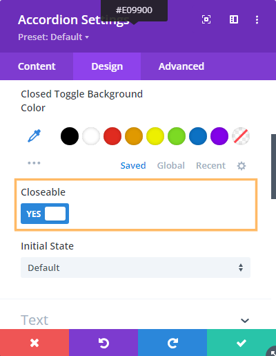
Enable the 'Closeable' Option in Accordion Settings
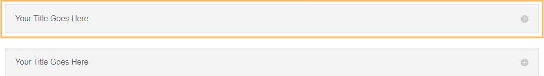
In your existing page or layout where you've added an Accordion module, open the Accordion module's settings. Head to the Design tab, then expand the Toggle section. Here, you'll see the Closeable option. Switch the 'Closeable' toggle to YES to allow users to close each accordion item independently—with no other item automatically opening in its place.
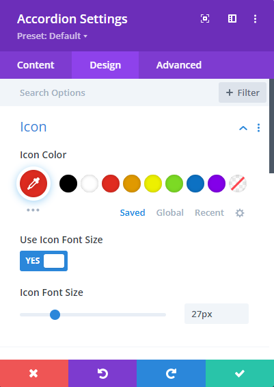
Styling the Close Icon
The close icon added by this feature inherits the styles of the built in "open" icon. That means you can style both the open and close icons using the existing options in the accordion module settings:
If you wish to apply certain styles to the close icon only (i.e. not to the open icon), then you can do so using CSS such as this:
/* Normal state */
.et_pb_accordion .et_pb_toggle_open .et_pb_toggle_title:before {
	color: grey !important;
}

/* Hover state */
.et_pb_accordion .et_pb_toggle_open .et_pb_toggle_title:hover:before {
	color: blue !important;
}
Related Post: Adding CSS to the Divi Theme
The example above will make the icon grey normally, changing to blue when hovered.
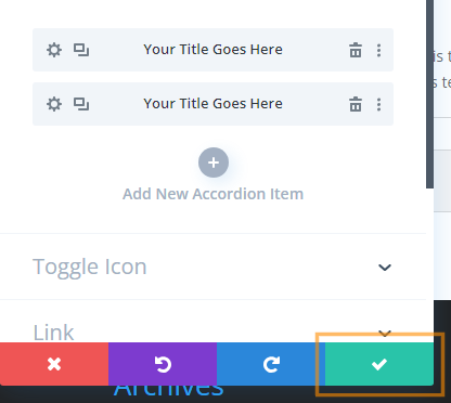
Save and Publish Your Changes
After enabling the 'Closeable' setting, simply click the green checkmark to save the Accordion module settings. Then, use the Divi Builder's toolbar at the bottom of the page to publish your changes and exit the visual builder. Your changes are now live!

Test the Closeable Accordion Feature
View your page on the front-end. Click the title of any accordion item to close it. Notice that you can now close all accordion items, leaving the accordion fully collapsed if you wish.

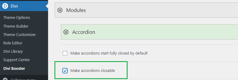
(Optional) Making All Accordion Modules Closeable using Divi Booster
It is also possible to make all accordions on the site closeable using the option found under "Modules > Accordion" on the Divi Booster settings page. This option has been available since Divi Booster v1.9.9.
Make Divi Accordion Module Items Closeable using jQuery and CSS in Theme Options
This method explains how to make items in the Divi Accordion module independently closeable by adding custom jQuery and CSS code in the Theme Options integration area. By following these steps, you gain more control over accordion behavior without needing third-party plugins, making it a flexible solution for customizing your site's interactivity directly from the Divi settings.
Add Custom jQuery and CSS in Divi Theme Options
Navigate to the Divi > Theme Options page in your WordPress dashboard, and go to the Integration tab. In the section labeled 'Add code to the of your blog,' paste in the following code. This script and style allow users to close open accordion items with a click.
<script>
jQuery(function($){
  $('.et_pb_toggle_title').click(function(){
    var $toggle = $(this).closest('.et_pb_toggle');
    if (!$toggle.hasClass('et_pb_accordion_toggling')) {
      var $accordion = $toggle.closest('.et_pb_accordion');
      if ($toggle.hasClass('et_pb_toggle_open')) {
        $accordion.addClass('et_pb_accordion_toggling');
        $toggle.find('.et_pb_toggle_content').slideToggle(700, function() {
          $toggle.removeClass('et_pb_toggle_open').addClass('et_pb_toggle_close');

        });
      }
      setTimeout(function(){
        $accordion.removeClass('et_pb_accordion_toggling');
      }, 750);
    }
  });
});
</script>
<style>
.et_pb_accordion .et_pb_toggle_open .et_pb_toggle_title:before {
    display: block!important;
    content: "\e04f" !important;
}
</style>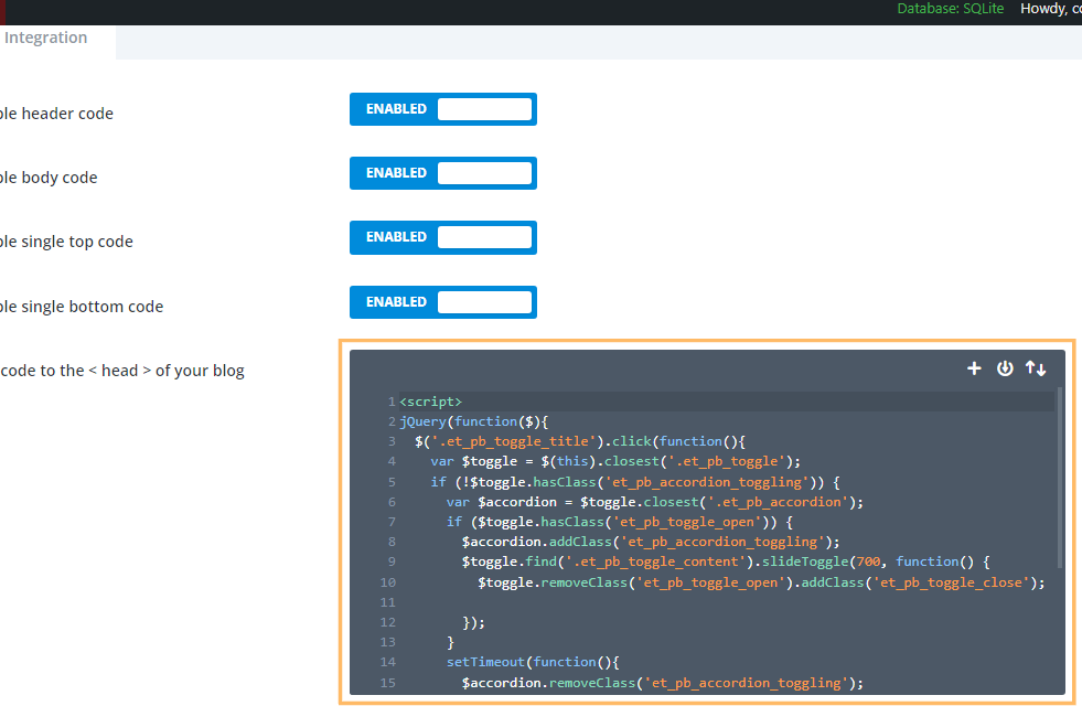
Save Theme Option Changes
Once you have pasted in the code, click the Save Changes button at the top of the Theme Options page to apply your new settings.

Insert an Accordion Module and Publish
Add an Accordion module to your desired row using Divi Builder. You can style your accordion as usual—no changes are needed in the module settings to enable closeable functionality with this method. When you're finished, save your module and publish the page.
Test Your Closeable Accordion
On the front-end, test your accordion by clicking any accordion item’s title to open or close it. Thanks to your custom code, you (and your visitors) can now collapse all sections without having to keep any of them open.
Adding a Second Close Icon at the Bottom of Toggles
If your accordion toggles contain a lot of text, you may want to add a second close icon at the bottom to save your users having to scroll all the way back to the top of the text to close the toggle. Here's the code to do this. It should be used in addition to either the Divi Booster / manual methods given above. The code can be placed either in a code module on the page in question, or in the "Divi > Theme Options > Integrations > Add Code to the Head of your Blog" box.
<script>
jQuery(function($){
	$('.et_pb_toggle_title').each(function(){
		var $title = $(this);
		var $closebar = $title.clone(true).addClass('db_pb_toggle_close2').html(' ');
		$title.closest('.et_pb_toggle').append($closebar);
	});

  	$('.db_pb_toggle_close2').click(function(){ // Listen for clicks on the close bar
    		var $toggle = $(this).closest('.et_pb_toggle');
    		var mainAreaOffset = $('#et-main-area').length ? $('#et-main-area').offset().top : 0;
    		$('html, body').animate({scrollTop: $toggle.offset().top - mainAreaOffset - 16}, 700); // Scroll considering the main area's top offset
  	});
});
</script>
<style>
	.et_pb_toggle_close .db_pb_toggle_close2 {
		display: none;
	}
	.db_pb_toggle_close2 {
		margin-top: 10px;
		visibility: hidden;
	}
	.db_pb_toggle_close2:before {
		visibility: visible;
	}
</style>
Conclusion
Allowing visitors to close accordion items adds flexibility and improves navigation in your Divi layouts. You can achieve this easily with the Divi Booster plugin or by inserting a simple code snippet into your Theme Options. Enjoy a cleaner, more interactive accordion experience!


It took some help but now I have it working with a different icon for the close!
#page-container .et_pb_toggle_open .et_pb_toggle_title:before {
display: block !important;
content: "\42"!important;
}
Nice one, Sheila! I'm glad you were able to get it working and thanks for sharing! :)
I must say. I purchased lifelong DIVI BOOSTER package in 2018. I forgot about it. I really needed to find a solutions for a large site I am working on and when I Googled for the solution, I found this page. I checked my files and found my login to your website. All the details were there and it saved my day!
So, I just wanted to say thank you for being here for over 6 years! I just think that is really cool. What great value!
Clayton, you just made my day. Thank you! :)
Hello, I have a question, I have added the code but on Safari it doesn't work, do you know why?
Hi Bryan, sorry I'm only just responding now. I'm not sure yet why it's not working on Safari for you. I just checked on my test site and it seems to be working correctly on Safari. If you haven't already, try clearing the browser cache in Safari. If that doesn't help, are you able to share a link to the page you're working on so that I can check it out for you? Thanks!
Thank you! Amazing post!
You're welcome, Renzo!
Hey there! I've followed the instructions and the icon appears, but it doesn't close the accordion module. Any ideas why this might be the case? Thank you!
Hey Gillian! Thanks for reaching out. It sounds like an issue with the jQuery code – either it isn't working on your site or something is blocking it from running. Are you able to share the URL of the page where you've set up the accordion so I can take a closer look? In the meantime, try clearing your caches just to make sure you're not seeing an older version the page. Thanks! Dan
Thank you.This one solve my problem.
Great! Glad it helped SuB HerO :)
Thank you very much! It's great!
You’re very welcome, Mikhail!
how can i style the icon you added to the toggle tab when closed?
Hey Christina, I've just added a section to the post on styling the close icon. The process is the same, regardless of which method you used to make the accordion closeable. If you need any help getting it to look how you want, just let me know (with a link to the page you're working on, if possible). Thanks!
I have added the code as instructed but my accordions still done close. I know the code is working but this line never gets true if ($toggle.hasClass('et_pb_toggle_open')) {
As other people have this working I am wondering what I am doing wrong.
Hey Ralf, the code is still working for me in the latest version of Divi, so I'm not sure yet why it's not working for you. Is there any chance you're able to share a link so that I can take a look?
The 'et_pb_toggle_open' class is applied by Divi to any open toggles in the accordion, so that line should in theory be true whenever the clicked accordion toggle is initially open…
I just implemented this solution, but in a slightly different way. Rather than putting the javascript in the Theme Options > Integration > Head of my site, I put the script in a Code Module BELOW the Accordion Module, right on the page. I did this so that the script only loaded on the page where I needed it.
The solution is working as expected – thank you for sharing this solution!!
Is there a way to force the accordion to be all closed by default?
You're welcome, Jono. The code module is a great way to load Javascript on a single page – good to hear the code works in this configuration. Thanks! This post describes how to start accordions closed by default:
https://divibooster.com/make-divi-accordions-closed-by-default/
You should be able to place that in the same code module (or an additional one), if you wish. Hope it helps.
I try with with both code you mentioned, and three of your CSS working together, the site is working fine now!
Thank you very very much for your share.
however, do you know how to add ICON to Accordion?
Hi Jasper, you're very welcome. Am I right in thinking you've got the close icon displaying now, and you'd like to add an additional icon? If so, perhaps this will do what you want:
https://divibooster.com/add-icons-to-accordion-module-titles/
Let me know if that isn't what you need. Thanks!
How can I change the icon in the open-state? It's still the same when I open it what doesn't make any sense as I want a "-" sign to close and a "+" sign to open. Please help
Hey Carola, both the Divi Booster feature and the manual method (if you follow the optional step 2) should give a "-" sign for closing the accordion tabs. But if it isn't working for you, is there any chance you're able through a link to the page you're working on so that I can take a look for you? Cheers!
Same for me. Got the +, cant get a – to display. I have changed the icon for the toggle in the Divi panel, nothing makes a difference. I have implemented your code exactly as described.
This site references your code and says the icon is there, but offscreen. However, his code does not toggle the icon either.
https://wellmadewebsite.co.uk/how-to-make-divi-toggle-accordians-closeable-and-start-closed/
Hey Maurice, it looks like Divi's own styles are taking priority. I've updated the CSS in the post to be slightly more specific, which means it should override Divi's own styles and get the (-) icon showing. Note that the issue isn't one of positioning as that site suggests. The version of the code posted there also doesn't work as-is because the quotation marks are being modified from straight to curly quotes. Hope that helps!
That worked great! Thank you very much
Great! You’re very welcome, Maurice!
Hello, this is very useful thank you!
However, I can't seem to figure out why my close icon is disappearing. I'm still able to click on it and make it close but it is not visible.
Any help would be appreciated: https://empirecg.com.au/clients/yarra-valley-cheese/2021/08/31/camembert-200g/
Hey Stephanie, I can't see the CSS for adding the close icon being applied to your site. If you haven't added it yet, here it is (same as in the post):
.et_pb_toggle_open .et_pb_toggle_title:before {
	display: block !important;
	content: "\e04f";
}
Try adding it in the "Divi > Theme Options > General > Custom CSS" box to see if that works.
If you've already added it / it still doesn't show, I can see you've got some form of caching on your site. Try clearing your caches and refreshing the page – hopefully that will get it showing up.
Let me know if that doesn't fix it. Thanks!
P.S. I tested the CSS above against your site and it made the close icon show correctly, so once it's getting added to the live page you should be good to go.
Hello, Dan. I have exactly same problem with Stephanie Parr, the close icon works fine, but its not show up on the page…
By the way, what you shared is very very useful, thank you.