The Divi theme comes with a Social Media Follow module which lets you add icons for various social networks, including Instagram. By default, the Instagram icon has the old-style red background. If you'd rather use Instagram's newer yellow / purple color gradiant for the background, this post explains how.
Adding a Background Gradiant to the Instagram Icon
First, let's look at the case where we change the background of the instagram icon, like so:
Changing the Instagram Background with CSS
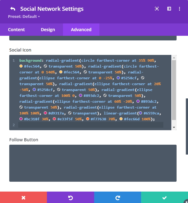
The Instagram background can be changed relatively easily by pasting some CSS into the Social Media Module.
First, here's the CSS:
background: radial-gradient(circle farthest-corner at 35% 90%, #fec564, transparent 50%), radial-gradient(circle farthest-corner at 0 140%, #fec564, transparent 50%), radial-gradient(ellipse farthest-corner at 0 -25%, #5258cf, transparent 50%), radial-gradient(ellipse farthest-corner at 20% -50%, #5258cf, transparent 50%), radial-gradient(ellipse farthest-corner at 100% 0, #893dc2, transparent 50%), radial-gradient(ellipse farthest-corner at 60% -20%, #893dc2, transparent 50%), radial-gradient(ellipse farthest-corner at 100% 100%, #d9317a, transparent), linear-gradient(#6559ca, #bc318f 30%, #e33f5f 50%, #f77638 70%, #fec66d 100%);
Social Media Follow Settings > Social Network Settings {for your Instagram icon} > Advanced > Custom CSS > Social Icon
And paste in the CSS above like so:
Adding a Foreground Gradiant to the Instagram Icon
Now, let's look at the case where we change the color of the instagram icon itself, not the background. i.e:
Changing the Instagram Icon Color with CSS
The Instagram foreground can be similarly changed by pasting some CSS into the Social Media Module.
In this situation, we need some different CSS, and unfortunately this CSS can't be applied via the module's Custom CSS fields. Instead we can add it into the "Divi > Theme Options > General > Custom CSS" box, from where it will be applied to all usage of the Instagram icon in the social media module site-wide.
.et_pb_social_media_follow .et-social-instagram a.icon {
    background-color: #fff0 !important;
}
.et_pb_social_media_follow .et-social-instagram a.icon:before {
    background: radial-gradient(circle farthest-corner at 35% 90%, #fec564, transparent 50%), radial-gradient(circle farthest-corner at 0 140%, #fec564, transparent 50%), radial-gradient(ellipse farthest-corner at 0 -25%, #5258cf, transparent 50%), radial-gradient(ellipse farthest-corner at 20% -50%, #5258cf, transparent 50%), radial-gradient(ellipse farthest-corner at 100% 0, #893dc2, transparent 50%), radial-gradient(ellipse farthest-corner at 60% -20%, #893dc2, transparent 50%), radial-gradient(ellipse farthest-corner at 100% 100%, #d9317a, transparent), linear-gradient(#6559ca, #bc318f 30%, #e33f5f 50%, #f77638 70%, #fec66d 100%);
    -webkit-background-clip: text;
    -webkit-text-fill-color: transparent;
    color: #fff0 !important;
}
Related Post: Adding CSS to the Divi Theme
Once added, it should override the colors set within the social media module.
Note: This CSS code won't work with Internet Explorer, which will instead show the gradient as a background, similar to the effect shown earlier in this post.
Note: If you'd like to apply the effect only on hover, use this CSS instead:
Hover-only version:
.et_pb_social_media_follow .et-social-instagram a.icon:hover {
    background-color: #fff0 !important;
}
.et_pb_social_media_follow .et-social-instagram a.icon:hover:before {
    background: radial-gradient(circle farthest-corner at 35% 90%, #fec564, transparent 50%), radial-gradient(circle farthest-corner at 0 140%, #fec564, transparent 50%), radial-gradient(ellipse farthest-corner at 0 -25%, #5258cf, transparent 50%), radial-gradient(ellipse farthest-corner at 20% -50%, #5258cf, transparent 50%), radial-gradient(ellipse farthest-corner at 100% 0, #893dc2, transparent 50%), radial-gradient(ellipse farthest-corner at 60% -20%, #893dc2, transparent 50%), radial-gradient(ellipse farthest-corner at 100% 100%, #d9317a, transparent), linear-gradient(#6559ca, #bc318f 30%, #e33f5f 50%, #f77638 70%, #fec66d 100%);
    -webkit-background-clip: text;
    -webkit-text-fill-color: transparent;
    color: #fff0 !important;
}

0 Comments