This post describes how to show, hide or toggle Divi Builder elements at the click of a button.
Reveal Elements on Click using Divi Show / Hide Module
Divi Show / Hide Button Module is a plugin I designed to make it easier to implement some of the effects described later in this post – without the need to mess around with jQuery code.
It is a modified version of the built-in Divi Button module. Rather than linking to another page, it lets you show, hide and toggle the visibility of elements on the same page. It can be styled the same way as the standard button module.
Check out the Divi Show / Hide Button Module here.

Reveal Elements on Click Using CSS / JQuery
Rob over at Divi Notes has a nice post on how to reveal a Divi section, row or module when a button is clicked. I've made what I think are a couple of improvements, which are shared below. The changes include:
- Preventing the hidden component from being briefly displayed when the page loads
- Support for multiple hidden sections / reveal buttons
- No hiding of the component in the visual builder for easier editing
Here are the steps to making a Divi Builder element (module, etc) displayed on the click of a button (and re-hidden if the button is clicked again).
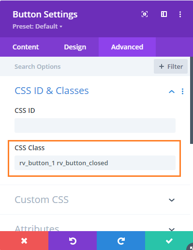
Step 1: Add the "reveal" button and give it a class
Add a Button Module to your page that you want to use to show / reveal the target element.
Then set
Button Settings > Advanced > CSS ID & Classes > CSS Class
to
rv_button_1 rv_button_closed
like so:
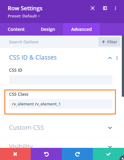
Step 2: Add the hidden element and give it a class
Now add the element you want to show / hide. This can be a section, row or module. Go to the settings for the element, e.g.
{Element} Settings > Advanced > CSS ID & Classes > CSS Class
And add the following to the CSS Class field:
rv_element rv_element_1
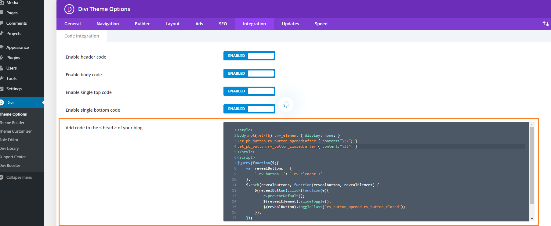
Step 3: Add the following CSS / JavaScript code to your site
<style>
body:not(.et-fb) .rv_element { display: none; }
.et_pb_button.rv_button_opened:after { content:"\32"; }
.et_pb_button.rv_button_closed:after { content:"\33"; }
</style>
Related Post: Adding CSS to the Divi Theme
<script>
jQuery(function($){
	var revealButtons = {
		'.rv_button_1': '.rv_element_1'
	};
	$.each(revealButtons, function(revealButton, revealElement) {
		$(revealButton).click(function(e){
			e.preventDefault();
			$(revealElement).slideToggle();
			$(revealButton).toggleClass('rv_button_opened rv_button_closed');
		});
	});
});
</script>
Related Post: Adding JavaScript / jQuery to Divi.
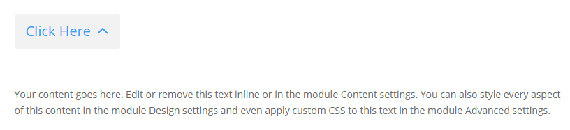
Step 4: Publish and view the page
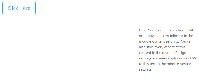
If all has gone well, the element should be hidden on the page. Clicking on the reveal button should reveal the element, and clicking a second time should hide it again.
If you have any trouble getting it to work, let me know in the comments or via the contact form.
It should look something like this:
Before:

Advanced: Adding more reveal buttons
If you want to add further reveal buttons (which reveal their own elements), you can do it like so:
- Give each new reveal button its own CSS class, for example "rv_button_2" for the second reveal button, "rv_button_3" for the third and so on.
- Give each new hidden element its own CSS class, for example "rv_element rv_element_2" for the second element, "rv_element rv_element_3" for the third, and so on.
- Modify the JavaScript code to include these new classes, e.g.
<script>
jQuery(function($){
	var revealButtons = {
		'.rv_button_1': '.rv_element_1',
		'.rv_button_2': '.rv_element_2',
		'.rv_button_3': '.rv_element_3'
	};
	$.each(revealButtons, function(revealButton, revealElement) {
		$(revealButton).click(function(e){
			e.preventDefault();
			$(revealElement).slideToggle();
			$(revealButton).toggleClass('rv_button_opened rv_button_closed');
		});
	});
});
</script>
Advanced 2: Showing and hiding elements on click
If you want to do something more than just revealing an element when the reveal button is clicked, here's an extended version of the code above, which adds the ability to show, hide and toggle multiple elements from the same button. This lets you do things like hide an element when revealing another, or replacing the reveal button with content (by hiding the reveal button once clicked).
<style>
body:not(.et-fb) .show-on-click,
body:not(.et-fb) .toggle-on-click {
	display: none;
}
.et_pb_button.rv_button_opened:after { content:"\32"; }
.et_pb_button.rv_button_closed:after { content:"\33"; }
</style>
<script>
jQuery(function($){
	var buttons = {
		'.rv_button_1': {
			'toggle': '.toggle-on-click',
			'hide'  : '.hide-on-click',
			'show'  : '.show-on-click'
		}
	};
	$.each(buttons, function(button, elements) {
		$(button).click(function(e){
			e.preventDefault();
			$(elements.toggle).slideToggle();
			$(elements.show).slideDown();
			$(elements.hide).slideUp();
			$(button).toggleClass('rv_button_opened rv_button_closed');
		});
	});
});
</script>
The biggest change is that the buttons array now defines "toggle", "hide" and "show" values for the button(s).
- "toggle" takes a comma-separated list of CSS selectors which will be alternated between hidden and visible with each click of the reveal button. This is the default behavior of the earlier code examples.
- "hide" takes a comma-separated list of CSS selectors which will be hidden when the button is clicked. Subsequent clicks won't affect their visibility.
- "show" takes a comma-separated list of CSS selectors which will be displayed when the button is clicked. Subsequent clicks won't affect their visibility. It makes sense to hide such elements initially using CSS, as done for the ".show-on-click" class in the style block above.
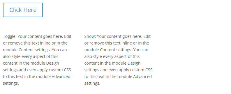
Setup the button as per step 1, and give each element you want to be affected by the button the appropriate class (in the case of the example code this would be either "toggle-on-click", "hide-on-click" or "show-on-click").
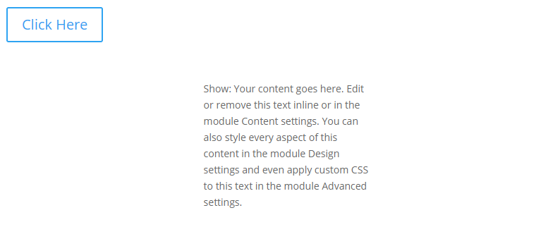
Now you should see an effect similar to this (left column is set to toggle, center to show, and right to hide):
Initial state:
After first click:
After second click:
Advanced 3: Changing the Open / Close Icons
you can change the open / close icon from the default up / down arrow by changing these lines of CSS:
.et_pb_button.rv_button_opened:after { content:"32"; }
.et_pb_button.rv_button_closed:after { content:"33"; }
Here '32' is the code for the up arrow icon and '33' is the code for the down arrow icon. You can easily change this to another icon from this list:
https://www.elegantthemes.com/blog/resources/elegant-icon-font
Go to the "Complete Set and Unicode Reference Guide" section and then locate your desired icon(s). Take the part of the icon's code as shown here:
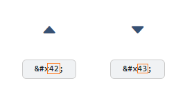
.et_pb_button.rv_button_opened:after { content:"42"; }
.et_pb_button.rv_button_closed:after { content:"43"; }
Advanced 4: Hiding Other "Tabs" Initially
If you have several reveal buttons and want to create a "tabbed" effect, you may wish to simulate a click on the first reveal button to hide the content of the other "tabs". Here's two ways to do it:
1) Hide the other tab content elements initially via CSS, such as:
.rv_element_2,.rv_element_3,.rv_element_4 {
	display: none;
}
Note that you may need to change these class names to match your setup.
You can add this into your child theme style.css file or the "Divi > Theme Options > General > Custom CSS" box.
2) Trigger a click event on the button using jQuery. You should be able to do so by adding this after the jQuery code you've already added above:
jQuery(function($){
	$('.rv_button_1').click();
});
Where "rv_button_1" is the class assigned to your first "tab" button.
The two options should achieve pretty much the same result, but there are some slight differences. The first option will apply immediately, while the second option only applies once the page is fully loaded, which might lead to the rows being briefly visible while the page is loading. The second option, though, more accurately simulates a button click which might be useful if you ever attach more complex behavior to the button.
Related post: Creating Tabs using the Divi Show / Hide Button Module
Advanced 5: Sliding the Revealed Element Left / Right
In the examples above, the element being revealed slides up / down as it is revealed / hidden. There isn't an equivalent way in jQuery to instead slide it left / right. However, we can achieve a left / right slide effect by additionally making use of the jQuery UI library.
First, install the jQuery UI library on your page / site following the instructions on the jQuery UI site. This will likely involve adding a script tag such as this to your site:
<script src="https://cdnjs.cloudflare.com/ajax/libs/jqueryui/1.13.2/jquery-ui.min.js" integrity="sha512-57oZ/vW8ANMjR/KQ6Be9v/+/h6bq9/l3f0Oc7vn6qMqyhvPd1cvKBRWWpzu0QoneImqr2SkmO4MSqU+RpHom3Q==" crossorigin="anonymous" referrerpolicy="no-referrer"></script>Important: To get jQuery UI to work correctly, you may also need to disable Divi's jQuery Deferral option at:
Divi > Theme Options > General > Performance > Defer jQuery And jQuery Migrate
This in the original example (given at the top of this post), replace the line that reads:
$(revealElement).slideToggle();With this (to slide right):
$(revealElement).toggle("slide", { direction: "left" }, 1000);Or this (to slide right):
$(revealElement).toggle("slide", { direction: "right" }, 1000);It is worth noting that loading jQuery UI and disabling Divi's jQuery Deferral may impact the page / site speed to some degree, so be sure to check that you are happy with the resulting site performance when implementing this.
Advanced 6: Deactivating Previously Active Buttons
In the above examples, a button which has been clicked becomes "active" and can be styled using the "rv_button_opened" class added to it. When the button is clicked again the class is removed, removing the active styling. However, buttons added using the instructions above act independently: activating one button doesn't "deactivate" the others. If you would actually like a newly active button to deactivate others (so you only have one button active at a time), then one way to handle this situation is to modify the code such that when the button is clicked, it removes the rv_button_opened class from the other buttons. Adding a line like this should do it:
$('.et_pb_button.rv_button_opened').not(revealButton).removeClass('rv_button_opened').addClass('rv_button_closed');This is how it would look added to the code in the "Advanced: Adding more reveal buttons" section:
jQuery(function($){
	var revealButtons = {
		'.rv_button_1': '.rv_element_1',
		'.rv_button_2': '.rv_element_2',
		'.rv_button_3': '.rv_element_3'
	};
	$.each(revealButtons, function(revealButton, revealElement) {
		$(revealButton).click(function(e){
			e.preventDefault();
			$(revealElement).slideToggle();
			$(revealButton).toggleClass('rv_button_opened rv_button_closed');
			$('.et_pb_button.rv_button_opened').not(revealButton).removeClass('rv_button_opened').addClass('rv_button_closed');
		});
	});
});
Note that if you use it with the code in "Advanced 2: Showing and hiding elements on click" you'd instead need to use:
$('.et_pb_button.rv_button_opened').not(button).removeClass('rv_button_opened').addClass('rv_button_closed');(as it uses "button" as the variable name, instead of "revealButton").
For users of the Divi Show / Hide Button module, the grouping option can be used to make a set of buttons act as a group with only one button active at a time. The currently active button can then be styled using the active button styling options.
Advanced 7: Only Show the Button on Mobile
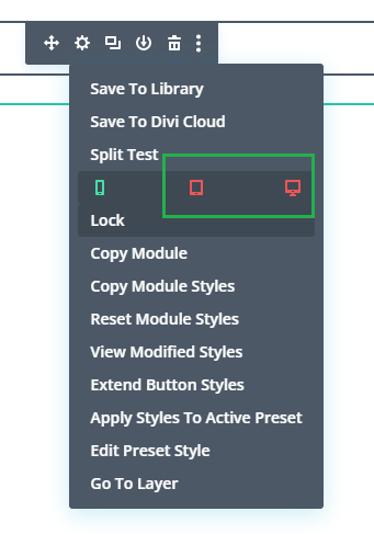
To only show the button on mobile:
1. Click on the "disable" option in the button module's menu:
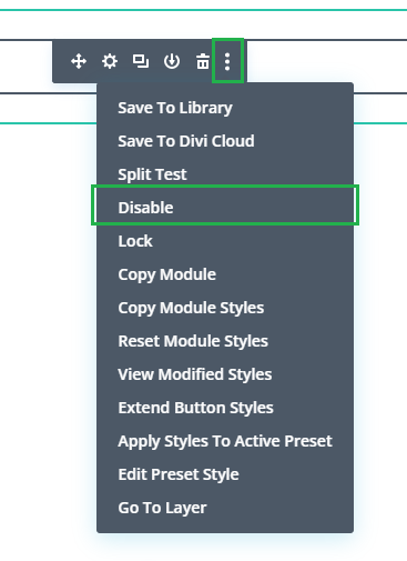
2. Click on the "tablet" and "desktop" icons, to disable the button module on those devices. This will make the button show on mobile only.
3. Wrap the CSS code from the tutorial in a "media query" which will make the CSS code only apply on mobile (leaving the filters visible on tablet / desktop). For example, if you are using this CSS from above:
<style>
body:not(.et-fb) .rv_element { display: none; }
.et_pb_button.rv_button_opened:after { content:"\32"; }
.et_pb_button.rv_button_closed:after { content:"\33"; }
</style>
You'd change it to this:
<style>
@media only screen and (max-width: 980px) {
	body:not(.et-fb) .rv_element { display: none; }
	.et_pb_button.rv_button_opened:after { content:"\32"; }
	.et_pb_button.rv_button_closed:after { content:"\33"; }
}
</style>

This is great, thank you so much! I've been trying to see if there is a way to have an icon only on the button. Would you know if that's possible?
Hey Libby, are you using the standard Divi button module? If so, this might help you:
https://divibooster.com/create-an-icon-only-divi-button/
If you're using the Divi Show / Hide Button, let me know, as the instructions in that post won't work without some adjustments. Thanks!
Hey Dan, yes I was using the standard Divi button module. Thanks for the link, I think that will get me to where I want to be. Thank you for your speedy reply.
You’re very welcome, Libby :)
Brilliant, sincere thanks.
You’re welcome, Mark :)
Dan, I added
body:not(.et-fb) .rv_element { display: none; }
to the beginning of the CSS and now everything works. Thank you again for your code and for answering people's questions! I finally got it!
Great, I'm glad you were able to figure it out, Laura! Thanks for sharing your solution :)
Hi Dan, thank you so much for this! Your code is working great on my site except I have one problem: for some reason the sections all default to open. Could you help me figure out how to have them closed when the page opens? Thank you so much!
Hi Dan, this has been a great tool for me to use on my websites. Is it possible for one button to toggle multiple items but have their initial state on the site vary in appearance? For example, I have a section that appears once a button is clicked but it gets in the way of another module on my site. I would like that section to disappear once the new one appears and then they can toggle back on and off when the button is clicked.
Hey Evan, this should certainly be possible. The basic idea would be to hide one section (say “#section1”) initially but leave the other showing (say “#section2”). Then simply configure the button to toggle both of them by specifying them in a comma separated list (i.e. “#section1, #section2”). That will alternate the visibility of the two sections with each button press. I hope that helps, but let me know if you need help implementing it (and if so whether you’re using the show/hide button plugin or just manually adding the code). Thanks!
Hi, I am not sure why is this happening, but the element I am trying to hide before the button is clicked it not hiding? and then once I click the button it hides?
How can I fix this so that the element should be hidden on the page. Clicking on the reveal button should reveal the element.
Hey A, any chance you're able to share a link to the page you're working on / point out the element in question so that I can look into it for you? Thanks!
Hi Dan,
I've used the Advanced 2 code to open/close various elements and it works like a charm; however I would like to add in a button at the bottom of each section to toggle close the open section so that all elements are hidden.
I would really appreciate your help. I have temporarily placed a button at the bottom of each section to return to the section above that holds the reveal buttons.
The page that I'm working on has not been published yet as I wouldn't want anyone to stumble across it while I'm still working on the design.
Hi Yolandi. It should be possible to do this in basically the same way – give each section a CSS class in "Section Settings > Advanced > CSS ID & Classes > CSS Class" – which you've probably already done in order to open / close them. Here I'll assume you've used "my_section". Then give your bottom button a class such as "close_button" ("Button Settings > Advanced > CSS ID & Classes > CSS Class") and either repeat the Advanced 2 Code with the new classes, or change the part that reads:
var buttons = {
	'.rv_button_1': {
		'toggle': '.toggle-on-click',
		'hide'  : '.hide-on-click',
		'show'  : '.show-on-click'
	}
};
To include an entry for the second button. Something like this:
var buttons = {
	'.rv_button_1': {
		'toggle': '.toggle-on-click',
		'hide'  : '.hide-on-click',
		'show'  : '.show-on-click'
	},
	'.close_button': {
		'toggle': '',
		'hide'  : '.my_section',
		'show'  : ''
	}
};
Now when you click on any button with the "close_button" class, it should hide any section named "my_section".
I hope that helps, but if not perhaps you'd be able to give me access to an example page – e.g. by sending login details via the contact form?
Thanks!
I have been searching for this kind of feature, and finally, this has actually helped me a lot. Only one issue I have at the moment. I want the revealed content to open on top of the button, not below. Is there CSS for this? or Jquery codes?
Thank you in Advance.
Hi Msilikale, hopefully I'm understanding correctly. You should be able to place the revealed content and the reveal button anywhere on the page, independently. This means you can simply move the reveal button module below the content element in your Divi Builder layout. Then the content will appear above the button when clicked. Hope that makes sense / is what you need, but let me know if I've misunderstood what you need. Thanks!
Hey Dan! Thank you so much for this post. Im only in the beginning of website building.
Maybe you can help me with my problem: Is it possible to close for example "rv_element_1" and "rv_element_2 " on the click of "rv_button_3" while "rv_button_3" still opens "rv_element_3"?
Im not sure if thats the question Andrew asked or if that request is just so simple and i am a bit dumb.
Anyway thanks for the help! It is so much fun to learn!
Have a great Week!
Tobi
Hey Tobias,
This is what the "Advanced 2: Showing and hiding elements on click" section of the post is about. To do what you are asking, you'd probably want to change the code in that section that reads:
var buttons = {
	'.rv_button_1': {
		'toggle': '.toggle-on-click',
		'hide'  : '.hide-on-click',
		'show'  : '.show-on-click'
	}
};
To something like:
var buttons = {
	'.rv_button_1': {
		'toggle': '',
		'hide'  : '.rv_element_2,.rv_element_3',
		'show'  : '.rv_element_1'
	},
	'.rv_button_2': {
		'toggle': '',
		'hide'  : '.rv_element_1,.rv_element_3',
		'show'  : '.rv_element_2'
	},
	'.rv_button_3': {
		'toggle': '',
		'hide'  : '.rv_element_1,.rv_element_2',
		'show'  : '.rv_element_3'
	}
};
I haven't had a chance to test that change for you yet, but hopefully it works. Let me know if not, or if you need any more help with it.
It's great that you're having a go at the code and I hope you stick at it. But if you (or anyone else) wants a no-code approach to creating button-based tabs, it can be done with my Divi Show / Hide Button module, as described here:
https://divibooster.com/creating-tabs-using-the-divi-show-hide-button-module/
Hope that helps!
Hey! Thanks for this article. How would I close all but 1 element on a button click or define which elements are visible on the button click?
Hey Andrew, the code in the "Advanced 2: Showing and hiding elements on click" section of the post should cover this. These lines:
are where you can enter the selectors (CSS ID, CSS class, etc) to hide and/or show when the button is clicked. If have any trouble getting it to work, perhaps you can send me a link to the page your working on so that I can take a look and try to advise you on the specifics?
Alternatively, you might like to take a look at the Divi Show / Hide Button I just released yesterday – it is basically a version of the Divi Button module that incorporates this code so you don't need to add / modify it yourself.
Dan, thanks for the help on the previous question. I have another. In the page that I am using this reveal feature, I have applied it to an entire section with content. When I click the button, the section seems to reveal towards the right of the screen then stretches across. Is there a fix for this? I can supply the URL if necessary. I know this is something my client will surely notice. Thanks!
Hey Chris, yeah if you can send through the URL, that would be great – that way I can make sure I'm addressing the correct issue. You can send it via the contact form if you don't want to share it publicly. Cheers!
Hi Dan, this is great, thanks! Question… how do I change the down icon to match the other icons that I am using throughout the website? I would like to have a filled triangle if possible.
Hey Chris, I've just added a new section, "Advanced 3: Changing the Open / Close Icons", to the post which explains how to do this. I hope it fits your needs, but let me know if not. Thanks!
Thanks Dan! This worked great!