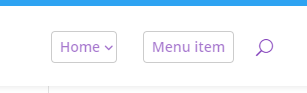
Here's how to add a simple border round the main menu links in the Divi Theme's primary header.
Adding a box round all menu items
The menu links in the Divi main header can be a bit tricky to style when it comes to borders. The reason for this is that Divi applies padding to the bottom of the links to control the height of the header itself (as the padding pushes the bottom of the header down). In CSS a border applied to an element surrounds the padding too. This means that a simple attempt to set a border on the menu links will result in a border that stretches from the top of the link to the bottom of the header – probably not what you want.
To solve this, we can change this extra bottom padding to extra bottom margin instead. The margin will still control the size of the menu, but allow a border to surround just the element and our choice of padding.
Here is the CSS code to achieve this. There are a few complications, which I explain below:
/* Add a border round main menu items */
@media only screen and (min-width: 981px) {

    #top-menu > .menu-item > a {

        /* Apply border */
        border: 1px solid #ccc;
        border-radius: 4px;

        /* Set size of border */
        padding: 8px !important;
        top: -8px;

        /* Correct the space below the menu */
        margin-bottom: 15px; /* (old padding-bottom) - (2 * new padding) - (2 * border width) = 33px-16px-2px */
    }

    /* Make space for submenu "arrows" */
    #top-menu > .menu-item.menu-item-has-children > a {
        padding-right: 16px !important;
    }

    /* Correct the position of the arrows */
    #top-menu > .menu-item.menu-item-has-children > a:after {
        top: 8px; /* Same as padding amount from above*/
    }
}
Related Post: Adding CSS to the Divi Theme
The first thing to pay attention to is the padding. This determines the size of the box round the menu links. Here I've used a padding of 8px, which means that there will be 8px of space between the menu link text and the edges of the box. To get this to work correctly, it's necessary to add this 8px in several places. As you'll see, "8px" appears in 3 places in the code above (once negative). Replace all of these with the same value if you want a different padding amount.
The next thing to deal with is the margin. You probably want the bottom of the header to remain where it is. This requires setting the margin equal to the original padding, but then removing the extra height added by padding and border we added. I've included the calculation in the comments in the code above – on my test site it worked out to 15px – but the easiest way is probably just to try a few different values until it looks the same as before.
Adding a box around a single menu item
If you'd like to add a box round just one item in the menu, you can do so with a slightly modified version of the code from above, like so:
/* Add a border round main menu items */
@media only screen and (min-width: 981px) {

    /* Setup */
    #top-menu > .menu-item > a {
        border-radius: 4px;
        /* Set size of border */
        padding: 8px 0 !important;
        top: -8px;
        /* Correct the space below the menu */
        margin-bottom: 15px; /* (old padding-bottom) - (2 * new padding) - (2 * border width) = 33px-16px-2px */
    }
    /* Make space for submenu "arrows" */
    #top-menu > .menu-item.menu-item-has-children > a {
        padding-right: 16px !important;
    }
    /* Correct the position of the arrows */
    #top-menu > .menu-item.menu-item-has-children > a:after {
        top: 8px; /* Same as padding amount from above*/
    }

    /* Apply box round the 3rd item in the menu */
    #top-menu > .menu-item:nth-child(3) > a {
        border: 1px solid #ccc;
        padding: 8px !important;
    }
}
The main difference from the code further up this post is that I've moved a couple of CSS rules into their own block at the end, and changed the selector on this block to target only the third menu item.
To put the box around a different menu item, simply change "3" in this part of the code to the number of the menu item you want to place the box around (counting from the left):
#top-menu > .menu-item:nth-child(3) > a {If you'd like to refer to the menu item by a CSS class, instead of by its current position in the menu (which might change), you can do so by first adding a CSS class such as "boxed-menu-item" to the menu item. The process for doing that is explained in the first section of this post:
https://divibooster.com/hiding-menu-item-from-the-mobile-menu/
You can then modify that line of the code to this instead:
#top-menu > .menu-item.boxed-menu-item > a {

Thank you for posting this! Do you happen to know how to modify the code so that only one nav item has the border around it? Like on this website: https://www.cortneymcdermott.com/
I saw it and wanted to add it to my website but have no idea how to mofidy your code to get it to work.
Any help would be greatly appreciated :)
Thank you!
Hey Nikki, I've just added a section to the post on how to apply the code to a single nav item.
I've testing it against your site and it seems to be working correctly. I can see though that the code you originally added is there, but some of the code hasn't copied correctly – something has html encoded it along the way. I'd suggest removing that old code entirely and replacing it with the new code. If it doesn't work, try adding the code via a different means, e.g. by putting it in the "Divi > Theme Options > General > Custom CSS" box.
I hope it helps, but give me a shout if you have any questions about it. Cheers!
I have a random 33px showing on my Login menu item.
I have used the following code to style:
#menu-item-36779 {
color: #C6450C!important;
border-width: 2px!important;
border-color: none;
border-radius: 10px;
padding-left: 10px !important;
padding-right: 10px !important;
padding-top: 5px !important;
font-weight: 600!important;
background-color: #C6450C;
display: block;
}
#menu-item-36779 a {
color: #ffffff !important;
}
There is still a random 33px bottom padding showing in inspect mode. Nothing I do removes this.
Hey Alycia, am I right in thinking you've been able to solve this? I can see that you've been able to compensate for the padding with a negative margin, like so:
#menu-item-36779 a {
    color: #ffffff!important;
    margin-bottom: -23px !important;
}
Hopefully it's all sorted now, but if you're still having trouble with it, just let me know.
P.S. The bottom padding is added by Divi as a way of vertically centering the menu links. It's a bit of an old technique that interferes with things such as setting a background color, as you've seen, but I guess Elegant Themes can't easily change it now without breaking a lot of site headers…